[Guide] What is The Most Legible and Accessible Font for SEO?
Written by 

There has been a lot of discussion of fonts on websites over the years.
If you think back to the internet in the 90s or even earlier, you've probably seen all kinds of nonsense, from entire websites in an elegant cursive script to websites made with what looks like death metal band names to custom handwriting fonts created by the more "creative" site owners out there.
Fast-forward to today, and it seems like every website uses the same popular fonts as a default. They might use sans-serif typeface fonts like Verdana, Arial, and Helvetica, serif fonts like Times New Roman or Georgia, or some monospace font like Courier. Some websites use fancier typography from Adobe Fonts or Google Fonts (like mine, I'm using Montserrat).
Let's dig in because this is a fascinating question.
Font and SEO
First of all, let's talk about font and SEO. SEO, of course, is a set of rules and guidelines by Google (primarily) on how website owners should construct websites for optimum usability and performance. But does Google or other search engines specify anything about using the right fonts, and is there a "best font" for SEO?
The answer is no; your choice of font likely doesn't matter much.
And that makes sense! When you read about how Google indexes a page, most of what they do is pull the HTML from your website. They don't necessarily care what font your content is using. There are font considerations that they pay attention to, such as line height, size, and color, but we'll get to that in a second.
Here are some of the settings that matter in terms of your font.
- If you have a white background and choose a white font, it will look like you're trying to cloak or hide text, and that's a red flag for spam.
- Likewise, if your font is too small, it won't be readable, and that looks like a spam technique.
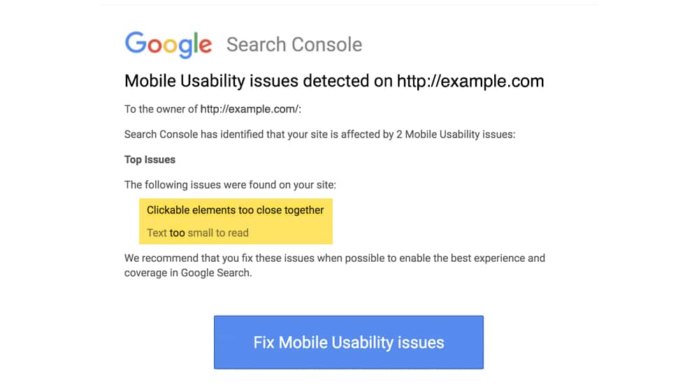
- One of the standard mobile errors is that "clickable elements" are too close together and are often text links. You can typically resolve this by increasing your line height, so your sentences aren't stacked so closely on top of one another.
- If one of your website elements overlaps your text and makes it difficult or impossible to read, that could hurt your user experience and confuse readers.
All of these are aspects of font that make it look like you're trying to hide something from users while you show it to Google, such as keywords, which is a big no-no in SEO.
On top of that, fonts can have a tremendous indirect impact on SEO.
Let's say you do a Google search for something you want to read about and click on a result. The page you land on, though, looks like this.
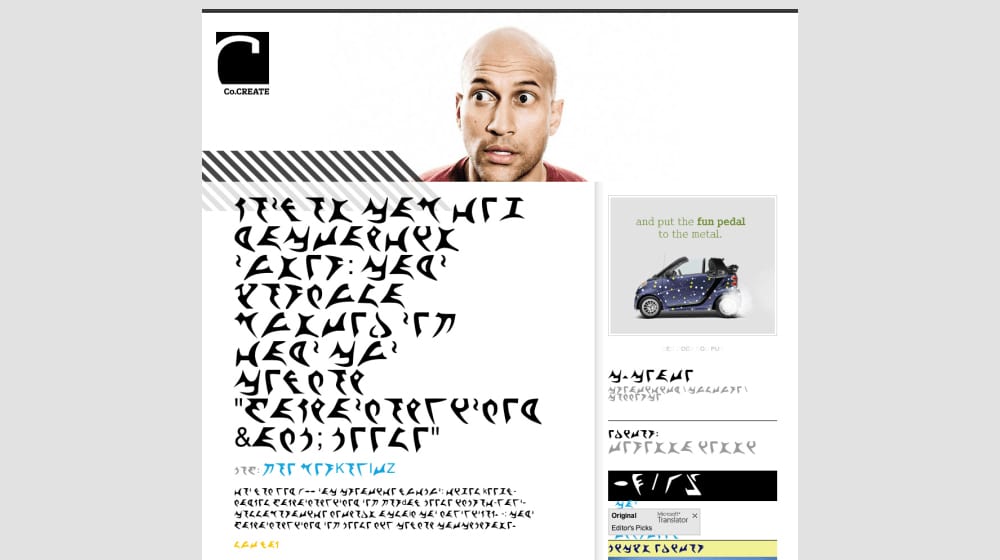
I chose Klingon as an example because it's fictional, but the same thing can happen if your site is in Chinese, Korean, Thai, or Farsi. If your primary audience can't read what you're publishing, you're going to have a 100% bounce rate, zero engagement, and no usability.
All those things, from click-through and bounce rates to nebulous estimates of the "user experience," are secondary elements of SEO. Google's algorithm almost certainly takes at least some of them into account. Moreover, the human search raters whose job it is to spot-check the algorithm and feed the machine learning AIs will rate the sites poorly, further penalizing them.
Plus, there's always the fact that any custom font that isn't just a basic Google font or something pre-loaded on every computer is an asset that will need to load on a user's computer before they can view the site, and that slows down site speed, even if it's only by a few milliseconds.
Font Beyond Font Choice
"Font," as most people think, is primarily the choice of personal preference. But, there's a lot more that goes into your web page's font style than just the choice of typeface. Do you prefer the look of web-safe fonts like Verdana, Tahoma, or Helvetica? Or do you want a Google Font like Roboto, Lato, Open Sans, or Montserrat?
- Line spacing. If your text lines overlap or are too close together, it becomes more challenging to read them.
- Paragraph spacing. The "wall of text" occurs when paragraphs run too long, are left unbroken, and are much more challenging to read.
- Font size. If your font is too small, it's harder to read. If it's too large, it takes up too much space and makes it harder to use the site.
- Font weight. Also known as how bold the font is. A thinner font can often be harder to read, though some fonts get "puffy" when bold and lose definition.
- Font style. An example of a font style is italics. Italics can be appropriate in some cases, but with some fonts, it can make your text unreadable.
- Text color. The color itself doesn't necessarily matter, so much as the contrast between the body text and the background, which you can check here. Too little contrast makes it harder to read.
- Margins and padding. These values are the spacing between your paragraphs and the elements around your text. If your text is hugging the container that it's in, or if your sentences are all touching, you might need to increase your margins and padding to give them some breathing room.
- Lesser known CSS styles. These include text-shadow, opacity, letter-spacing, text-align, and more. Use best practices here and make sure your styles aren't making your text easier to read.
These elements are essential for accessibility and the ability to read and use a site.
There have been several attempts throughout the years to promote and normalize different forms of font choice or layout to make sites (and website content in general) easier to read. For example:
- A myth was started that Comic Sans was a suitable font for people with dyslexia.
- The development of actual dyslexia-friendly fonts.
- The creation (and subsequent monetization and abandonment of) "Bionic Reading," a method of systematically bolding parts of words to make them easier to read.
These examples are helpful in a high-level discussion about accessibility, the challenges of reading text with disabilities like dyslexia, and other related subjects.
So, let's talk about the things you should do and the things you shouldn't.
The Dos of Website Fonts
First, here are five things you should do.
1. Do pick a default font for speed reasons.
Picking a font that isn't one of the standard fonts can make your site look different from everyone else, but most people aren't going to care, and some of them won't even see it because it doesn't download correctly for them. On top of that, picking a non-standard font will slow down your site, even if just a little, and those little delays add up over time.
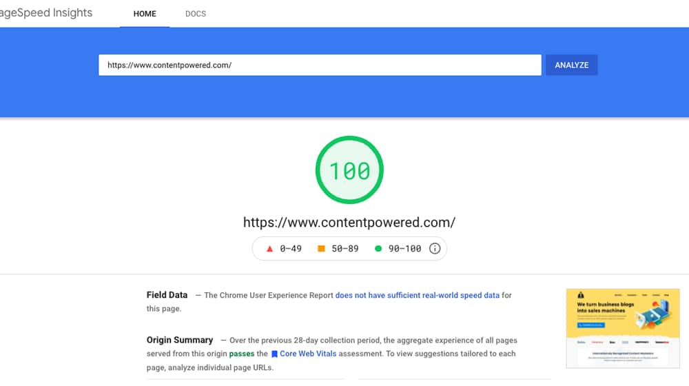
Can you get away with it as long as you follow other guidelines? Sure. Is it worth it to make "Verdana, but slightly thicker"? Probably not. It's a trade-off, but it's not usually one that's worthwhile. Remember to run a test on Google PageSpeed Insights after implementing a new font to see if it is slowing down your website.
2. Do make liberal use of text styling to break up passages.
Text styling is a little contentious. On the one hand, it's a great way to break up your text and make it more enjoyable to read. Adding sections with bolded text, using italics for emphasis, and underlining key terms can help users understand the text they're reading.
On the other hand, there's one major issue: screen readers ignore it. That means if anyone is relying on a text-to-speech app to navigate your website, all of that context is lost. I'm guilty of this, too (I use formatting for emphasis that would be lost), but it's something I can work on, and now it's something you know too.
3. Do frequently break up paragraphs.
One of the most significant issues with website functionality online is the text that stacks up into huge paragraphs with no differentiation. No matter what your font choice is, that wall of text will be impenetrable. I've even turned away reading something I was interested in because it blasted me with a dense wall of text that kept losing me. Use a few line breaks; it makes a big difference.
4. Do make sure similar characters look different.
Usually, a serif font is best for this, but it depends on the design of the font you pick. The font you choose should make it obvious that certain similar letters are the letter they're supposed to be.
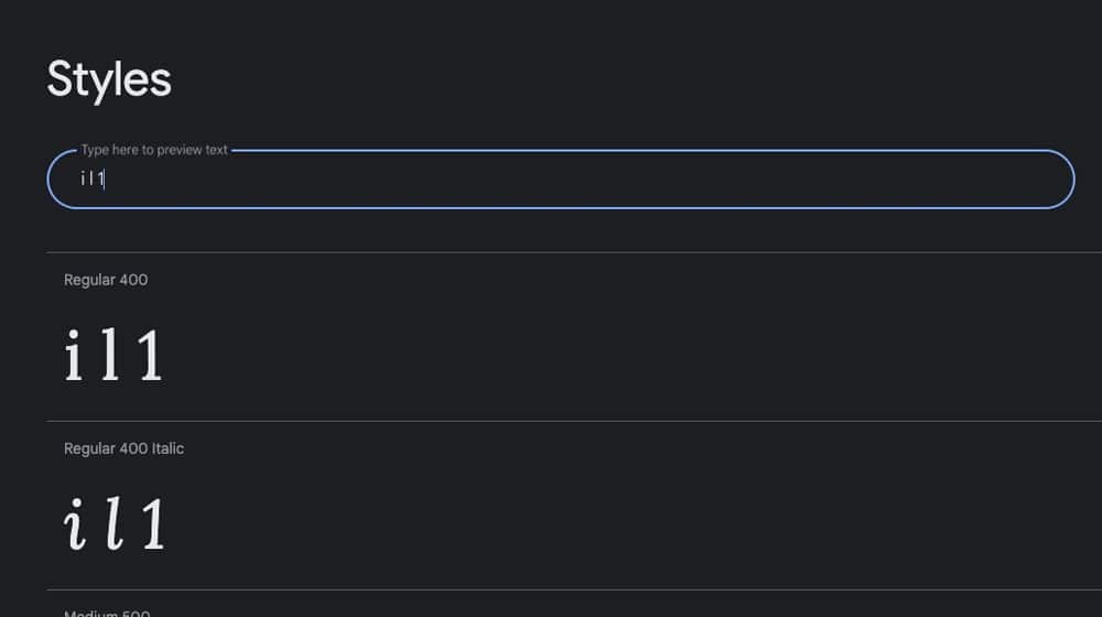
In particular, check:
- I, l, and 1. In the wrong font, these can run into each other and be indistinguishable, hurting readability.
- C, o, e, and a. These are similar to the above in that (in lower case) they're all small, mostly circular, and can be hard to distinguish in some fonts.
- M, N, W, and V. In upper-case, these can run into each other, adding I and other bars and slashes to the mix.
- The mirrors of d, b, p, and q. Usually, it's recommended to have something more than the direction of the tail to differentiate these letters.
These letters are essential to differentiate as they can be confusing, especially in cases where legibility and distinction are critical, like in a logo or heading.
5. Do make sure you set adequate letter and line spacing.
Spacing is a lot more important than people think. You want spacing between letters, between words, between sentences, between paragraphs, and between elements to all be adequate. Make sure not to overdo it, or your sentences and lines get spread out and disconnected.
What someone might consider "adequate spacing" depends on many different factors and may even need to be different between your mobile and desktop versions. The important thing is to test it and find something that looks appropriate. It's also important to keep website accessibility in mind for users who have impaired vision.
The Don'ts of Website Fonts
Next, here are five things to avoid. Of course, you can turn around the top five points and invert them, but I picked a few more unique things to avoid here.
1. Don't choose colors that don't contrast enough.
Above, I linked to a contrast test. Contrast is tricky because something that looks like it's enough might not be enough, depending on the colors you choose.

Color choice can also be problematic because it's affected by your computer screen; different screens with different color tones can have different levels of vibrancy, which throws everything off when you're designing by sight. Make sure you use external tools and validation of hex codes for it rather than your eyesight.
2. Don't forget about mobile users.
Make sure your design is responsive and elements like your font appear on mobile devices (not just a mobile preview on your desktop!). Remember, over half of all web surfing today is performed on a mobile device.
It's too standard for site designers to pick elements, spacing, and designs that look good on a desktop but fall over when crammed into a mobile screen.
3. Don't put looks over usability.
Look, I get it. Sometimes you want a site that looks fancy, and you're willing to sacrifice a few users to get it. That's fine if that's what you want to do, but you need to be aware that that's the trade-off you're making. Some people – often people with visual impairment, dyslexia, or other processing issues – are going to be turned away. If that audience is one you're willing to alienate, then so be it, but remember that's the audience you're getting rid of for a fancy design.
4. Don't get too caught up in tiny details.
When we're talking about SEO in general, and you're trying to squeeze every last drop of value you can out of your site, don't sweat the small stuff. The truth is, as long as you hit the primary baseline of "readable text," you're going to be okay. You can squeeze a little bit more optimization out of it, but that's all it is; a little bit.
You may not go up a rank or get a higher conversion rate because you changed from 11-point font to 12-point font, or you started using a little bit more bolding. It's just not that impactful. But font sizing and spacing is one ranking signal of many, and you should seize every opportunity to improve your user experience.
5. Don't make a website in Klingon.
Even if John Mueller confirmed that your choice of font doesn't matter to SEO, your font styling and user experience do matter. Don't pick a font that your readers can't read. Now, if you're writing a website for Trekkies who have learned Klingon, then, by all means, go for it. Otherwise? Focus on a readable font and make some changes to your website to maximize usability. It's well worth the effort.
Do you have any specific concerns or considerations about font and styling on websites? What's your favorite font to use for readability? Please let me know! Feel free to bring up points you think I should know! I admit that I'm only tertiary to the overall accessibility discussion, and I'm approaching things from a digital marketing perspective on SEO.
Written by James Parsons
Hi, I'm James Parsons! I founded Content Powered, a content marketing agency where I partner with businesses to help them grow through strategic content. With nearly twenty years of SEO and content marketing experience, I've had the joy of helping companies connect with their audiences in meaningful ways. I started my journey by building and growing several successful eCommerce companies solely through content marketing, and I love to share what I've learned along the way. You'll find my thoughts and insights in publications like Search Engine Watch, Search Engine Journal, Forbes, Entrepreneur, and Inc, among others. I've been fortunate to work with wonderful clients ranging from growing businesses to Fortune 500 companies like eBay and Expedia, and helping them shape their content strategies. My focus is on creating optimized content that resonates and converts. I'd love to connect – the best way to contact me is by scheduling a call or by email.


September 06, 2022
I feel like people don't discuss the importance of fonts that much so I'm glad you did this. My ultimate go-to is Tahoma.
October 07, 2022
Thanks! I'm a Helvetica guy, and Montserrat from Google Fonts, if you could tell by my site 😀