How to Fix The "Properly Size Images" Warning in WordPress
Written by 
Online, images are tricky. Every website needs them, whether they're for product pages or for blog posts, but they're very easy to get wrong.
In particular, images can get very, very large. A typical smartphone can take pictures that are frankly immense, especially when you consider that only 10-20 years ago, an image the size of a postage stamp would take several minutes to download.
Easy access to large images, easy viewing on large computer screens, and easy access to high-speed internet for many of us means that we might not think of images as having nearly the impact they do.
But then you drive out to a rural area and try to use your smartphone via LTE service to browse a website, and you watch images time out when loading, see websites devoid of content because the images didn't load in, and you realize.
Oh.
Oh, that's why Google cares.
Key Takeaways
- The "Properly Size Images" warning appears when Google detects significant differences between an image's actual file size and its displayed size.
- Large images drastically slow page load times, negatively impacting Core Web Vitals metrics and search rankings, especially on mobile.
- The warning isn't a critical SEO dealbreaker; fixing other PageSpeed issues may be more impactful depending on your site's situation.
- Using plugins like Mobile Featured Image or Just Responsive Images is the easiest fix, automatically serving appropriately sized images for mobile devices.
- Manually editing WordPress code offers the most precise solution but requires significant technical effort and time investment.
Web Images and the Modern Internet
Over 50% of modern web browsing is handled on mobile devices. And, while high-speed internet is swiftly growing in availability, it's still not everywhere.
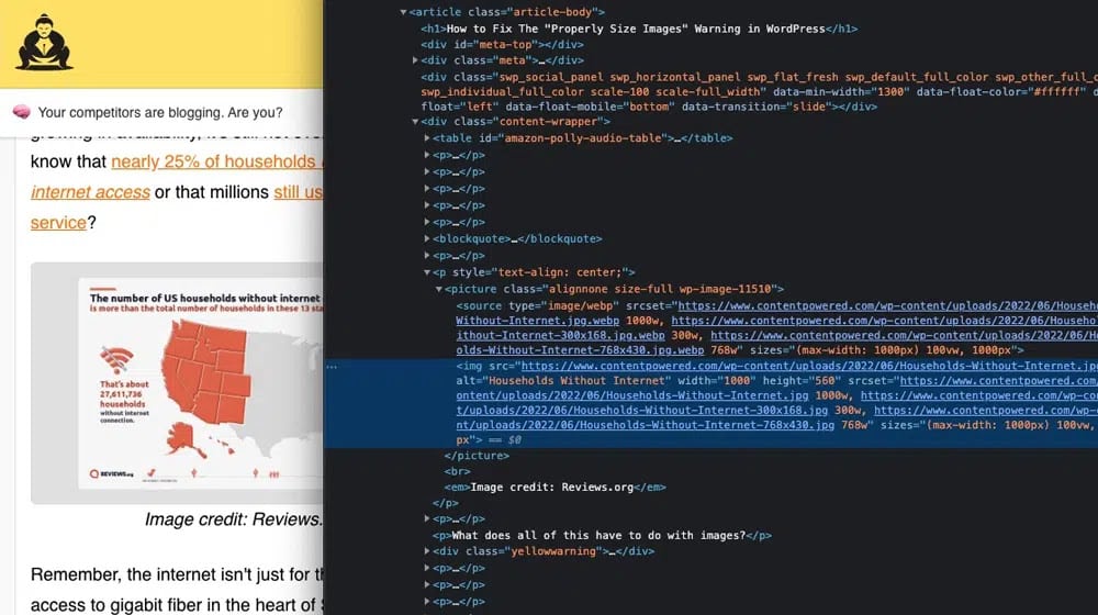
Did you know that nearly 25% of households don't even have internet access? Rural broadband is barely better than dial-up in many cases. That doesn't even get into all of the people in the global south, in developing nations, and other places with very limited infrastructure.
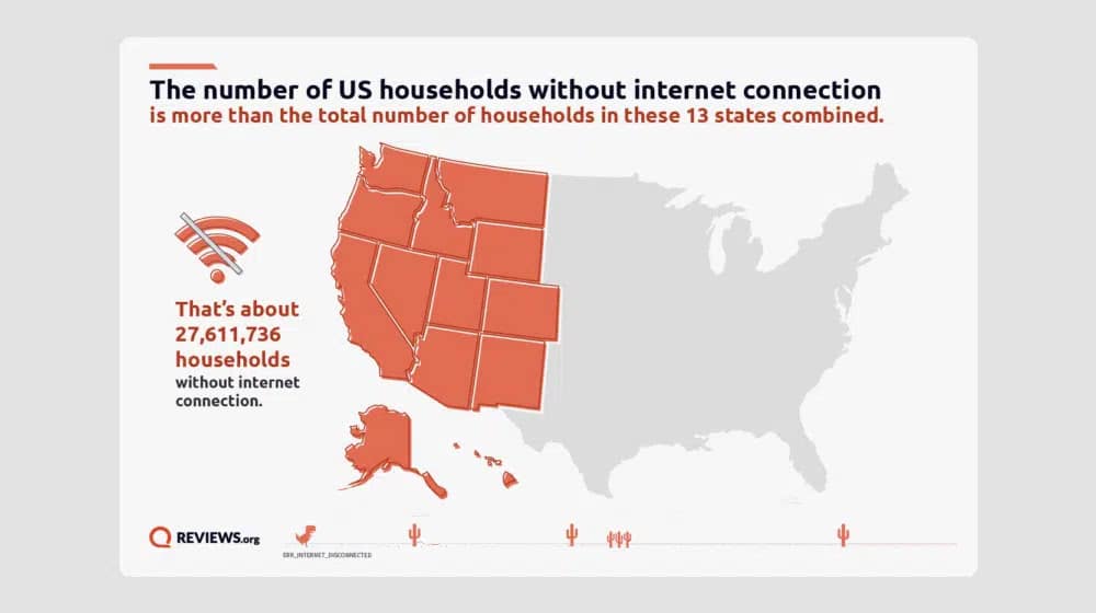
Image source: Reviews.org
Remember, the internet isn't just for the people with access to gigabit fiber in the heart of Silicon Valley. The internet is for everyone, and that means people using extremely slow, spotty, connections, people browsing via satellite internet, and more.
What does all of this have to do with images?
Images are big. Not just in dimensions; images are large in file size. A website, even a fully-featured website with a ton of content, isn't going to be more than a couple of megabytes. They're getting larger, but they're still only 2-3 megabytes on average in 2024.
Now, consider how large a picture is. A single photo from a modern smartphone can easily be 4MB, twice the size of an entire webpage. Then remember that a web page can have many photos on it. It's no wonder that images can slow down websites by multiple orders of magnitude. You might also want to consider whether the types of images you use affect your SEO beyond just load times.
This is where Google's policies come in. Google has set "fast-loading pages" and several load-time metrics in the Core Web Vitals as key search ranking factors. The slower a page is to load, the more it will detrimentally affect your search ranking. This goes double for mobile websites, which are, on average, accessed on spottier and slower connections.
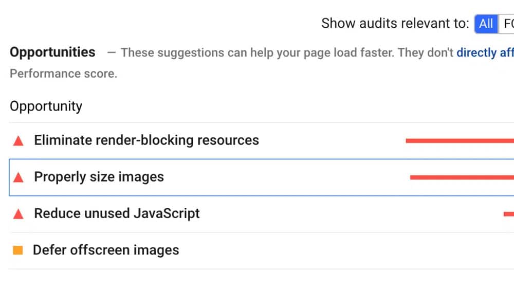
To facilitate optimizing this, Google provides a tool called PageSpeed Insights. PageSpeed Insights scans your website and determines how quickly it loads, both for mobile and for desktop versions. They audit your site for dozens of different potential issues, and deliver you a report with any issues they detect. One of those issues is the Properly Size Images error.
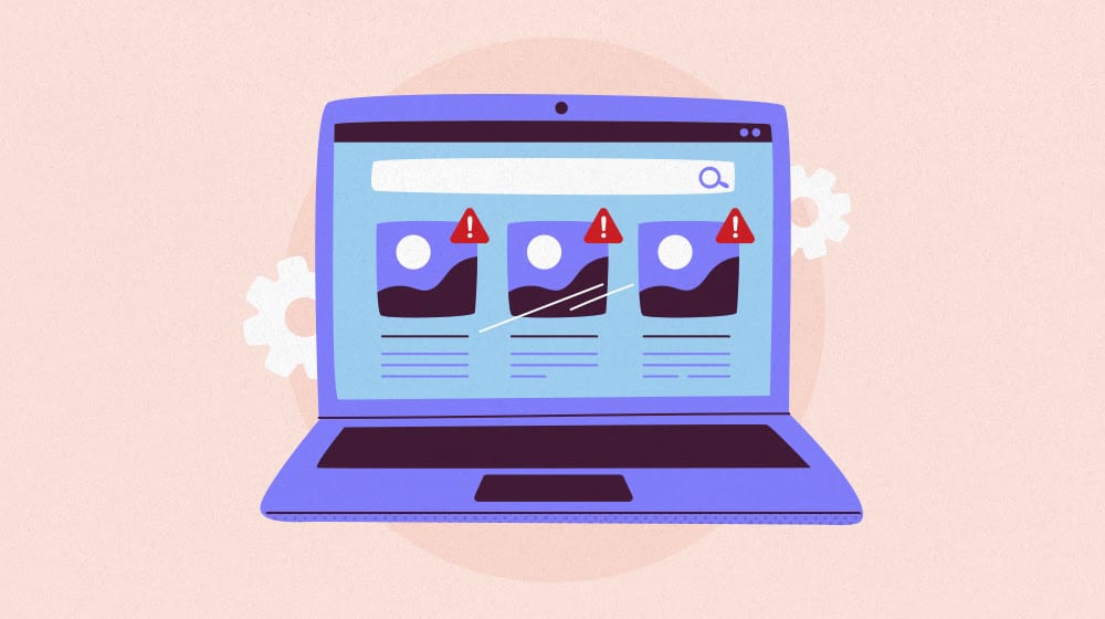
What Does Properly Size Images Mean?
If you're getting the warning about "Properly Size Images" in PageSpeed Insights, you probably want to know what it is and how you can solve it. After all, if you're aiming to hit over 90 on your PSI Score, you need to address as many problems in their reading as possible.
Before I dig into exactly what this error is and what it means, I want to say one thing: it's not an absolute deal-breaker. You don't need to drop everything to fix this error on every page.
What I mean is, this issue isn't tanking your SEO, and fixing it isn't going to skyrocket you to the #1 position. Fixing it will help, in that it improves your page load times and Core Web Vitals, but it's not going to have a massive, dramatic effect.
So, what is the problem?
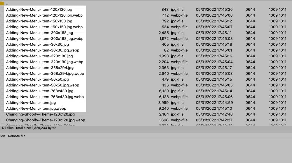
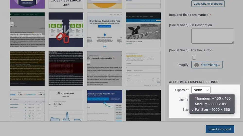
When you upload an image in WordPress, the platform will automatically generate several different-sized versions of the image for use, which you can then specify in the image blog you add to your site. This allows you to choose a large, medium, small, or thumbnail version of the image to display.
Any other resizing on the site - for example, when your site is scrunched down with a responsive design, on a mobile device - WordPress will use code to resize the display of the image.
That means you might have an image with dimensions like 1440x1080, with code scrunching it down to display at 370x278 on a mobile device. That's a huge difference! All of that extra size is unnecessary, but it means your image files are huge. That's just an example, too; a modern smartphone photo can start at 4032x3024!
More importantly, many modern website designs have a large above-the-fold image to accompany the title and introduction of a post. That huge image looks great, but it has to load front and center, and that takes time. It hurts your first and largest contentful paints (both Core Web Vitals metrics), can cause cumulative layout shifts, and generally wrecks your Core Web Vitals.
One of my test sites scores 98 on the desktop PageSpeed Insights but a meager 76 on mobile, and it's almost entirely because those above-the-fold images aren't optimized for mobile viewing. It's an incredible difference! You can use an image SEO checker to help identify other image-related issues on your pages as well. You can also automatically generate alt text for images to address other common image optimization gaps.
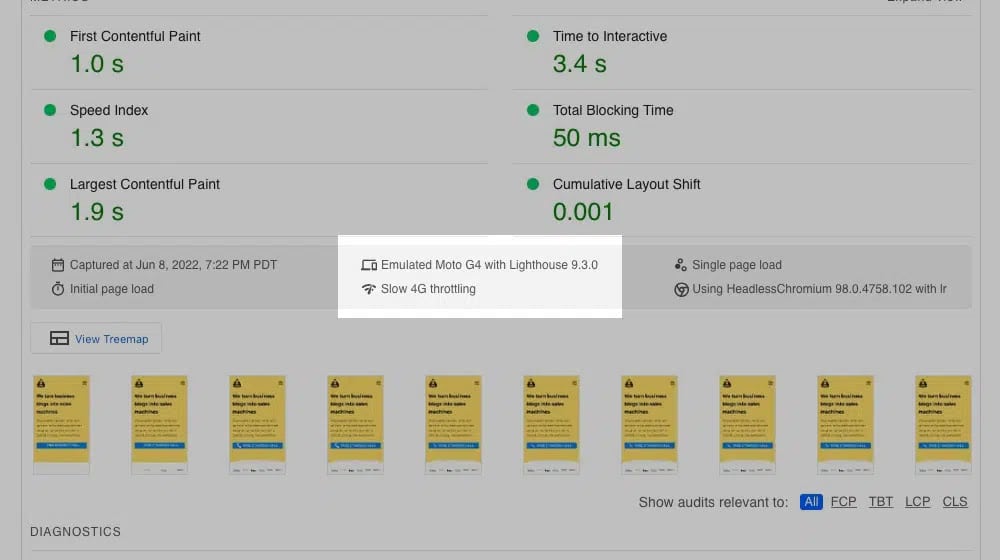
For a technical brief: when Google scans your site on mobile for PageSpeed Insights, they do it by simulating a throttled 4G cell network and using an emulated Moto G4, so it's using outdated "hardware". But, since millions of people across the country still use outdated hardware, it's a fine simulation of what someone in a middle of the road situation might be using.
As such, Google's expectation for images in a responsive design is quite small. Specifically, what they do is compare the size of the rendered image (what you see) versus the size of the actual image file being loaded. If there's any significant difference in dimensions or more than 4kb in file size, Google will throw this up as an issue.
Unfortunately, there's no one simple check-box you can click to fix this in WordPress. WordPress was designed to facilitate image scaling, and doesn't consider that scaling to be inherently bad. Google, on the other hand, prefers if the images are as close to their display size as possible.
Four Possible Solutions to Properly Size Images
In the course of researching (and fixing) the WordPress Properly Size Images error, I've come up with several possible solutions. It's up to you to choose the option that best fits your needs and goals, but I'll do my best to help you pick which one that will be.
Option 1: Ignore the Problem
Solution one is to simply ignore the issue entirely. If you can take care of other critical issues in PageSpeed Insights, you can reach over 90 in the tool without fixing the "properly size images" problem. In fact, on that test site I mentioned? The desktop version with 98 has the error, while the mobile version with 76 does not. Wild!
Is ignoring it a good idea? Probably not. Mostly, it comes down to two things: how much time you have to tinker and what other possible problems you could be solving instead. I'd much rather tinker and get that 76 up to above 90 than I would get the 98 to 99.
Whenever you're getting into the weeds with an element of technical SEO, I always recommend stepping back and pausing. Are there other, broader issues you could be addressing that will have a larger impact? If so, this one is one you can safely put on the back burner for now. For example, WooCommerce sites often have more pressing SEO issues worth tackling first.
Option 2: Manually Resize Images
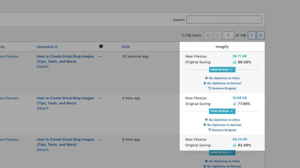
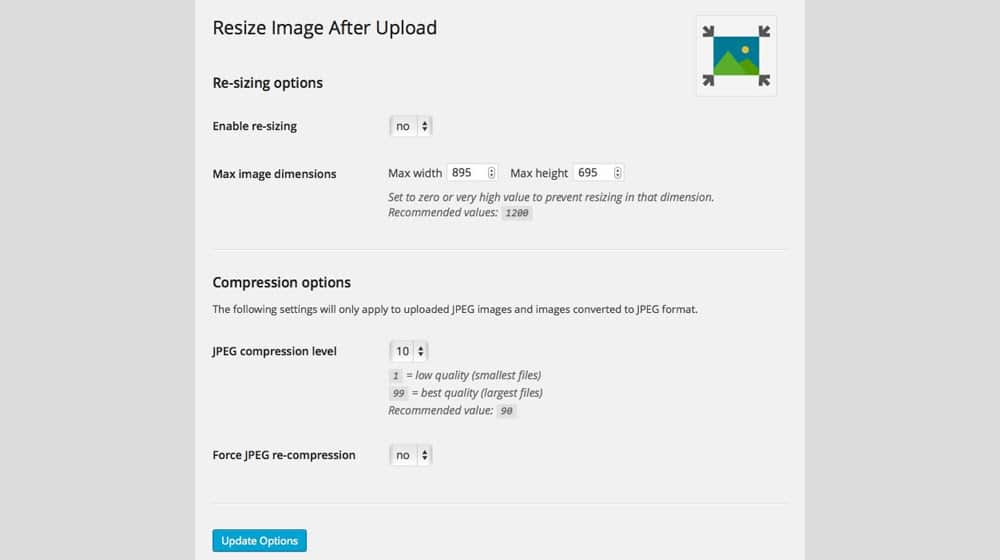
Solution two is to do a bunch of manual image resizing. You can do this with apps like Imagify or Smush; I wrote about a bunch of different options here, so give this a read if you want to mass resize your image files. One note: this option will probably require you to go through and replace all of your featured images, and any other images that are causing problems.
This will solve the problem, but there's one big issue: it's work you need to keep doing forever. Every time you want to add new images to your site, you need to proactively resize them, and make sure you have the right sizes available for all of the common display modes. I don't know about you, but that's another checklist box I don't want to have to tick every time I write a new post. It's worth using a system to track content updates in WordPress so nothing slips through the cracks.
Option 3: Automate Image Resizing with Plugins
Solution three is to use plugins to automatically swap your smaller-sized images to, for example, the thumbnail version WordPress generates. There are a lot of different WordPress plugins to automatically resize images and replace different scaled versions with resized versions.
The benefit here is that they generally automatically do all of this resizing when you upload an image, so you don't need to do it manually. On the other hand, this can have the issue of overshooting and using too-small images in some instances. That's often better than using too-large images, so it works out, but it may be less than ideal in your site design.
Option 4: Tinker with WordPress Code
Solution four is to wade deep into the weeds of the WordPress code, identify multiple different break points, and specify source images for each. This is overkill; it will virtually guarantee the best possible results for anyone on any mobile device, but Google only uses the one simulated mobile device for PageSpeed Insights (and, presumably, their index.)
Why would you want to do this, then? It depends on your goal. If you want the best possible user experience for every mobile user, this option will help you achieve that goal. On the other hand, if you just want the best SEO metrics according to Google, the added work (and benefit) won't impact your ranking. It's up to you what you want to do.
This also runs the risk of tripping a flag in Google's algorithm. Google says, a lot, that you should "create content for users, not for the search engines." If they see that you're tailoring your images to the display size of a Moto G4, especially if it's at the expense of more modern devices, that can act as a honeypot and earn you a penalty. This kind of over-optimization is one of the reasons pages sometimes struggle to rank despite technical effort.
Since solution one is to ignore the problem and solution two is both tedious and has been covered elsewhere, I'm going to focus the rest of this post on solutions three and four.
Using Plugins to Solve the Properly Size Images Error
This option is, if we're being honest, the one 90% of you are going to use. It's fast, it's relatively easy, and it caters specifically to what Google is looking for. If Google changes how they measure mobile page responsiveness, then they might need tweaking, but until that point, this should work fine.
The first plugin you want to use is Mobile Featured Image, which you can find on this GitHub page. How does it work?
When WordPress processes an image you upload, it generates several different sizes, and then attempts to serve the best size for each usage. Unfortunately, with mobile responsive design, it's not always accurate.
The plugin adds a new line to the list of sizes WordPress uses, and gives you the added option for a "mobile featured image" beneath the standard "featured image" box in a post you create. If you let it do its thing, it will replace all mobile featured images with the thumbnail version of your featured image, automatically.
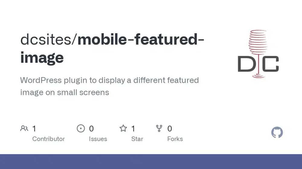
If you want, however, you can also specify the exact image that shows up on mobile, including making it a different and unique image if you want. I wouldn't recommend making it completely unique - Google likes the different versions of a site to be the same - but it's an option if you want to use it.
Note: if the above plugin doesn't solve the issue for you, you can try something like Just Responsive Images. There are also WordPress plugins to help with other site improvements worth exploring while you're at it.
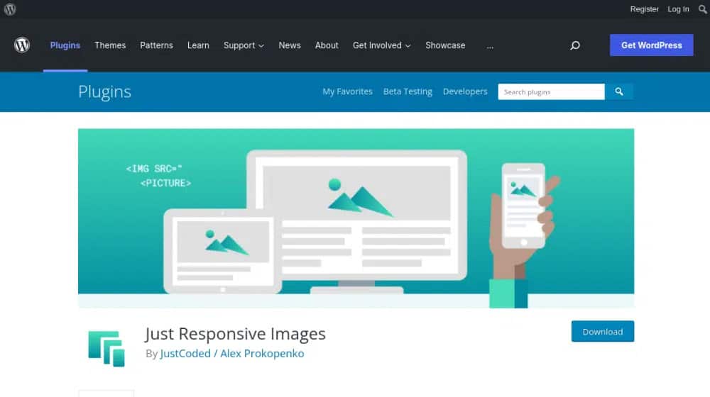
This is a more detailed plugin that helps convert all of your images into responsive images with more nuance than WordPress usually allows.
The other part of this process is optimizing the rest of the images on your site. By lazy loading the below-the-fold images, you speed up page load times significantly. I love WP Rocket for this; they have the feature built into their core plugin, which is a paid plugin. If you're running an online store, it's also worth thinking about how to add a blog to your WooCommerce store alongside how much server memory your WooCommerce setup needs to handle these optimizations smoothly. Alternatively, you can use their free lazy-loading spin-off here.
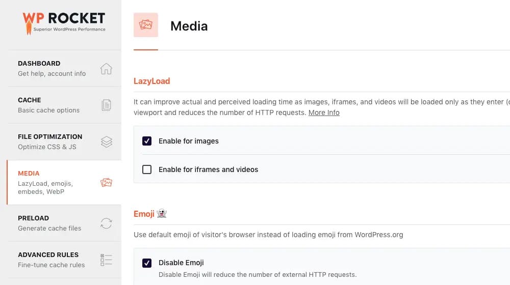
Either one will work, but I love WP Rocket and highly recommend buying a license.
Manually Editing WordPress to Solve the Properly Size Images Error
The second option you have is to manually find "break points" in screen sizing, where your responsive design adjusts for different mobile viewports.
I recommend using Responsive Image Linter to audit your images. This is a bookmarklet; that is, a script that runs when you put the code into your browser's address bar. All you need to do is bookmark the link on the page, and then when you're on your website, click to "visit" the bookmark. It will run a script, audit your page, and generate a report of all of your images at various screen sizes. The report will tell you which images have issues, at what sizes, and how to fix them.
Once you have this report, you'll have to figure out what image dimensions and sizes you'll need to optimize for. You'll need to generate those images and upload them to your hosting, and regenerate thumbnails for them. Then, you need to register more image sizes in your add_image_size() function, and serve images properly for various viewport sizes.
You can read more documentation about how to go about this process on this page. Keep in mind that this will be a pretty large project with a lot of time spent executing scripts if your site has more than a few dozen pages on it, so budget your time accordingly.
If this option is too technical for you, don't worry about it. The previous plugin-based option will get you close enough. This is just for my fellow tech-heads who want to dig into code until we're up to our eyebrows in variables.
Either way, these options should help you solve the majority of the potential issues you have with images not showing at the right sizes. From there, you just have to pay attention to the other Core Web Vitals and make sure they're all sorted out as well.
Written by James Parsons
Hi, I'm James Parsons! I founded Content Powered, a content marketing agency where I partner with businesses to help them grow through strategic content. With nearly twenty years of SEO and content marketing experience, I've had the joy of helping companies connect with their audiences in meaningful ways. I started my journey by building and growing several successful eCommerce companies solely through content marketing, and I love to share what I've learned along the way. You'll find my thoughts and insights in publications like Search Engine Watch, Search Engine Journal, Forbes, Entrepreneur, and Inc, among others. I've been fortunate to work with wonderful clients ranging from growing businesses to Fortune 500 companies like eBay and Expedia, and helping them shape their content strategies. My focus is on creating optimized content that resonates and converts. I'd love to connect – the best way to contact me is by scheduling a call or by email.


Comments