Fix The "Defer Offscreen Images" Message on Google PageSpeed
Written by 
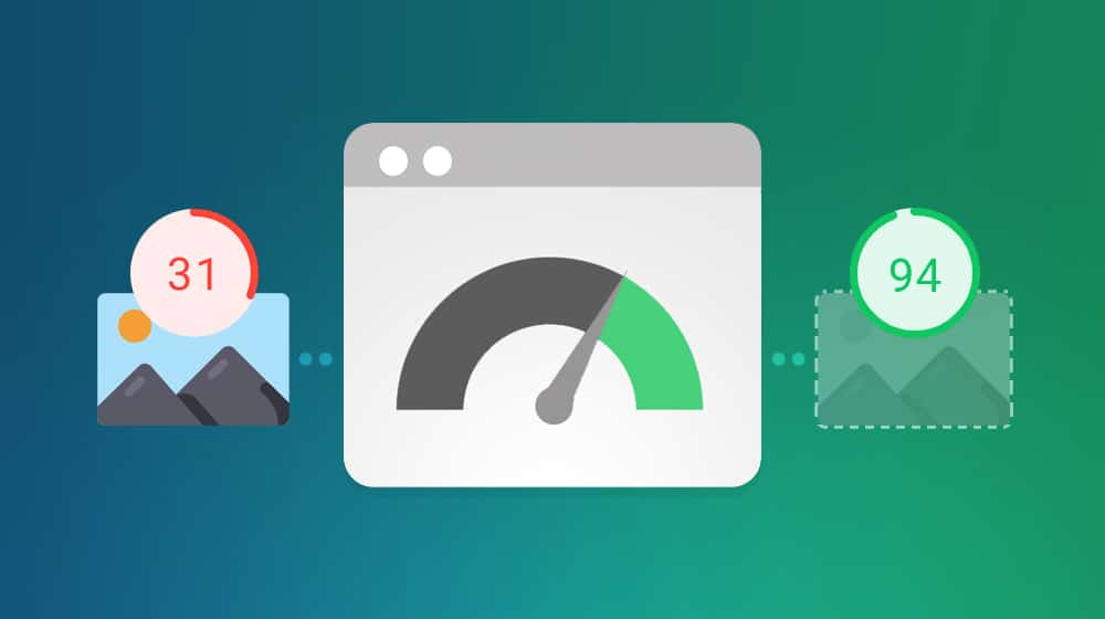
One of the most critical modern metrics for SEO is site speed. That is, of course, in terms of purely mechanical things you can influence, rather than the more subjective content quality metrics. Site loading speeds have been a ranking factor for years, but they're getting progressively more important. How are they getting more important?
Well, first, it was simple page loading speeds that were important to search engines. Then Google started adding nuance to it. They began viewing pages on both desktop and mobile and grading each version separately. With the mobile-first indexing update a while back, they've also started ranking sites more on their mobile experiences than desktop versions.
And, of course, the new Core Web Vitals are all narrow, nuanced versions of page speed. The latest update rolls these Core Web Vitals into page experience, which means if your site is slow, your page experience is "poor." Trust me; you don't want that if you can avoid it.
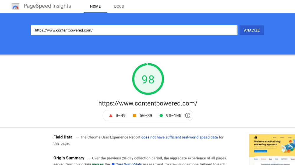
The primary tool we web admins can use to grade our sites regarding speed is the PSI tool, also known as Google PageSpeed Insights.
The PSI tool allows you to run a URL through Google's servers and get a graded report on everything relevant about page speed and load times. I recommend checking both PSI and the Core Web Vitals reports.
- PageSpeed Insights
- Core Web Vitals
That said, PageSpeed Insights now includes data about Core Web Vitals, so you can get away with just using PSI if you want to.
When you run PageSpeed Insights on your site, you're presented with a report that runs you through something like 36 different tests, looking for specific quirks of site design that can slow it down. These can be anything from using next-gen image formats to minifying scripts to the error we're going to talk about today.
Key Takeaways
- The "Defer Offscreen Images" error appears in Google PageSpeed Insights when sites load images unnecessarily, slowing overall load times.
- Two main causes exist: not implementing lazy-loading at all, or mobile designs hiding images that still load invisibly.
- Native lazy-loading uses an HTML "loading" attribute but doesn't work on Safari or older browsers, limiting its reliability.
- The CSS "content-visibility: hidden" property prevents entire elements from rendering, working beyond just images but lacks broad browser support.
- A PageSpeed score above 90 is the goal; Google itself states a perfect 100 score is unrealistic and unnecessary.
What Does "Defer Offscreen Images" Mean?
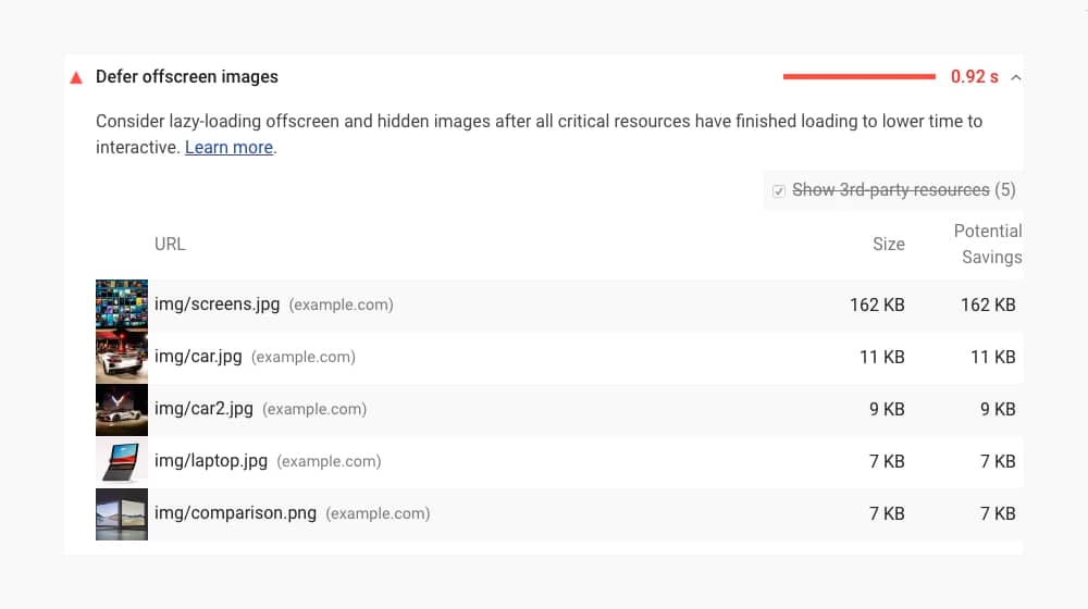
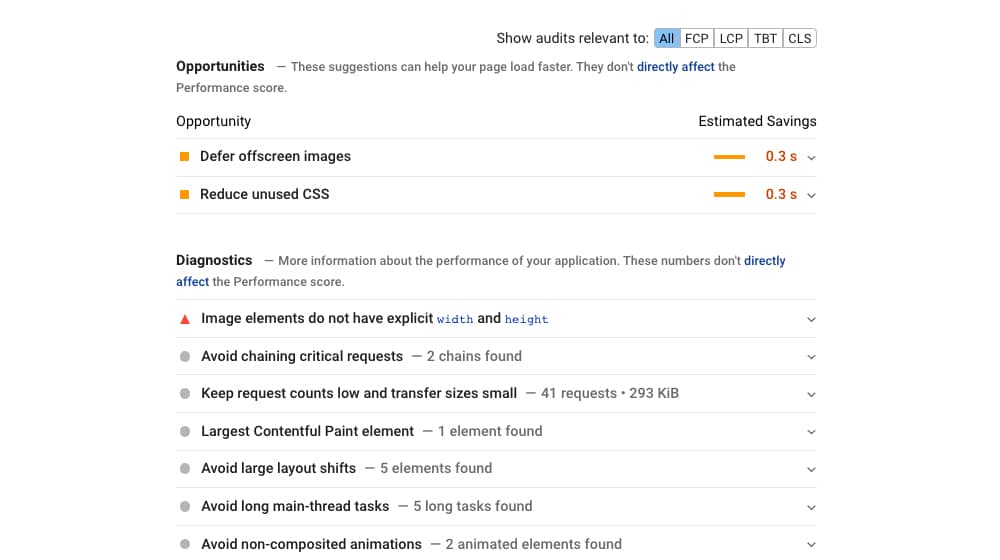
One error PSI can give you is "Defer Offscreen Images." When you pass this audit, it shows up in green in the "passed audits" section. When you don't, it shows up in red and offers a list of images on your site, as well as the potential size savings you could get from deferring them. The question is, what does that mean?
If you look into the description, here's what Google says:
"Consider lazy-loading offscreen and hidden images after all critical resources have finished loading to lower time to interactive."
They also have a Learn More link that leads to this page.
One thing worth mentioning is that this error shows up more frequently for mobile sites than for desktop sites. There are two main reasons for this. One is that mobile designs are often less optimized than desktop sites, based on themes and construction. The other is that Google is harsher on mobile sites than desktop sites, primarily because there are more mobile phone users in the world than desktop users. In addition, the mobile experience is very reliant on load times, just because of how easily frustrated users tend to be when browsing on the phone. If a user is in a spotty service area and they try loading your site, having a clumsy and poorly-optimized site is only going to lengthen the time it takes for them to render your site.
What this error means is that your site is loading images when it doesn't need them, slowing down the overall load times dramatically. Typically, the solution is to lazy-load the pictures on your page, as Google suggests. However, you can still have this error even though you're lazy-loading images, so what gives?
Two Causes for the "Defer Offscreen Images" Error
There are generally two reasons why you might have this error showing up in your PSI report.
1. The first is that you aren't doing any lazy-loading at all.
What is lazy-loading? If you don't know, it's time to learn. When a web page loads, all of the assets on that page need to load, so the user can browse it, right? Well, that's not strictly true. Yes, every include on the page needs to load, but you can defer some to a later stage in the process. For example, if you have assets like images way down the page, what good does it do to load them if the reader clicks a link at the top and never scroll down? That delayed your load time unnecessarily.

Enter lazy-loading. Why is it called lazy loading? You're making the loading of those lower assets "lazy." The files, typically images, don't load until the user is getting close to them by scrolling.
If you have lazy-loading enabled, your initial page load times will be faster because many assets won't load right away. However, even if you're crunching your images correctly, their file size is still huge. These take longer than most files to load, so they still slow down your site. And, of course, the longer it takes a page to load, the worse a score you get on PSI. This can also contribute to service pages struggling to rank on Google.
2. The second cause of the error is your mobile site hiding images. A common trick for a mobile site is to hide photos that aren't necessary on the smaller, mobile-focused version of the page. So, for example, if you have a gutter sidebar with images for a call to action in it, do those load on your mobile site?
They shouldn't because your mobile design doesn't have a sidebar. Mobile screens are both too small and laid out in the wrong way for a sidebar to work. However, many mobile responsive designs hide the sidebar and the images in it. If you're running an online store, these issues can also show up as common WooCommerce SEO problems.
Here's an example. Visit ProBlogger's Blog on a desktop site. You can see the sidebars. You have the newsletter CTA, the social media CTA box, and so on, including a handful of image banners for various services.
Now, resize your browser window to be tall and narrow. Websites with a responsive design set their design based on the size of the viewport, so by making your browser window smaller, you can see it shift directly into the mobile version of their website.
You'll notice that the sidebar is no longer visible. However, the images are still there; all of those sidebar elements are now hidden from view.
Now, ProBlogger uses a trick here. If you refresh the page while your window is in mobile view (and clear your cache if necessary), it reloads the page as what will load with the mobile version loads. If you then expand the window, you'll see a brief flicker where the sidebar pops in, but the images haven't loaded; placeholders load instead. Those placeholders are much smaller than the actual images, which replace them in a matter of milliseconds.

Sites that don't explicitly use a trick here will find that all of that hidden content still loads, and it still delays site loading times, even though the images aren't visible or relevant. That's bad practice.
Fixing Cause #1
If you don't have lazy-loading implemented on your site, well, do that. That's your solution to the issue. There are, thankfully, a lot of different ways to implement lazy loading.
Native lazy loading. This feature is a relatively recent one, and new HTML versions now have a "loading" attribute attached to images. Loading is an attribute that can have two different values: Lazy and Eager.
- Lazy: The image is delayed and doesn't load until certain conditions are met - typically, the user's viewport reaching the point where you would display an image.
- Eager: The default behavior. The image loads when the page loads.
To use this, all you need to do is add the attribute to the HTML code for an image.
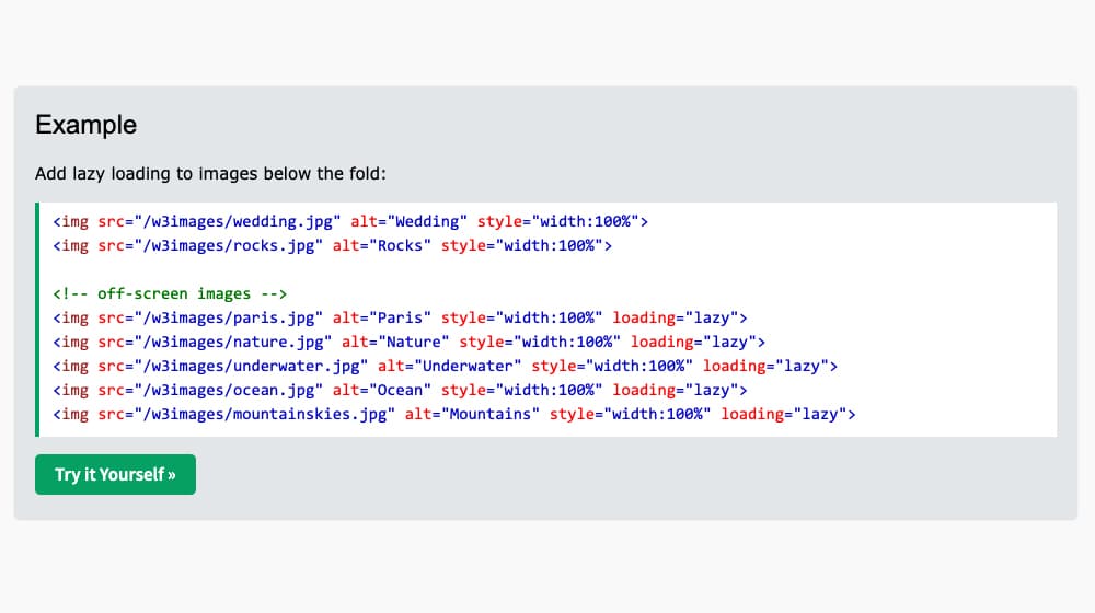
Your code will look something like this (Example from W3Schools):
<img src="/w3images/paris.jpg" alt="Paris" style="width:100%" loading="lazy">
I recommend only doing this for images and elements that are below the fold. If pictures above the fold are delayed, it affects the Core Web Vitals, specifically the First Contentful Paint. This metric is the time between initiating a connection to a site and the first significant element loading. Typically, the first notable element is the most prominent image above the fold, so you want that to load quickly.
Why doesn't everyone use this? Well, it doesn't work on older web browsers, or any version of Safari, at the moment. That might not be a deal-breaker, though - if it works on most modern browsers and resolves the Google PageSpeed warning, that may be all you need for some elements. If you use WordPress, you may also want to know the best way to display a PDF in a WordPress post.
There are alternatives you can use as well. This page from SitePoint offers four other options, primarily JavaScript, that implement lazy loading. Also, if you're using WordPress, you can generally pick up a plugin that handles it for you. This list includes several options, including a3 Lazy Load. WPRocket is also a good option.
Fixing Cause #2
If you have lazy loading enabled and it isn't working, or there's some other issue with your site's configuration, you can fix the problem with CSS. Here is what I do now, and it's pretty brilliant.
Specifically, there's a CSS attribute called content-visibility. When it's set to hidden, anything flagged with that CSS attribute won't render until the browser is told otherwise. To quote the Mozilla Developers page for it:
"The content-visibility CSS property controls whether or not an element renders its contents at all, along with forcing a strong set of containments, allowing user agents to potentially omit large swathes of layout and rendering work until it becomes needed. Basically, it enables the user agent to skip an element's rendering work (including layout and painting) until it is needed - which makes the initial page load much faster."
This practice is ideal for one primary reason: it can tag more than just images. Lazy loading generally works for pictures and a few other large media types, but it's not that great for scripts and various kinds of code. This CSS works on anything, including entire DOMs or large swaths of content.
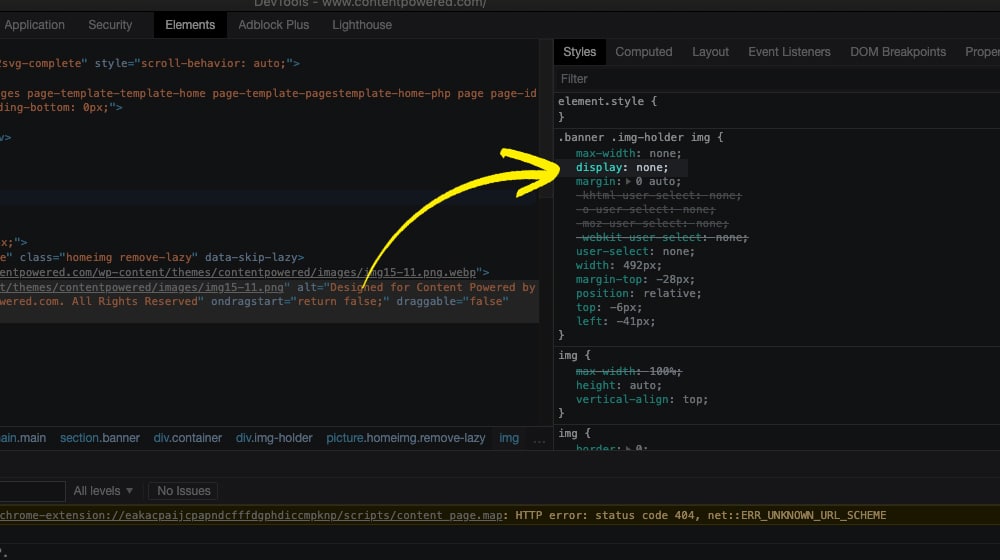
Here's an example of some code I've used:
<br>
@media (max-width: 767px) {<br>
    .single .remove-lazy {<br>
        display: none;<br>
        content-visibility: hidden;<br>
    }<br>
}<br>
This code works smoothly and is a good option as an alternative to lazy loading. You can also use tools like our Thin Content Detector to identify other areas of your site that may need attention.
I love it; it's clever, and it will be perfect soon. So why only "soon" and not now?
The major downside to this method is that it's still new and experimental. The most recent reports don't work on Firefox, Internet Explorer, or Safari at all. That said, it's an excellent way to future-proof your site; I'm hoping that it will pick up in popularity very soon because it's a very clever bit of code. As soon as it's in regular circulation and the major browsers support it (and Chrome, Edge, and Opera already do), it will be a great choice.
The good news is that it will improve your Google PageSpeed score, and it will help remove the "Defer Offscreen Images" message. If you're also noticing issues with how your analytics are reporting site performance, it may be worth checking why GA4 isn't tracking mobile traffic correctly.
Make Your Images Lazier
These tips generally indicate that your site needs to be optimized for both the mobile and desktop user experiences. It's a constant quest to try to reach the highest score that you can in PageSpeed Insights. I'm currently scoring somewhere around 96/100 for mobile and 98/100 for desktop. But, of course, that's with a lot of work and clever tweaks like this put into place.
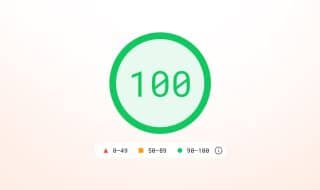
Luckily, getting to 100/100 isn't that important. Google says that you shouldn't expect to score 100 - it's not realistic:
"A 'perfect' score of 100 is extremely challenging to achieve and not expected. For example, taking a score from 99 to 100 needs about the same amount of metric improvement that would take a 90 to 94."
Anything over 80 is fine, and the returns are pretty diminished after 90. The goal is for all of your pages to be score "Good," which is 90 or higher.
Perhaps more importantly, PSI doesn't necessarily tell you the whole story. PSI is what Google measures, and getting yourself optimized for Google is a good idea, but it's not necessarily entirely on track. Your users aren't loading your site from Google's servers, after all. They could be anywhere in the world, using all manner of different origin points. Some people will naturally have longer or shorter paths to your servers, with longer or shorter load times as a consequence.
My recommendation is this. Start by using the PageSpeed Insights tool to identify any significant issues that might be occurring on your site. Then, make sure to check both desktop and mobile! For example, a buddy's site I know of has a 97 for the desktop site but only 43 for mobile. That's quite a disparity and is pretty bad for Google's mobile-first indexing policies. Luckily, it's not too bad to identify and fix the problems.
Finally, remember that the goalposts are always moving. Every time you make a significant change to your site, make sure your tests still pass. Moreover, every 3-6 months, you should check to make sure nothing substantial has changed. Google often makes changes to what they care about and how they measure it, and it's always possible that they now care about a metric they didn't before. Plugins could also update, and some of them have a pesky habit of including resources all over your site where they aren't needed.
Lazy-loading images and other media is a great way to help speed up your site. So is using a CDN, and doing both in conjunction works very well. On top of that, using CSS tricks to help hide entire chunks of the site when they aren't necessary - and prevent their rendering, rather than rendering them invisibly - is an excellent option. If you notice your pages trending down in GSC Insights, performance issues like these could be a contributing factor.
Give this a shot, and let me know how it turns out for you!
Written by James Parsons
Hi, I'm James Parsons! I founded Content Powered, a content marketing agency where I partner with businesses to help them grow through strategic content. With nearly twenty years of SEO and content marketing experience, I've had the joy of helping companies connect with their audiences in meaningful ways. I started my journey by building and growing several successful eCommerce companies solely through content marketing, and I love to share what I've learned along the way. You'll find my thoughts and insights in publications like Search Engine Watch, Search Engine Journal, Forbes, Entrepreneur, and Inc, among others. I've been fortunate to work with wonderful clients ranging from growing businesses to Fortune 500 companies like eBay and Expedia, and helping them shape their content strategies. My focus is on creating optimized content that resonates and converts. I'd love to connect – the best way to contact me is by scheduling a call or by email.


April 15, 2022
Thanks! I was looking for a fix and implementing lazy loading worked for me.
April 15, 2022
Thanks, Terry! I'm glad it was that easy! Happy to help.
April 17, 2022
I found that I already had lazy loading enabled so I had to try the second fix. Thankfully, it worked!
April 29, 2022
Hey Martin!
It makes a big difference in load times; it doesn't make much sense to load assets that aren't even in view yet.
I'm happy to hear it's working for you!
June 20, 2022
The second fix solved it for me. Thanks a lot!
June 23, 2022
Thanks Briggs, I'm happy to hear that!
November 04, 2022
Hello,
I have the similar problem with your friend, the score is 43 in mobile and 91 for desktop. Our software team says that they deferred the images but it doesn't work for mobile. How we can solve the problem in mobile?
November 04, 2022
Hi Sofia!
There's a good chance your images aren't actually being deferred. Some background images can do that, or (in the case of WordPress) images that are served outside of the WordPress loop, like drag-and-drop builders. Those are trickier to defer.
How are you deferring them currently? Did you try my visibility:hidden; trick? 🙂