22 Common Reasons Why Visitors Aren't Clicking Your CTA
Written by ![]()

A blog is only as good as the marketing that surrounds it. Great blog posts and great content marketing can get people to your site, but it's up to your calls to action to get them to do something once they're on your page.
I've written before about 50+ calls to action that increase conversions, and I even provided a guide on 30 ways you can add those calls to action to your blog posts. Hopefully, some of my loyal readers have put this information to use.
What's next? Well, as with any good campaign, you need to monitor and measure your results. Are your calls to action working, or are visitors ignoring them? If they're being ignored, there are a lot of possible reasons why, and it's your job to figure out which it is.
That's why I've put together this guide. I've come up with a huge pile of reasons why your CTAs might be ignored, overlooked, or left unclicked. There are larger lists available, but many of these won't apply to you. Instead, I've only focused on the most common reasons, and I cut out the rest.
Treat this as a checklist to run through to determine which ones might apply to you, and as a starting point to research how to fix it.
Key Takeaways
- CTA placement matters greatly - positioning too high or too low reduces visibility, making scrolling CTAs a reliable alternative.
- Overly disruptive CTAs like auto-playing audio, excessive animations, or poorly timed pop-ups frustrate users and reduce click-through rates.
- Each page should have one focused CTA, customized to that page's purpose and the visitor's intent or history.
- Trust signals like privacy policies, modern design, and clear incentives are essential for convincing users to click and share information.
- Continuous A/B testing of CTA color, size, language, and timing is necessary for ongoing optimization and improved conversions.
Positioning and Timing
First up, let's talk about issues with the positioning and timing of your call to action. Consider a car salesman. Would they start by asking if you want to buy a Ford F350? Probably not. They start by asking you what you're looking for, narrowing down the options they have available, talking about features you want, and finding vehicles that might work for you. Your calls to action need to work the same way; delivered to the user at the right time, with the right information, and offering the right incentive.
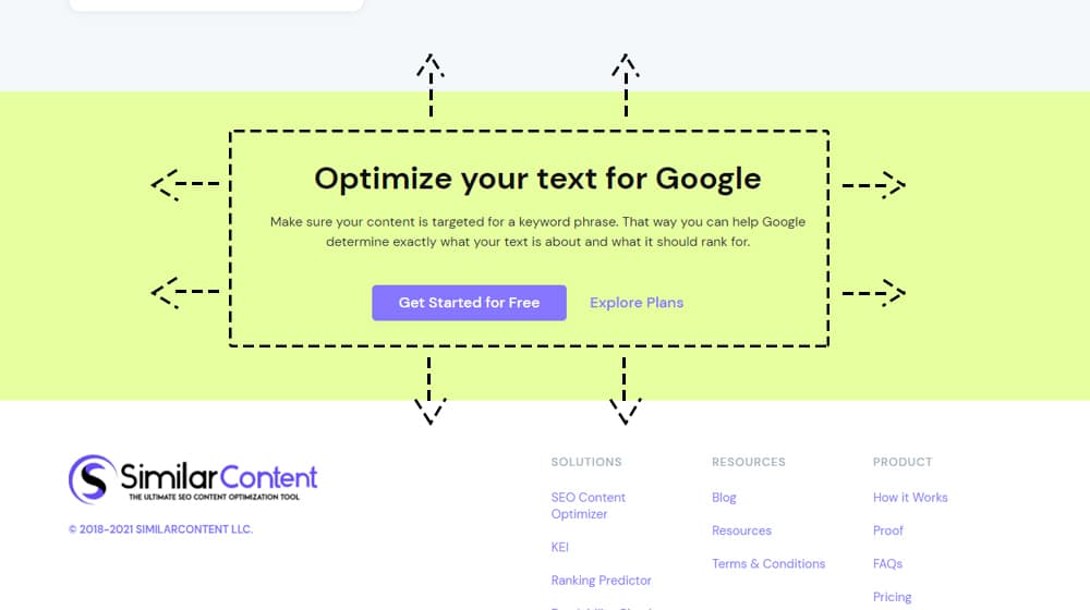
1. Your CTA is too low on the page. A large proportion of your users will not scroll down your page at all. Those that do will rarely make it to the end of your site. If your call to action is the last line of your blog post, positioned as a box below the blog post, or in the footer of your site, no one will ever see it, and even fewer people will click it.
2. Your CTA is too high on the page. Just like a car salesman won't ask if you want to buy a showroom model the moment you walk in the door, you shouldn't be positioning your calls to action at the top of the page. Anyone who isn't already interested in clicking will need time to read your content, which means scrolling down. The chances that they scroll back up to click a call to action are pretty slim.
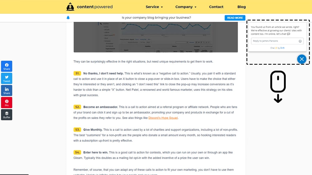
3. Your CTA doesn't draw attention to itself. When you browse a modern website, you probably notice all of the tricks people use to get you to notice their calls to action. Making a window slide in from the corner, making one pop up over the content, making one wiggle periodically, making it blink or flash; these are all attention-grabbing bits of animation. Bear in mind that doing too much of this can put people off your site - you don't want to look like a casino, dazzling with light and sound - but some minor quirks can help draw attention at the moment when a user is most ready to click.
4. Your CTA falls victim to banner blindness. Banner blindness is a phenomenon from back when banner ads were becoming a major thing online. Users grew to recognize the image shapes, formats, layouts, and positioning for banner ads and started ignoring them entirely, no matter how disruptive or in-your-face they are.
Banner blindness continues into the modern age. Recent studies indicate that users of both mobile and desktop sites continue to ignore anything that looks like an ad, is positioned in or near a normally ad-dedicated space, or resembles an ad. Unfortunately, this often means many typical call-to-action locations are also dead zones in user awareness.
5. Your CTA doesn't scroll. If you can't position your CTA high on the screen, and you can't position it low on the screen, what do you do? The typical solution is to make the call to action scroll with the user, so it's always there when they're ready to notice and click it.
This might mean making your top bar navigation scroll with the content, or it might mean a scrolling hover bar on the footer or sidebar. Whatever option you choose, make sure it's ever-present for a user to click.
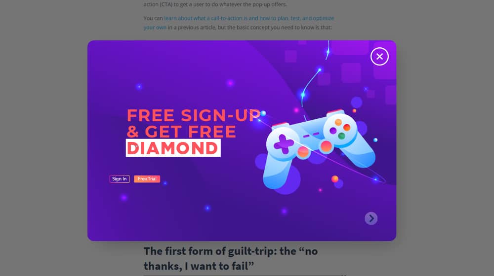
6. Your CTA doesn't appear at the right time. The other option, rather than making your CTA scroll with the user, is making it appear at the right time. You might make a lightbox pop-up with a call to action on it, or a sliding shutter that covers the content, or a slide-in box on the side of the screen. All of these work fine, but you need to time them properly. If they're too early, it disrupts the user's reading and makes them close it out of irritation. If it's too late, they'll already be leaving and won't see it. Make sure to adjust the timing until your CTA pops up at exactly the right moment.
7. Your CTA isn't customized to the page the user is on. It's exceedingly rare that a single call to action works across an entire website. Different people land on different pages and have different desires from their visit. Your hypothetical car salesman won't have a one-vehicle-fits-all offering. No, they'll offer one person a sedan, another a sports car, and another a heavy-duty truck. Your calls to action need to be customized to the page, based on the purpose of that page and the content on it. Why did the user reach that specific page? What do they want? How can you give them something they'll want in exchange for a click? Answer these questions for every CTA you use.
8. Your CTA doesn't take visitor history into account. Just like you should consider the page the user is on, if possible, you should consider whether or not a user has visited before. The call to action you deliver to a first-time visitor should be different from the one you deliver to a returning visitor, which should be different from the one you deliver to a logged-in user. Some CTA systems don't have the data tracking to do this, so it can be difficult to pull off, but if you can do it, do it. Customization is always better, right up until it crosses the line and becomes creepy. Luckily, unless you have the resources of Google, you shouldn't be able to reach the creepy level.
Annoyance and Disruption
Another one of the primary reasons why a user might decide not to click your call to action is that it annoys them or disrupts their experience. A pop-up in the middle of playing a game, a persistent wiggling box that distracts them every 1.75 seconds, a chime that plays when a box opens up; these are all bad disruptions that, while they draw attention, also make a user less inclined to pay attention to anything other than "how to make it stop." I know I have, more than once, used an ad blocker to block an entire class of CTAs just because it makes using a site an abysmal experience. Don't be one of the sites that I have to do that with.
9. Your CTA is annoying. General annoyance factors vary from person to person. Typically, motion, noise, and obscuring the visual medium are all ways to get in the way of the user experience and annoy them. An exit intent pop-up is always better than a timed one, for example. A wiggle is better if it only happens every 5-10 seconds instead of every second. Tailor your disruptions to be minimally disruptive to a user that is consuming your content, and instead capture them when they're finished. You may get fewer overall clicks since you'll get fewer accidental clicks, but your leads and engagement will improve.
10. Your CTA plays audio or video automatically without user input. Auto-playing video and audio is my single biggest pet peeve with the internet. No website should be allowed to play audio, whether or not I can see a video on the screen - unless I tell it to. I know I'm not alone in this opinion, either; Google hates auto-playing video, and while they don't necessarily punish sites that have little bloops and chimes attached to CTA windows, I wish they would. Test to see if a chime works for your audience or drives them away, but I suspect it will generally be a negative effect. If you're wondering whether video embeds affect your SEO rankings, that's a separate consideration worth exploring.
11. Your CTA is caught by ad blockers. In some cases, the scripts and formats used by calls to action can be caught by ad blockers. Your CTA obviously won't work if the browser or a plugin detects that it's an ad and makes it invisible. If you're also noticing unusual traffic patterns around this time, it may be worth checking why your site has spam traffic from certain regions.
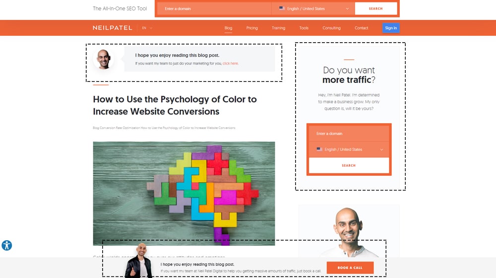
12. You have multiple competing CTAs. This is especially noticeable on landing pages. Every landing page should have one call to action, though that one call to action can have multiple buttons. Each page on your site has a purpose, and it should have a focused call to action to reach people for that purpose. It's better to have 100 different CTAs on your site all targeting different types and categories of users than it is to have one omnipresent CTA on every page on your site. If your pages still aren't converting despite a clean CTA strategy, it may be worth reviewing why your service pages aren't ranking in the first place.
Testing and Optimization
Implementing a call to action is not enough. You need to customize, change, test, and optimize your calls to action on an ongoing basis. Run split tests with different segments of your audience, changing a single attribute each time, and determining which is better. More importantly, keep changing up your calls to action so that they never grow stale and ignored.
13. Your CTA is the wrong color. You wouldn't want to make a button on Facebook blue or gray, because it blends in with the rest of the site design. The same goes for your site. Important buttons should be a color that stands out. You can make use of color theory and psychology to give buttons a specific emotional resonance, or you can just pick colors randomly and see what works through empirical testing.
14. Your CTA is the wrong size. A button that is too small will blend in, and people might not even recognize it as a button. A button that is too large might make people think it's an image or display instead, and might also not be viewed as a button. You need your buttons and CTAs to be the right size, in that sweet spot where it gets the most attention and recognition as a call to action. There are many call to action plugins for WordPress that can help you test and adjust sizing more easily.
15. Your CTA uses the wrong language. There are a lot of tips and tricks for the language you can use in your call to action. For example, using "Claim My Free Trial" instead of "Claim Your Free Trial" might seem minor, but it can make a tangible difference. There are a lot of different guides on the language of calls to action, and many of them contradict one another, so just experiment and see what works best for your audience. Some unconfirmed ranking factors suggest that engagement signals tied to how users respond to your content - including CTAs - may matter more than we think.
16. You're not continually testing and optimizing. As I mentioned above, testing and optimization is an ongoing process. Every week, every month, you should be running tests to determine how you can optimize some part of your call-to-action plan. This list has a bunch of different levers you can pull and dials you can adjust - read into split testing and start creating variations and adjusting them to find what works best. Pairing this with advanced blogging strategies can help you get even more out of your optimization efforts.
Trust and Information
The other major hurdle between you and your users is that of trust and information. Users have to know why they should click a call to action, what they're going to get out of it, and above all, why they should trust you. You wouldn't give your social security number to a random phone call, and you shouldn't expect users to give you their email addresses when they have no incentive to trust you.

17. Your users have no incentive to click. Every user, when looking at a call to action, asks themselves the same question: "what's in it for me?" Sometimes it might mean getting your content first. Sometimes it's access to special deals or offers. Sometimes it's a free trial or a book. The key isn't what, specifically, the key is that there's something there. You need to provide an incentive your users care about enough to click.
18. Your incentive isn't what users want. In addition to providing an incentive, you need to provide one that is relevant and worthwhile to your users. Offering them access to your content early doesn't work if they don't like your content. Offering them an eBook doesn't work if it's not on a topic they like. Offering them a free trial doesn't work if they don't care about your product. Figure out what your users want and provide that specifically.
19. Your users don't trust your site. Trust is a key component that many small businesses often overlook. A modern web design is important, and your site needs to have elements of trust built into it. Modern design is one thing, but you also need to have an About page, a privacy policy, statements about how you'll use or not use their information, a contact page with actual contact information, and other signs of trust. If your website or call to action looks shady, fewer users will be inclined to click on your CTAs. If you're also concerned about your content's credibility, it may be worth evaluating when to fire your content writing company if the quality isn't building that trust.
20. Your CTA asks for too much information. One of the biggest roadblocks to filling out an opt-in form-style CTA is asking for too much information. Only ask for the bare minimum of what you need. Want to give them a book? Ask for a name and email address. Want to give them a free trial? Ask for name and email, and perhaps the business size and niche. Want to sell them something? Only then should you ask for more. Adding too many fields to forms increases friction and will reduce your conversions.
21. Your CTA doesn't work on mobile. Over 50% of web traffic is on mobile today, and yet a lot of the major kinds of CTAs, including pop-ups and sidebars, don't work on mobile. If you want to capture that half of your traffic's interest, you need CTAs that work on mobile devices.
22. Your users are worried about email spam. If you're asking for an email address, you need to be clear about how you're going to use it, and equally clear about how you aren't. State plainly that you're not going to sell or give away their email address, and that you're only going to use it for newsletters and marketing messages, nothing else. nothing else.
As I mentioned above, this guide is meant to be relatively broad and give you a checklist of things to check with your calls to action. How many of these apply to you? What is your biggest roadblock? Let me know in the comments below, and maybe we can discuss solutions.
Written by James Parsons
Hi, I'm James Parsons! I founded Content Powered, a content marketing agency where I partner with businesses to help them grow through strategic content. With nearly twenty years of SEO and content marketing experience, I've had the joy of helping companies connect with their audiences in meaningful ways. I started my journey by building and growing several successful eCommerce companies solely through content marketing, and I love to share what I've learned along the way. You'll find my thoughts and insights in publications like Search Engine Watch, Search Engine Journal, Forbes, Entrepreneur, and Inc, among others. I've been fortunate to work with wonderful clients ranging from growing businesses to Fortune 500 companies like eBay and Expedia, and helping them shape their content strategies. My focus is on creating optimized content that resonates and converts. I'd love to connect – the best way to contact me is by scheduling a call or by email.


July 14, 2021
I'm getting around 2,000 unique visitors per day on my articles, but only 3-12 clicks per day on my button. Any advice on how to bump those numbers up?
July 15, 2021
I recommend split testing your call to action - test new language, colors, sizes, and so on. Find out which gets the most engagement.
Sometimes the issue isn't the button color or size but with the language itself.
Changing from "Try Now" to "Sign Up Free" could result in a 50% boost of clicks. You won't know until you try it.
Software like Hellobar has built-in split testing that you can try out. They have a free trial, so you can always test it until you've found the combination that yields the most results. Then, use that same language and style combination in a free alternative and cancel your subscription.
March 02, 2022
It's worrying because we never seem to get substantial clicks on our CTA despite having good traffic. I'll run through this list and try to see what the root cause is. Thanks.
March 02, 2022
Hey Danny! Thanks for sharing.
The most common causes for this are:
1. Not many people are seeing your call to action. If it's static and doesn't scroll with your users, users don't have a significant opportunity to see it, let alone click it. People scroll pretty quickly and skim through content, so a scrolling CTA will improve your odds here.
2. There's not strong buyer intent with your content. Traffic isn't everything. We're a content marketing agency - let's say that we write an article on "free ways to get content." Well, most people searching for that aren't looking to hire an agency like ours because we cost money, and they're looking for free solutions. You could try testing new content angles and test your CTAs.
Feel free to drop me a line; I'm happy to take a look at what you have currently!
June 29, 2022
I think I can vouch for the first one. We shifted to a scrolling CTA a few months ago and saw a significant jump in the CTA clicks we get.
July 21, 2022
Nice! It makes sense, it's in front of the reader the entire time they're on your site.
Better than crossing your fingers and hoping they stick around on one section long enough to click your button.
July 17, 2022
I'm worried banner blindness might be causing ours. We'll try to experiment with the CTA's appearance and see if we can improve on it.
July 21, 2022
Hey Reed,
Always be testing! If you don't have a way to A/B test yet, it might be a good idea to sign up for an app that lets you split test.
Some apps will let you create as many variations as you want, and you can just let it run for 6 months.
After 6 months, it will tally up all of those impressions and clicks and tell you which call to actions are the most effective. Well worth it!