10 Ways to Convert Blog Visitors into Sales with CTAs
Written by 
Blog traffic is worthless.
Did I get your attention? It's true. On its own, blog traffic does nothing for you. People see your content, sure. People might recognize your name later on down the line, or they might gain a more favorable impression of your brand, but who cares? What does that do for you?
In order for blog traffic to mean anything at all, you need some way to capture that traffic and convert those visitors from just visitors into leads and customers. Until those visitors click an affiliate link, sign up for your newsletter, purchase your product, or otherwise convert, they might as well be ghosts.
Enter the Call to Action
This is where the call to action comes into play. A call to action is simple: it's a call, of some kind, that encourages the people who see it, to take action. Easy.
A call to action can be anything from a simple "click here" to what amounts to an entire landing page leading up to a single sentence. Regardless of what the actual text is, the call to action makes use of the context of the page, FOMO elements, and timing to gain the reader's attention and convince them to take that action, whatever the action is.
Elsewhere on this blog, I've covered different CTA placements and different text for CTAs. Now it's time to look into different funnel paths you can use to take a visitor and convert them into something.
So that's step one: determine what that something is.
Your general options are: newsletter subscriber, qualified lead, and customer. Newsletter subscribers are the lowest tier in my view; they're obviously interested in my content and my business, but they may not even be the right kind of person to become a customer, let alone a qualified lead. For example, I've had people subscribe to my newsletter who did it just because they wanted an ebook I wrote, or who are following my content because they're also bloggers who want references to link later. They aren't my target market, but they still converted.
Qualified leads are good, but they're still not inherently valuable until you do something with them. They're like lottery tickets. They might be winners, or they might not, but until you scratch them off, you don't know.
Customers, of course, are the end goal of all of this. They're the ones that give you tangible benefit, in the form of money, for your products or your subscriptions or your services.
Deciding on your desired outcome is easy, though. It's simply "all of them", and your real decision is figuring out where and when to target people with specific calls to specific actions. Using dynamic scripts to serve context-sensitive calls to action is great here in many cases. Some still require a decision, though; is your landing page trying to gather leads or direct sales? Figure out which works better.
To help you figure out which should go where, and give you some ideas you might not have come up with before, here are ten ways you can convert visitors into customers.
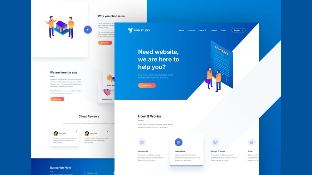
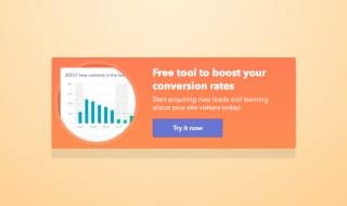
1. Use a Top Bar to Promote a Time Sensitive Deal
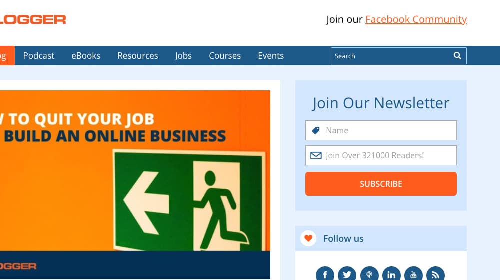
One of the more common pieces of screen real estate being used for a call to action today is a thin bar at the top of the screen. This bar, often called a Hello Bar because of the company that initially branded them, is often brightly colored to stand out from the rest of the page. It hovers above everything else, even the navigation, and it provides a call to action for something relevant. It might be an ebook, a newsletter, or a product
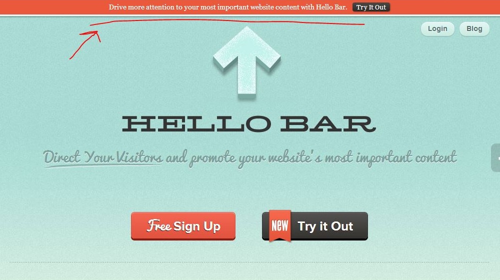
There are a few things that make this kind of CTA effective.
- They hover and scroll with the user. They're always there (unless the user closes them) so the user can convert at any time.
- They're often brightly colored to contrast with the rest of the site and draw attention.
- They can include animated elements, like a countdown clock or a wiggling button, to draw the eye back to them.
One of the best things you can do with a top bar CTA is include something that inspires Fear Of Missing Out, or FOMO. A sentence like "We're only accepting 1,000 beta users: will you be one?" indicates that there are limited spaces available. A countdown timer indicates that whatever deal you're promoting is only available for a limited time. These encourage the user to convert now rather than later, because if they wait, they'll miss out.
You can see a few examples of how this kind of CTA is used in this post by Optin Monster. Some of the examples are no longer live, but that's what screenshots are for.
2. Use a Slide-In Box to Promote a Free eBook
Promoting an ebook for free generally means you're accepting "payment" in the form of a newsletter sign-up. A huge number of marketing companies do this; all they want is your email address in exchange for all manner of content. They can then send you marketing emails and try to get you deeper in their sales funnels, which is a strategy of its own I'm going to talk about later.
A slide-in call to action box is a box that slides in the lower corner of the screen, typically triggered based on scrolling far enough down the page. I've seen a few that will scroll back out of the page if you scroll up, but most of them are just there to stay once they're in, until you close them.
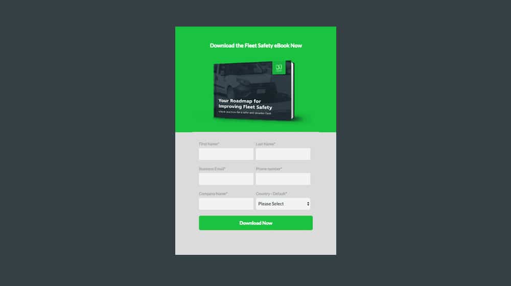
You can put anything you want in this box, and indeed, I've seen everything from the business's core service to a minor ebook advertised in those boxes. I recommend an ebook, though.
When a user triggers these slide-in boxes, it means they got far enough down the page to be engaged with what you've written in your blog. By promoting an ebook, you can offer them more content in the same line as what they've read. They're already primed to read more of your content – and indeed might be ready to click on a related post link already – so it's the best time to offer that kind of content.
3. Point Ads at Landing Pages for Product Sales
Your sales funnels and calls to action don't need to be limited to organic work, and they don't need to be limited to your page. Paid advertising on a site like Google or on any of the thousands of ad networks out there will help get people to your site. They might not be blog readers to begin with, but that's where you have options.
Your paid ads can take people to your blog, but this generally isn't necessarily a great idea. Organic search results do that better, and paid ads are ads you really want to get the best possible return on your investment from. Thus, sending users to landing pages.
A landing page should be similar to a blog post, in that it's packed with information, but the way that information is presented should be much more aggressive. Bullet points, illustrations, creative design, embedded media; it all helps inform the user and draw them towards one inevitable conclusion: they need to convert immediately.
The call to action you use in that landing page is where the conversion happens. You need to come up with something suitably compelling, and I highly recommend you continually test new variations in an ongoing process of conversion rate optimization. Still, it's the most likely kind of CTA to get you sales, when all is said and done.
Exit intent pop-ups are one of those techniques I love and hate. I personally don't like them; they're kind of annoying, and they're becoming so common that they're no longer really as attractive as they used to be. On the other hand, they work, so I can't really dispute their value.
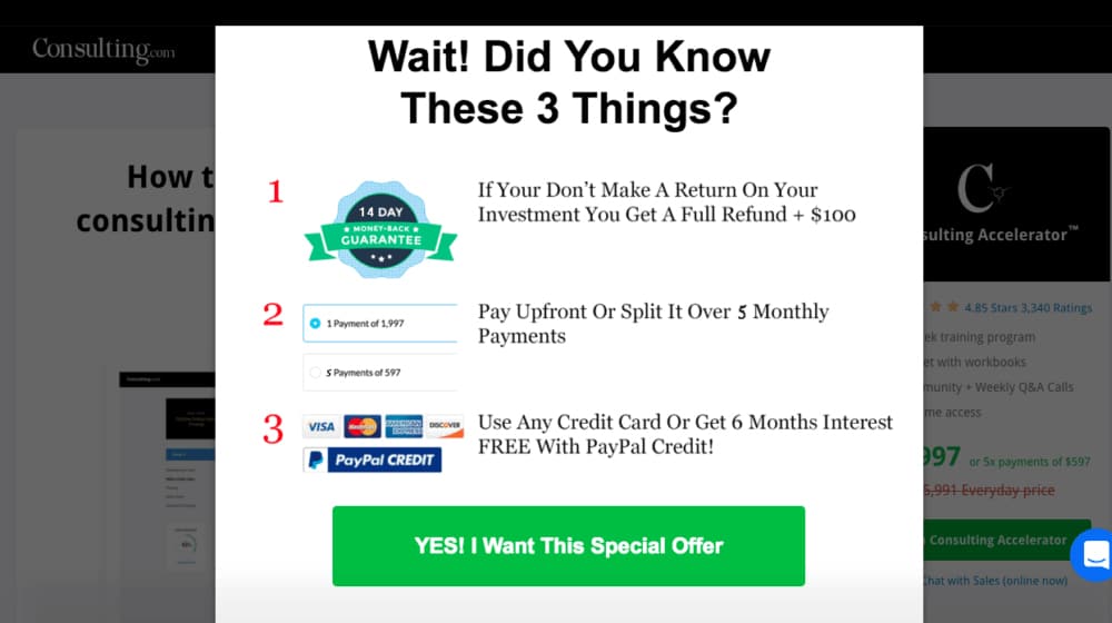
Exit intent pop-ups work because the user is already planning to leave, so by disrupting their intent, you give them one last "hey, before you go…" kind of message. This allows you to deliver a final call to action.
Since most people are leaving because they found what they wanted and have no further reason to stay on your site, it's generally a good idea to give them a call to action related to an easy conversion. Newsletter sign-ups tend to be the best, because they're easy for a user to just plug in their information on a whim.
If you offer a gift, they have to decide if they want the gift, when they may be busy. If you try to sell a product, and they aren't already convinced they want it, your offer doesn't matter. A newsletter, by being so simple, is an easy sale.
5. Add a CTA in Your Text to Encourage Immediate Conversions
One of the problems you find with many calls to action these days is a variation on something called banner blindness. Banner blindness is when your users are so used to see banner ads in the same sorts of places on every website, that they no longer consciously notice them. They're there, they display, and the user sees them, but they don't acknowledge them or care. Tests have shown that they don't even commit them to memory and won't recall their content when asked.
Banner blindness affects more than just banners. It applies to anything that is so common and so universally useless to the average user that they almost never need to care. Exit intent pop-ups and hello bars are starting to fall victim to this, in part because people like me recommending everyone use them, and people following our advice.
This is why one of the best places to put a call to action might just be in the middle of your text. In years past, this was dangerous, because Google used it as a sign of advertorial content. However, when it's incidental to your content, and it's not a huge focus – no using a sales keyword 10 times in a post – it can still gain attention.
For example, maybe you're writing a top ten list of services in a given niche that can solve a problem. Put your service on the list! Some people are sure to click through and read about your service, and may even convert, even though it's self-advertising. It works, as long as you use it sparingly.
A static sidebar is a call to action placed in a graphic in the sidebar next to your content. It's static because it sits there and doesn't move along with the user's scrolling. You can use a scrolling sidebar too if you wish, they both work about the same.
Check out ProBlogger to see a couple of examples of this. To the side of the blog feed, Darren Rowse has placed a column of calls to action. You have one asking you to subscribe to his newsletter, one with social media buttons you can click, one that asks you to specify what you want help with so he can provide you with resources, and three graphics below those with offers of free blog post ideas, a guide for creating a blog, and his list of tools. All of these are calls to action.
As you can see, you don't have to limit yourself to just one call to action in this style. I don't know that I would recommend doing six or more, but putting three or four CTAs – as long as they aren't aggressive or ad-like – can be pretty effective.
7. Provide Deeper Content with a Bottom Page CTA Box
One kind of content I like quite a bit is the content upsell call to action. Let's say I write you a 2,500-word blog post about different kinds of calls to action, another about where to place them, and another about the funnels related to them. That's three valuable posts on the same general topic.
What I can then do is produce a 10,000+word ebook about the topic. I can go into greater detail than I can in a blog post, and give you more and better information with better examples. Then, at the bottom of each of those CTA-based blog posts, I can put a box with a call to action to learn more about the topic by downloading the ebook.
Now, if you've read all of my other posts on CTAs, you might not get a ton of value out of the combined ebook, but there will be some new information for you. If you haven't read the other posts, the ebook becomes one centralized and valuable resource. It's definitely worth checking out, and for the low, low price of just your email address, it's yours! See how compelling that can be?
8. Convert Returning Visitors with a Welcome Mat
A welcome mat is a variation on both the exit intent pop-up and the hello bar. Instead of appearing when the user leaves, it appears the moment they arrive. They typically scroll down from the top, though I've seen them just appear as overlays as well. They are also similar to interstitials, but the actual content of the post has loaded, you just have to close the welcome mat to reach it.

This is a great kind of call to action to use to reach new visitors, particularly with a time-sensitive or FOMO-ridden offer. Ideally, you will use a script that uses context to serve the content of the mat. If the user has never visited before, the welcome mat can display some helpful directions and resources. If they've visited before, it can be a signup CTA. If they're already signed up, it can be a more product sales-focused CTA.
Welcome mats can be somewhat disruptive depending on how long it takes them to trigger and, more importantly, how much slower your page loads because it has to load too. You don't want to hurt your SEO because of the welcome mat.
To see one in action, click on this link. They have a welcome mat with a quick ebook offer in exchange for an email address, the usual sign-up option.
Your newsletter is great for a second stage of conversion. The people who are signed up are already interested in your brand and your content. If they weren't they wouldn't be signed up. And, sure, not all of them will be ideal customers, like the examples I've mentioned way up above. However, many of them will be, they just need further pushing.
You only really get one good call to action per newsletter, despite the many available options. However, if you have your users used to receiving multiple emails on a regular basis – like your newsletter is weekly instead of monthly – you can serve quite a few different kinds of CTAs through it.
Retargeting is one of the most powerful strategies you can use in marketing. Collecting data about the people who visit your site, and then using that data to reach them later on other sites? It's no wonder it's so hugely effective.
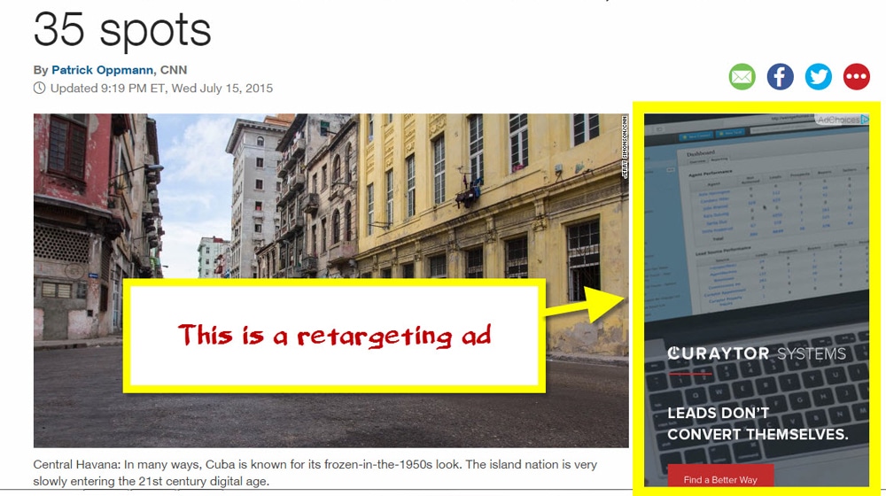
The simplest form of retargeting is to reach newsletter subscribers as a target audience, with something like Facebook or Google ads. However, you also want to reach website visitors and others who are already part of your sales funnels.
The downside, of course, is that remarketing is only available as paid advertising. Still, it doesn't cost much to reach a narrow targeted audience, and your success rate should be pretty high. Why not give it a try?
Written by James Parsons
Hi, I'm James Parsons! I founded Content Powered, a content marketing agency where I partner with businesses to help them grow through strategic content. With nearly twenty years of SEO and content marketing experience, I've had the joy of helping companies connect with their audiences in meaningful ways. I started my journey by building and growing several successful eCommerce companies solely through content marketing, and I love to share what I've learned along the way. You'll find my thoughts and insights in publications like Search Engine Watch, Search Engine Journal, Forbes, Entrepreneur, and Inc, among others. I've been fortunate to work with wonderful clients ranging from growing businesses to Fortune 500 companies like eBay and Expedia, and helping them shape their content strategies. My focus is on creating optimized content that resonates and converts. I'd love to connect – the best way to contact me is by scheduling a call or by email.


February 06, 2020
Very useful. How many call to actions do you recommend we have on our blog posts?
February 06, 2020
Hey David! Generally one or two well-placed call to actions is all you need. We're a big fan of scrolling sidebars, Hellobar-style bars at the top or bottom corner of the site, and call to actions at the very end of your blog post. You could experiement with these and see which yields the best results for you. Generally not a big fan of pop-ups, and I don't think users are either (from a user experience perspective), but they are effective for some. You have to make sure they aren't intrusive or it could hurt your search performance; having a clear and easy way to close the pop-up is your best bet if you decide to use one. Hope this helps!
September 02, 2020
I have not tried retargeting Ads and I’m curious. How do you set this up?
September 03, 2020
Hi Macy! Both Google and Facebook have guides on their website for this - the tricky part is deciding who you want to retarget to. You can set them up like any other ad and target to certain user interests, geographic locations, age ranges, and things like that. Feel free to drop me a line if you get stuck and I'll see what I can do to help!
June 08, 2021
Thanks for the tips. I use a top bar CTA with timer when I am promoting special offers. I have high conversions compared to when I'm only using an exit pop up.
June 11, 2021
Hey Mark!
Thanks for sharing what's working for you.
It seems silly; any time I see that "Sale ends in 5 hours!" message, I roll my eyes. I think I'm just blind to it by now.
I underestimated how effective this is initially. Establishing a sense of urgency is sales 101, and "low stock" or "sale ending soon" notifications are effective.
I'm not sure where I sit ethically regarding the "neverending sales" that just reset every 24 hours, but that's another discussion entirely.