Are Infographics Links Dead or Do They Still Help?
Written by ![]()

Over the decades that SEO has existed, ever since that fateful day that Google invented PageRank, links have been of the utmost importance for websites. Over that time, there has been an immense amount of evolution in the web, from the software that runs it to the kinds of information posted on it to the way it is indexed and ranked. But through it all, links have been the king.
Because of this, there have been hundreds of strategies to get more links. Some of them are obvious, while others are decidedly tricky. Some are exploitative, while others are legit. Some are downright malicious. For each and every one of them along the way, Google had evaluated them, and determined whether or not they should be kept around.
Links are undeniably critical, but getting the wrong kind of links in the wrong kind of way can hurt your site. In extreme cases, it can even result in a manual action taken against you.
One way to get links that was very popular for a while but has dropped off in recent years was the humble infographic. Usually tall and vertical, infographics ranged from simple arrays of charts and tables to detailed and cartoon-covered narratives to present data to interactive and animated conceptual websites that hardly qualify as graphics anymore.
The key to all of them was the combination of easy shareability, social virality, and a link back to the source of the graphic along the way. For a few years, they were everywhere on Facebook and Twitter, but now, I can't even remember the last time I saw one.
So, what happened? Where did the infographics go? Would they still work if you made one today? Are they a strategy worth trying in 2025?
Let's talk about it.
The History of Infographic Marketing
It's easy to see why infographics hit it big.
For one thing, the idea of an image presenting data is nothing new. Not only is it the basic origin of charts and graphs, it's so ingrained in culture that we have the phrase "a picture is worth a thousand words."
We humans are a visual species, but we're not necessarily an imaginative species. A relatively recent viral meme about the concept of aphantasia digs into what I'm talking about. You can read words and know about a thing, but it can be hard – and harder for some people than others – to actually visualize it in a way that makes it clear.
It's one thing if you're just trying to think about an apple, something nearly everyone has firsthand experience with. It's very different when it's something extremely complex.
When it's converted into something visual, though, it becomes a lot more understandable. It's no surprise, then, that graphical representations of complex information can be traced back thousands of years, not just before the internet, but in many cases before the existence of language as we know it.
Infographic marketing, though, requires that we skip a few millennia until we get to somewhere around, oh, 1915. A marketing poster used to promote the London Underground, made by Alfred Leete in 1915, is considered one of the first infographics used in marketing.

Infographics have existed longer than the internet, so it's no surprise that they have been used for marketing online as long as online marketing has existed. Their use for SEO, though, came later. Looking at Google's trends, it really started to take off around 2011. Makes sense; if Panda nuked a lot of sites, and they suddenly started trying to find ways to make unique content, infographics were a vector.
How Infographic Marketing Works
Infographic marketing is pretty simple in concept.
You pick a piece of information, usually something of moderate complexity, but which can be represented in a compelling way through visuals. You create those compelling visuals. Then, you post the infographic all around the web.
Where? Oh, you know. Facebook, Twitter, Pinterest, infographic syndication and republication hubs, as the core centerpiece in guest posts… basically everywhere.
The commonality between all of these was a link. Your infographic would have your website and branding on it, but since Google needed text to index at the time, they were generally accompanied by a text summary. That summary might be a few hundred words about the graphic, or it might be a whole blog post that covers everything in the graphic in greater detail.
Regardless of the text, it would always have a link pointing back to your site to credit you with the creation of the graphic.
Value for readers, viral sharing, and a backlink to pass SEO juice? What's not to love?
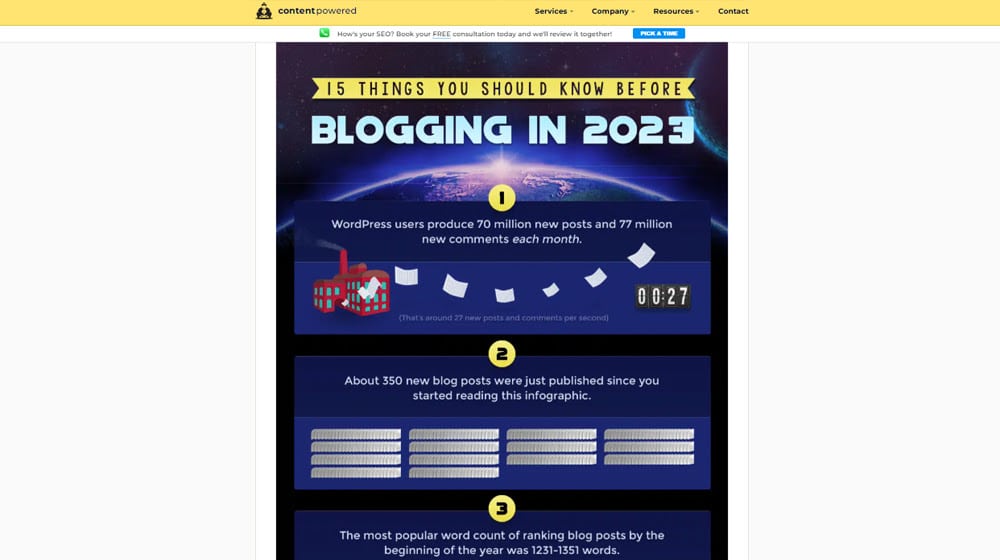
I'm no stranger to infographics myself. Here's one I made just a couple of years ago.
Google has been rating links with varying degrees of quality for years, so even during the heyday of infographic marketing, they knew how to grade the links you'd get. Some sites sharing the graphic would nofollow the link. Some would just be devalued, like the simple social media links or links on submission sites.
Others, especially if editorial content accompanied them, were given full value.
What Happened to Infographic Marketing?
If infographics used to be everywhere but aren't anymore, what happened? Did Google penalize them?
This is actually a surprisingly tricky question to answer. What it comes down to, though, is mostly just that the world moved on.
Several different factors combined to "kill" infographics, though I wouldn't say they're actually dead – but more on that in a bit. Let's go through all of those factors.
The market was very quickly saturated by low-quality infographics.
One of the biggest issues, and what you probably remember most if you lived through that era of marketing, was how infographics were the Next Big Thing and how it seemed like everyone was producing them.
More than that, though, a lot of the people producing them were not designers, were not artists, or were not willing to pay for their creations. A lot of infographics ended up being just a couple of pie charts exported from Excel on a colored background, with a few bits of clip art pasted in.
They sucked, in other words.
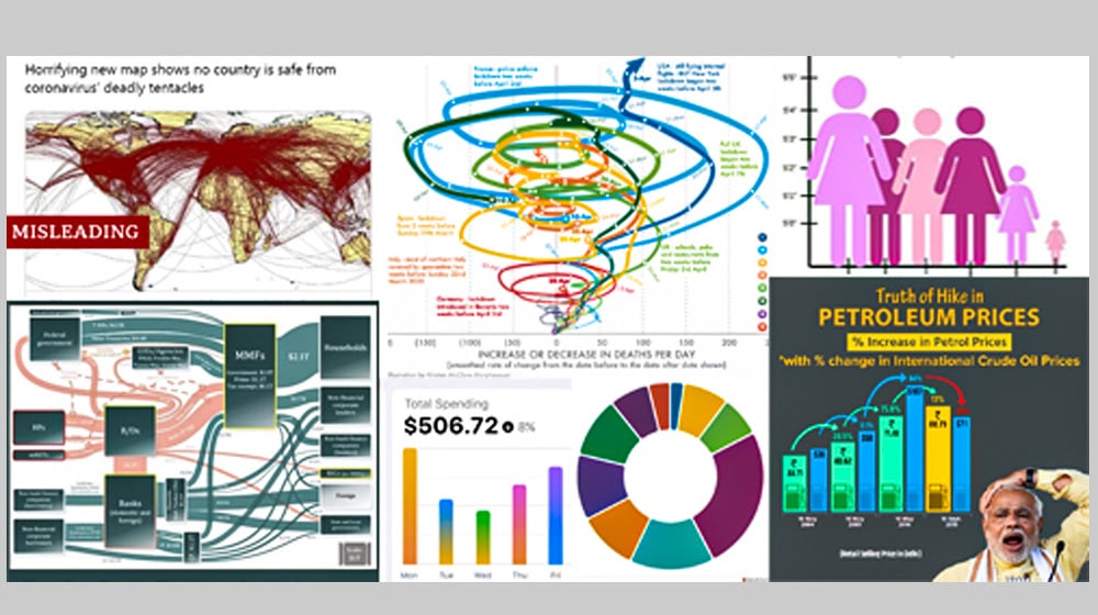
Image source: https://venngage-wordpress.s3.amazonaws.com/uploads/2021/01/badinfographicscollage.jpg
This is a tale as old as time, though. A new channel or content concept crops up, people figure out how to make it effective, then other people start to do it until it reaches a saturation point and they're inescapable.
A big part of why infographics worked was the novelty of seeing data presented in a compelling way. So, when both the novelty and the compelling presentation started to slip away, you were left with just images, and that wasn't effective. Since it wasn't effective, people dropped it.
Another big factor in the "death" of infographics is the explainer video.
It used to be that the video was exceptionally challenging. It was difficult to produce, it took specialized skills, it cost a lot, and you might not have even had a good way to host it without basically DDoSing your own server as people tried to load it.
Over time, though, video got better. YouTube made it much more broadly usable for brands, and Facebook astroturfed video value to push it, to everyone's detriment. Sites like Vine and later Instagram's Reels, TikTok, and more all cropped up.

Along with more prevalence of video came easier-to-use video creation tools. And, it shouldn't be ignored, smartphones. Back in 2011, smartphones were still fairly new, and taking video with them? Let's be real; the reviews of the time were talking about call quality, not HD4K video.
In a sense, though, one of the main roles of the infographic – being a compelling visual way to present information – was supplanted by explainer videos that could do the same thing, with added voice explanation.
Mobile internet use has gone way up.
Another primary driving factor in the slow decline of infographics is actually that same proliferation of mobile use.
Back in 2011, only 35% of Americans even owned smartphones, and while most of them did use their smartphones to use the internet, it was more of a slow novelty than a primary use case.
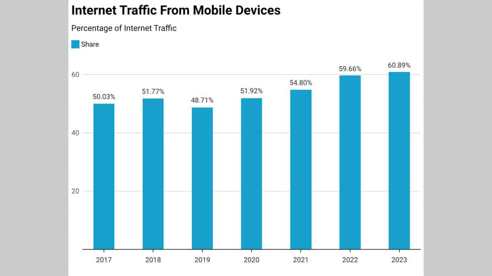
Image source: https://scoop.market.us/wp-content/uploads/2023/09/internet-traffic-from-mobile-devices-.png
Infographics have one critical flaw on mobile, which is that they often rely on being large and visual on a PC screen to convey their information. On a small, lower-resolution cell phone, it would require a lot of zooming, panning, and scrolling. To quote a meme from the time: ain't nobody got time for that.
Alongside all of this, Google has broadly discounted most sources of infographic link value.
All of the factors above meant that infographics were declining somewhat in popularity, but let's be real here: we're marketers. If a technique works, we'll use it. Yet, you don't see infographics very often in marketing anymore.
Does that mean they don't work?
Well, not quite.
Google doesn't hate infographics. They haven't decided that the strategy as a whole is worth killing off or anything like that.
What they've done is added more and more nuance to both their content algorithms and their link rating algorithms. This put two suppressive pressures on infographics.
Content-wise, a huge part of infographic marketing was creating a description or summary – with your link included – and effectively attaching it to your infographic. You can even see something similar on my infographic that I linked above (or here, for easy reference). See the box below the infographic? The one labeled "Copy code to embed this on your blog"?
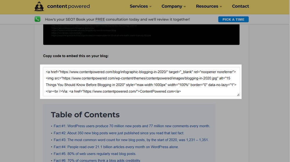
Anyone could just save the image and re-host it. But that code exists to get people to embed the image in a way that automatically links it back. Mine just has a simple "Via ContentPowered.com" text, but a lot of similar examples included a whole summary in their embed code.
This leads to a lot of small-scale duplicate content. Not enough to penalize anyone for duplicate content, but enough that Google could easily recognize that all of these different posts were effectively the same. And, ever since Panda, Google only ever ranks one page with the same content, even if it's the same content posted on multiple otherwise high-ranking domains.
The links are the more important part, though. Basically, a huge amount of the links you would get from infographic marketing came from sites that allowed you to just post them or pay to submit them. Much like blog post directory submissions or directories for podcasts or press releases, these sites share several attributes.
- They're very easy to get, so the barrier to entry is low, and a lot of spam or near spam ends up on them.
- They're often paid, and Google hates pay-for-link services of all sorts.
- They're often syndicated, so tons of different sites had effectively identical content.
All of this goes against what makes a link valuable and good, so it's no wonder that those links are either worth very, very little or nothing at all.
Infographics won't penalize you, but they have a pretty steep hill to climb before they give you value.
Is It Worth Using Infographics in 2025?
My overall conclusion is this: infographics aren't dead, but they're not all that useful right now.
I'll tell you one thing, though: they'll come back, eventually. They've existed for thousands of years, and they'll continue to exist. In fact, there were people asking this same question a decade ago.
And, if you go back up to those Google Trends, you can see that they regularly spike and fall in interest every so often.
Infographics are currently in a lull, and the barrier to making a good one that is compelling enough to circulate is pretty high. A lot of the infographic-focused businesses pivoted or shuttered, and of course, a lot of the links you get aren't really very valuable.
All of that could easily change in the coming years. Or maybe not! I can't predict the future with that level of accuracy.
What I can say, with confidence, is that if you really put in the work, you could make an infographic work today. A very good design for a compelling enough set of information circulated in the right places and the right ways could be an absolutely bonkers bit of link bait.
At the same time, it's very, very difficult to do that right now. So much so that I would say it's not really worth it unless you really want to make infographics your Thing for 2025. I think there are just many better ways to spend your time, money, and marketing attention for better, faster gains.
What do you think? I'd love to hear your thoughts on infographic marketing and get a conversation started. Leave me a comment below!
Written by James Parsons
Hi, I'm James Parsons! I founded Content Powered, a content marketing agency where I partner with businesses to help them grow through strategic content. With nearly twenty years of SEO and content marketing experience, I've had the joy of helping companies connect with their audiences in meaningful ways. I started my journey by building and growing several successful eCommerce companies solely through content marketing, and I love to share what I've learned along the way. You'll find my thoughts and insights in publications like Search Engine Watch, Search Engine Journal, Forbes, Entrepreneur, and Inc, among others. I've been fortunate to work with wonderful clients ranging from growing businesses to Fortune 500 companies like eBay and Expedia, and helping them shape their content strategies. My focus is on creating optimized content that resonates and converts. I'd love to connect – the best way to contact me is by scheduling a call or by email.


Comments