
30 Ways to Add Call to Actions to a Blog Post

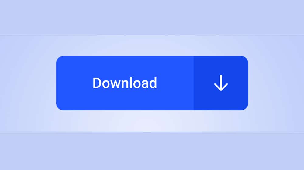
Recently, I wrote a post about the different kinds of CTAs you can plug into your blog posts to attract people into your sales funnel and push them deeper down. One question I've been asked because of that post, though, is where to put those calls to action. You have any number of different options for positioning, but a good website only uses a handful of them.
I've identified 30 different positions, designs, and methods for different kinds of CTAs you can use. Usually, you only want to use around five or so at any given time. Too many more and your site ends up looking cluttered and pushy, and it can drive people away, particularly if those people aren't in your sales funnel already. It's up to you to test which ones work best for your audience, of course. Here's my rundown of 30 call to action ideas.
Many businesses that have only a single product or service on offer tend to make their homepage a landing page for their service. For a long time, Dropbox was a great example of this, but with their push to promote Dropbox for Business, they've removed the simplicity of their page. These days, Crazy Egg is a great example.

Their homepage is little more than a landing page with a single, simple opt-in form that puts you on the path to setting up a free trial of their heatmap service.
2. Landing Page Box
In many ways, a landing page opt-in CTA is very similar to a homepage CTA. The difference is, a website can have many discrete landing pages, but they can only have one homepage. Businesses that have a variety of different products or services are usually better served by making their homepage a general rundown of their site, and using individual landing pages as, well, landing points for various ad campaigns, social links, and links from the homepage. Shopify has a good example of this here, for their free trial.
3. Ever-Present Top Bar
Also known as a "Hello Bar" because of the company that popularized them, these are top bars that load on page load and hover over the content for as long as you're scrolling through it.
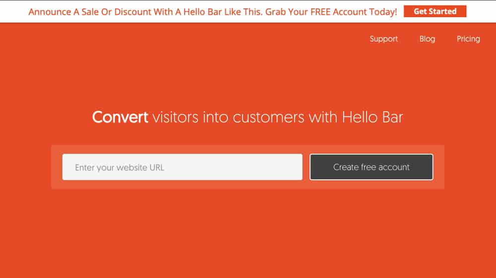
They're small and unobtrusive, but unless the user closes them, they're always there. They can include a CTA button and some text, as well as various additional features to encourage clicking the button, such as a countdown timer. As you might expect, Hello Bar has a good example on their page.
4. Activity/Load-Triggered Shutter
The shutter is a kind of CTA that used to be more popular than it is now, though I still see it around sometimes. When you load the page and go to scroll down, this shutter closes down over the content like a garage door, pushing a CTA in your face. You can close it immediately, or take action to engage with the business as they request. They fell out of favor because most people prefer to actually see the content they came to see before they give your site even one iota of information about themselves.
5. Time-Triggered Pop-Over
Pop-ups or pop-overs (as I prefer to call them) are those lightbox-style effects that cover content with a CTA abruptly, usually based on a trigger of some kind. Sometimes they're exit intent, which I'll cover next.

Sometimes they're scroll-based or time-based, popping up after a user has lingered on your page for a while. Taylor Stitch does this with a page load or very short time-triggered instance that covers the whole page.
6. Exit Intent Pop-Over
Exit intent pop-overs are, in my experience, the most effective kind of pop-over. They trigger when the user's mouse cursor leaves the window or they otherwise cause the window to lose focus, which usually indicates that the user is done browsing content, hence the "intent to exit" trigger.
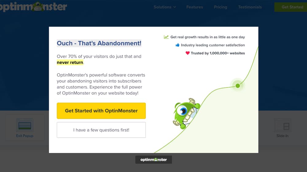
It doesn't disrupt content consumption, but it does disrupt the intent to leave and gives the user a chance to, say, sign up for a newsletter right at the end of their attention span. Optin Monster does this, ironically on their gallery of templates for their own exit intent service.
7. Browse History Pop-Over
Some pop-over or gate-style call to actions only trigger based on the user's behavior over time. Medium is one of the main examples of this I can think of. You can browse the site for free for a while, but once you've read a certain number of posts in a given month, they start restricting you from reading more. You can still read many freely available posts, but a lot of posts are behind the paywall, and you can only read a few of those each month before they ask you to register.
Most websites these days have a pretty standard kind of layout, with navigation either on the top bar or on a sidebar. Top bars are most common because it's easiest to transition from a top bar to a mobile version with responsive design, rather than having to shift elements around, though everything ends up behind the bars button anyways.
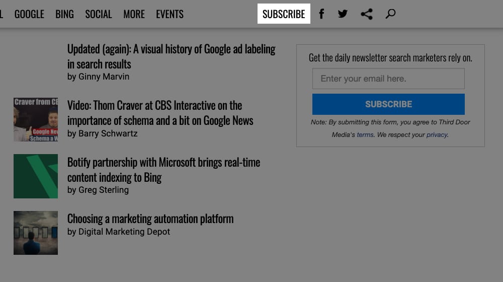
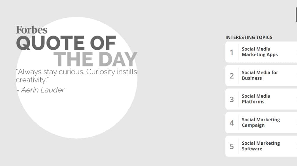
Navigation bars usually have site categories, but they can also have a CTA as well. Search Engine Land is an example of this; you can see their main categories like SEO, SEM, Mobile, and Local across the top, and then at the end you have Subscribe and some social media buttons as a passive, omnipresent CTA.
Gutters are a dying form of marketing because, as studies are showing, more and more people are doing their browsing predominantly or entirely on mobile, and mobile doesn't have space for sidebars.
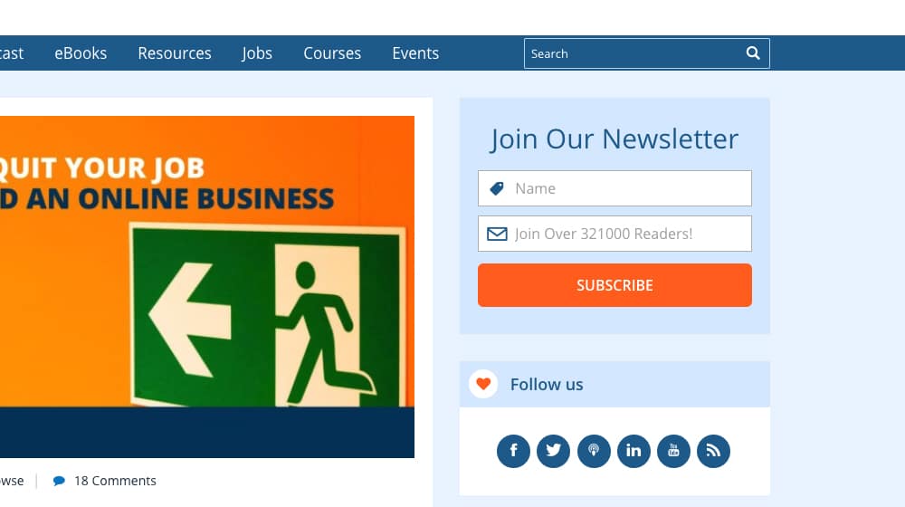
Still, using the sidebar or gutter around your page for desktop browsing is still valuable real estate, and the next half-dozen or so CTA positions all make use of it. The Sidebar Form Fill is a small box with a form you can fill out, right there in the sidebar. ProBlogger has one to join their newsletter, right in the top right of their page.
One of the coolest forms of sidebar opt-in I've seen is a small button with a call to action on it that, when you click it, causes a sliding pane to slide in from the side with the full opt-in form ready to be filled out. It's unfortunately rare enough that I can't currently find an example of it, but if you know of one, please let me know in the comments. It's nice because it's a two-step opt-in, which helps filter for more qualified leads and cuts down somewhat on spam submissions.
11. Gutter Ad
Gutter ads are very similar to sidebar opt-ins as mentioned up there in #9. In fact, ProBlogger uses them too, right beneath the other example I listed.
They're basically just ads for ProBlogger's own content, small images you can click to be taken to a landing page or opt-in form to get whatever kind of content they're advertising. As of this writing, on ProBlogger, that's three boxes; one for blog post ideas, one for blogging tools, and one for a five-step guide to creating a blog.
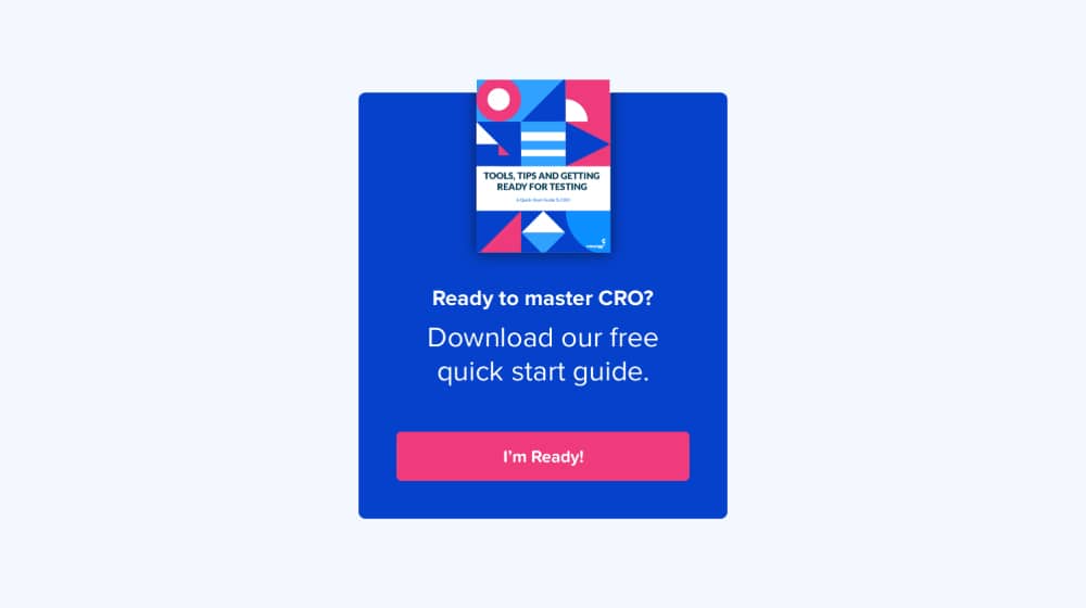
12. Scroll-Triggered Slide-In Box
I guarantee you've seen these before, because they're one of the most common forms of CTA today. Most of the examples I've already linked also use this, for that matter. Here; HubSpot's blog uses them, so just click that link and scroll down the page. Most of the way down, you'll see a box slide in on the lower right corner of the screen. In my case, it's advertising one of their ebooks, though it may be different for you. I've also seen these trigger based on time, but the scroll-based one is by far the most common.
13. Chat Bubble
Chat bubbles are often similar to slide-in boxes, and they generally occupy the same position. Sometimes they're an unobtrusive button, but often they pop up a greeting from a "real person" ready to answer any questions you may have.
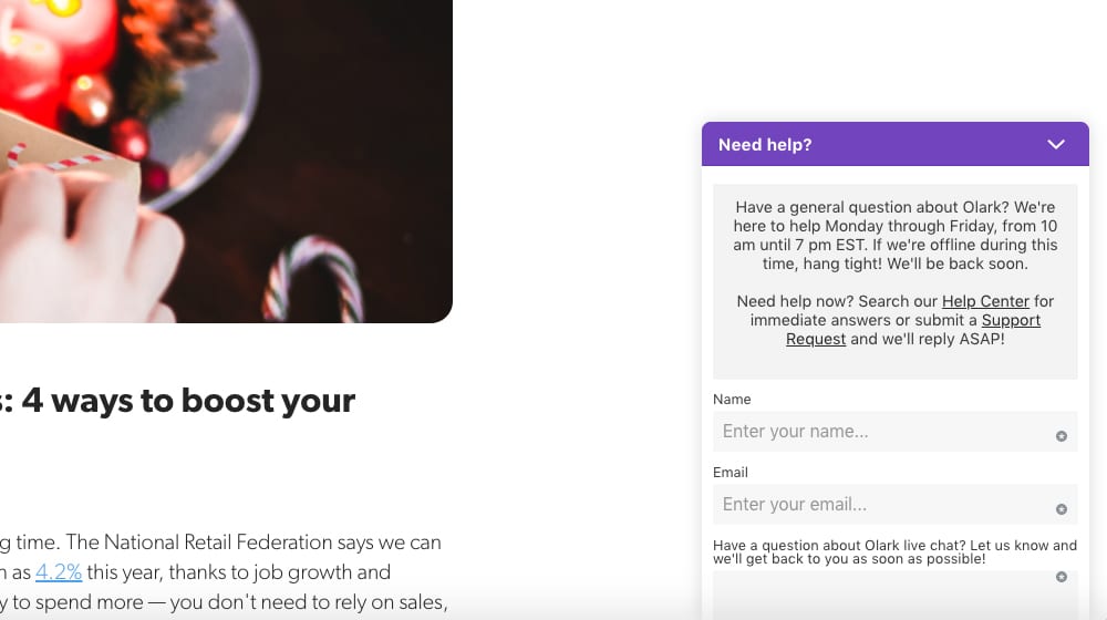
Of course, there's no real person there until you send a message, at which point you're added to the queue for the real customer service rep to answer. Olark shows you an example, and of course they're one of the companies that provides the widget and service to begin with.
We create blog content that converts - not just for ourselves, but for our clients, too.
We pick blog topics like hedge funds pick stocks. Then, we create articles that are 10x better to earn the top spot.
Content marketing has two ingredients - content and marketing. We've earned our black belts in both.
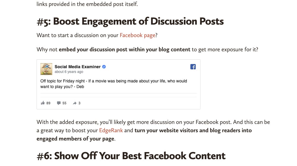
Social sharing buttons are a form of call to action, if you didn't quite draw that connection. They're so omnipresent that it's easy to forget about them, and they can be positioned in a wide range of different locations, but the most common is a left-hand sidebar that slides along with your viewport. My favorite set of plugins (and I'm not alone) is Social Warfare, which you can see in action here.
Social media content embeds are another form of social call to action. They're not necessarily a great call to action, because they tend to just get you social engagement rather than a more focused and directed call to action, but hey; sometimes that's exactly what you wanted to get.
You can find some examples of this around, but it's tricky; a lot of people don't use pure embeds anymore. Why not? If a social media post is deleted, you have to update your old blog post to reflect that, and the content might just be lost. Most people these days simply take screenshots to use as examples instead, which unfortunately loses the CTA aspect of the embed.
Embedding your social media feed on your website can be a passive way to showcase that you have an active social feed, to encourage people to follow you based on the content you post there, not just the content you post on your website. I've seen them in sidebars and footers. Instagram is more heavily used for this, and is usually used to link with product sales pages; the images pull double duty as product pages, so the grid feed embedded on the website works both ways. You can see examples of this here.
17. Interstitial Stop
The interstitial stop is an ad that loads in between loading pages. Forbes was famous for this for years before they finally gave up trying, at least as far as I know. Maybe I just finally got them blocked.
You click a link leading to a page, but instead of the page you wanted to load, you load an ad page. You then have to wait a few seconds before you can click through to the page you wanted to reach in the first place. Obviously, Google hates this, so they've fallen out of favor pretty heavily in the last couple years.
18. Box Above Content
Now let's get into calls to action that are a little more closely tied to the position of blog content. A lot of the other options above can be on any page on your site, but the next dozen of them are more specifically for blog posts. The first option is, of course, above the content. I've seen it both above and below the title of the blog post, but it's always above the content. Search Engine Land is an example; they have an opt-in form for their newsletter above the title of their post.
19. Box in Content
A second position for a call to action is in your content itself, but not PART of the content, if you know what I mean. It's basically just a disruption in between sections or paragraphs. These aren't terribly common anymore, because they easily blend in with all of the other forms of media on a page, and sometimes they may even be blocked by adblockers, though that's not always the case. There's not really a specific example of this; just imagine the box Search Engine Land uses, but down five or six paragraphs instead.
20. Box Below Content
Putting a box with a call to action below your content but above your comments is a good way to capture actions or leads from the people who are engaged enough to have made it all the way through your blog post. It has a few drawbacks, though. For one thing, you have to figure out how to order bottom-of-post content, like your author bio, your call to action, and your social sharing buttons.

It ends up forming a pretty big blog of stuff, and often I see the CTA moved to make room for the others. Also, it can disrupt people who might want to leave blog comments, by pushing them so far down you forget they're there. Even so, I make use of it, and you can see it at the bottom of this very post!
21. Text Link in Content
Instead of putting a more disruptive box in your content, you can add a text-based call to action instead. Sometimes this is organic, like a link to another post the author has written on the same site. Sometimes it's more obviously a call to action, like the italicized bit at the end of the intro in this post from Crazy Egg. Sometimes these work fine, but sometimes they come across as too salesy and can make some users turn away. It's definitely something worth testing, though.
22. Image CTA
There are two ways you can use an image in your blog posts as a call to action. One, which I rarely see, is to just create blog images that have a CTA built into them, whether it's just a logo or a more text-focused call to action.
The other is to use a script like the Pinterest overlay, so that when a user hovers over an image or clicks it, they are taken to a place to share it on Pinterest. That's also something that Crazy Egg does, if you click through and hover over an image.
23. Click to Tweet
There are also two ways to use this. There are plugins for Click to Tweet, which creates boxes with pre-written quotes with links and hashtags. The user only needs to click once or twice to tweet the post to their timeline. There's also a more free-form version like what Medium uses, where if you highlight a section of text, a box pops up allowing you to then share that quote on Twitter, in a comment response, or just as a highlight. They can both be pretty effective, though the second one is disruptive to people who use highlighting to keep their place as they read.
24. Content Locker
Another way to add a CTA to your content is with a content locker. You have, say, roughly half of a post available to read, but when the user gets far enough into it that they're invested in reading the whole thing, oops!
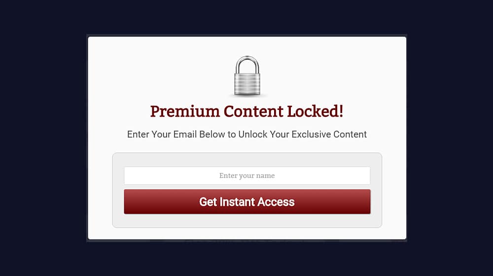
They can't without taking some kind of action, be it signing up for a mailing list, following on social media, or something else. There are a bunch of different plugins, which you can see here.
25. Content Upsell
A content upsell is similar to a content locker, but not quite. Typically, it's an ad at the bottom of a page, and it's related to the content of the page. For example, I could write a 2,500-word blog post about the basics of content marketing, and then at the bottom, I'd have a link to a 10,000-word ebook about the same topic. "Like what you read here? Check out our deeper and more detailed guide for free!" All they need to do to claim it is opt in, of course.
26. Content Customizer
A content customizer is one of those CTAs I've seen before, but never seen done well. A lot of smaller local businesses that cover a few select areas use this kind of CTA to ask the user for their specific location, to better serve them. Restaurants with franchises and stores with local pickup do this as well, to better effect, but that's on a storefront and not on a blog. The idea, of course, being to get the user to specify their location or allow location tracking on their device. Have you ever seen it done well on a blog? If so, link me to an example in the comments, I'd love to see it.
Related post links, much like social sharing buttons, are a kind of CTA many of us take for granted and forget is a call to action in the first place. You can see mine at the bottom of this page, above the comments but below the other CTA and author bio. They are, of course, internal links to other posts I've written, and the call to action is specifically "stick around and read more." They are also used for native advertising on other sites, using ad networks like Outbrain.
The footer is one of the least cared-for parts of a website these days. We all just tend to stuff contact information and some additional navigation links down there, and ignore it because most people never bother to scroll that far.
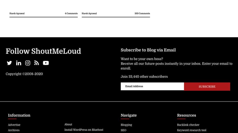
Still, you can add a call to action to it, like ShoutMeLoud does with both social sharing buttons and an email opt-in. It can work, but it's not going to be a high-value call to action given how few people ever make it that far down a page.
29. In-Video Ad
If you've watched a YouTube video any time in the last decade, you've pretty definitely had a content creator stop what they're doing and deliver a pitch for a sponsor. There are also video-based calls to action with the widgets that overlay the video, the video end cards, and other positions. All of these are only relevant to the overall "CTAs on your website" topic because you can then embed the video in your blog content. Hey, it's still a position on your site in that case, right?
30. Contextually Dynamic CTAs
This last one isn't a position so much as an important consideration. Some CTA management apps allow you to dynamically serve different calls to action to people in different stages of the funnel. Someone who hasn't visited the site before might see a box to ask them to sign up for a newsletter, but someone who is already signed up for the newsletter might see a CTA to download an ebook or visit a pricing page. These are, of course, more work to maintain – and hard for me to post a single example of without going through a bunch of sales funnels – but they can be extremely effective.
What positions do you use, and find most effective? Let me know below!
James Parsons is the founder and CEO of Content Powered, a premier content marketing agency that leverages nearly two decades of his experience in content marketing to drive business growth. Renowned for founding and scaling multi-million dollar eCommerce businesses through strategic content marketing, James has become a trusted voice in the industry, sharing his insights in Search Engine Watch, Search Engine Journal, Forbes, Entrepreneur, Inc, and other leading publications. His background encompasses key roles across various agencies, contributing to the content strategies of major brands like eBay and Expedia. James's expertise spans SEO, conversion rate optimization, and effective content strategies, making him a pivotal figure in the industry.


September 11, 2020 at 11:13 am
This is a lifesaver! A few days ago I was just thinking of what CTA to use and where to put it and now I have a bunch of good ideas. Thank you, James!
September 12, 2020 at 2:28 am
Hey thanks for the kind words! Happy that it helped you. Let us know which one(s) you ended up using!
November 02, 2020 at 7:39 pm
Hey James, was wondering if I can use multiple CTA? Which do you think will work better together?
November 09, 2020 at 7:44 pm
Hi Jim! Absolutely. Something like Hellobar might be interesting to you since you can split test multiple different call to actions at once to find out which is getting the best clickthrough rate. You might find out 80% of your conversions are coming from one call to action, and the other 2 are only giving you 20% and need work. Give it a try 🙂
June 10, 2021 at 7:08 am
Nice stuff! What do you think is the best CTA for ecommerce businesses??
June 11, 2021 at 6:07 pm
Hey Cindy!
I'm a big fan of a scrolling call to action.
They keep your article body pure and free from ads, they can be made sleek and discreet, and they're in front of your readers at all times since they scroll with them.