11 of the Best Business Blogging Examples for Inspiration
Written by 

We, marketers, talk a lot about what makes a blog good. There's the design, the navigation, the metadata, the content, and how it all comes together. It's all fine to talk about in the abstract, but how often do we give concrete examples of what we're talking about? Sometimes it's better to show, not tell.
Here are 11 examples of high-quality business blogs, and why they're great. Hopefully, something from among these will inspire you to improve, create, or otherwise bolster your own site.
1. Shopify
Shopify is one of the largest e-commerce platforms out there, and they make it almost trivially easy for anyone to start a business.
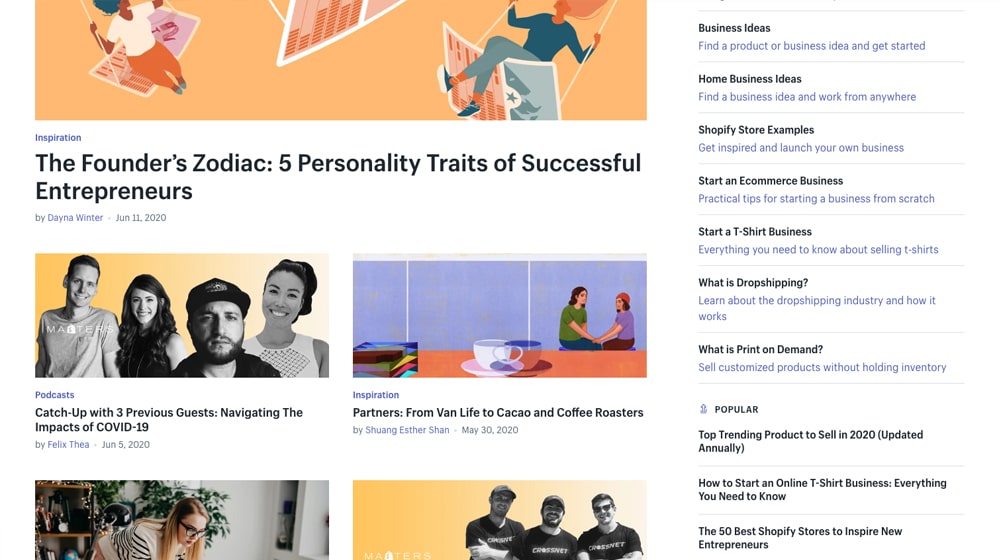
There's a lot going on with their blog that makes it good to use as an example, so let's start here.
- The top of their page is dominated by a call to action for their mailing list. They know what they want, they know what you want, and they're offering it upfront.
- Their blog posts all have large, compelling thumbnails. Some of them are thematically relevant to the post, while others are illustrative, like their Masters series.
- Their post titles are compelling. Many of them use numbered lists full of actionable tips related to starting or growing a business. Others are interviews or case studies with other successful Shopify users.
- They have category links above their blog posts, which help users navigate to specific kinds of content they might want to see, like updates to Shopify itself, or ideas for a new business.
- They have a prominently positioned search bar off to the side, which makes it a lot easier to find content related to your interests or rediscover content you remember reading but didn't save.
Overall, Shopify is a great example of the kind of blog a business would love to have. If I have any gripe with it, it's that they don't actually have very much content above the fold. Their call to action, while dominant and compelling, takes up a huge portion of the screen, and the image for their most recent blog post takes up more. You have to scroll to even see what the top post is about. I would personally recommend shrinking the call to action by about 15% to make more room to at least have the blog post title visible above the fold, but that's just me.
2. Crazy Egg
Crazy Egg is one of the top marketing blogs out there and with good reason. It would be hard to take their marketing advice seriously if they weren't good at it themselves, right? While their primary product is a heatmap for analytics, they also offer a ton of useful information for bloggers.
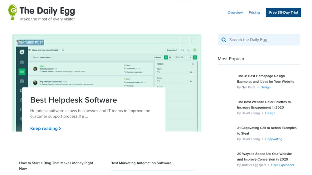
So what is there to like about their blog?
- They have a call to action at the top of the page, though unlike Shopify, it's smaller, in the form of a Hello Bar. The wiggly button serves to draw attention without being too distracting, and the bright pink stands out from the rest of the site.
- The bulk of the content pane is taken up by a featured post they change regularly. It's not just the most recent post, but a recent post they've chosen to promote more than normal.
- They offer a range of top content, followed by categories, followed by recent content. In my experience, this tends to be the general order people want to see content, so it works.
- Like Shopify, they have a search bar prominently positioned so you can find content specifically relating to something you want to see.
One thing I find is that a lot of people take the blog homepage for granted these days. A lot of us find our content through Google and never view the homepage, just the content, so we get this impression that the homepage isn't as important. In fact, it really is, and it's worth optimizing.
3. HubSpot
There was a time not too long ago where HubSpot had at least three different blogs, run side by side, with a homepage that allowed you to pick which one you wanted to see. These verticals were all relevant to anyone looking to build and grow a business, however, so it doesn't surprise me that they eventually rolled them into one single blog with individual categories.
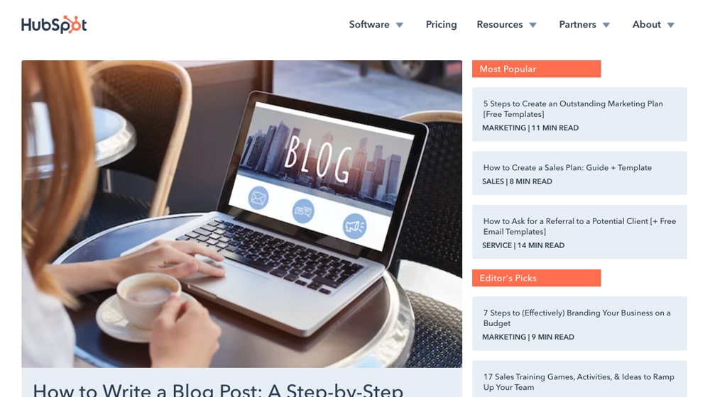
There's a lot to like about the HubSpot blog, and I don't just mean their expert content.
- While the bulk of the content pane is dominated by a recent blog post, there are several other posts visible at any given time, giving every visitor the chance to pick a relevant piece of content without even needing to scroll.
- Three kinds of content are available from the word "go": editor-picked content, most popular content, and most recent content. This way they can promote content they want to promote, and their newest content, at the same time.
- It's a little thing, but every blog post has an "x minute read" rating on it. Giving users an idea of how long it will take to read a blog post helps them choose which posts to read based on the time they have available, and gives an indication of the depth of a post.
- If you scroll down slightly, a top menu bar slides across the top of the page, with their categories: marketing, sales, service, and website. HubSpot doesn't make "choose your blog" the first step anymore, but you can still go to the specific sub-blog you want to see above all others.
And, of course, HubSpot wouldn't be where they are today if they didn't have top of the line content being published in each category every week. They cover interesting angles on common topics, and fringe topics that are becoming more important, like the use of audio in blog posts, or actionable tips on using particular strategies in your marketing.
4. Canva
Canva is a SaaS image editing platform heavily based on templates and stock assets, and as such, you expect their blog to be extremely focused on imagery. Indeed, every post has a wonderful image attached, though they aren't always all that relevant.
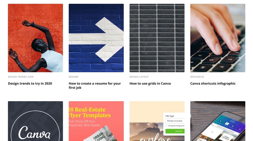
What's good about the Canva blog?
- As mentioned, they focus a lot of imagery. While their images aren't always directly related to the post they're writing, they're often bold and stand out from the usual blog post imagery you're used to seeing everywhere.
- They do a great job of mixing actionable business-focused marketing content, like team building, productivity tips, and design tips, with more abstract and inspirational content, like a post about quotes to ruminate on for meditative purposes.
- They don't bog down their blog with marketing from all angles. You can, at any point, click through to log in or sign up for their tool, but they aren't pushy about it.
- When you mouse over any of their blog post images or titles, the image zooms in slightly. It's not a lot, but the bit of motion makes the page a little more dynamic and gives you a feeling like you're about to go somewhere worthwhile.
Canva's blog is simplicity and elegance in a well-designed package. It does what it needs to do, and it's not pushy about it.
5. Imgur
You might not normally think of an image host as a site worth having a blog, but these days pretty much everyone has a blog, so it's not really surprising.

Imgur's blog carries over the theme of their site, which is pretty simple, but there are a few things I like about it.
- They don't shy away from animated content. Imgur hosts a lot of short videos and animated gifs on their platform, and they very much feature this content on their blog.
- They have a scrolling box of featured content at the top of the page. It's not just "the content you'd see if you scrolled down" either, it's actual feature content from the blog, going back years. They don't care about showcasing blog posts over two years old if they're compelling enough.
- Imgur is a social network as much as it is an image host, and as such, some users have grown to be influential on the platform. They feature those users, their content, and interview them regularly.
- In their blog posts, they embed their own posts using an actual embed function. Most people using Imgur just use direct links, so this is a good way for them to showcase the fact that you actually can embed their content social media style if you want.
The highlight of Imgur's blog, to me, is the fact that they are very in tune with their audience. They actively use new memes, they interview their influential content creators, and they show that they aren't just paying lip service to build a community; they're part of their community themselves.
6. Zillow
One of the largest real estate sites in the world, Zillow serves as the first stop for people shopping for a home by aggregating and hosting real estate listings. Their blog reflects this purpose, by focusing on real estate from both sides of the equation.
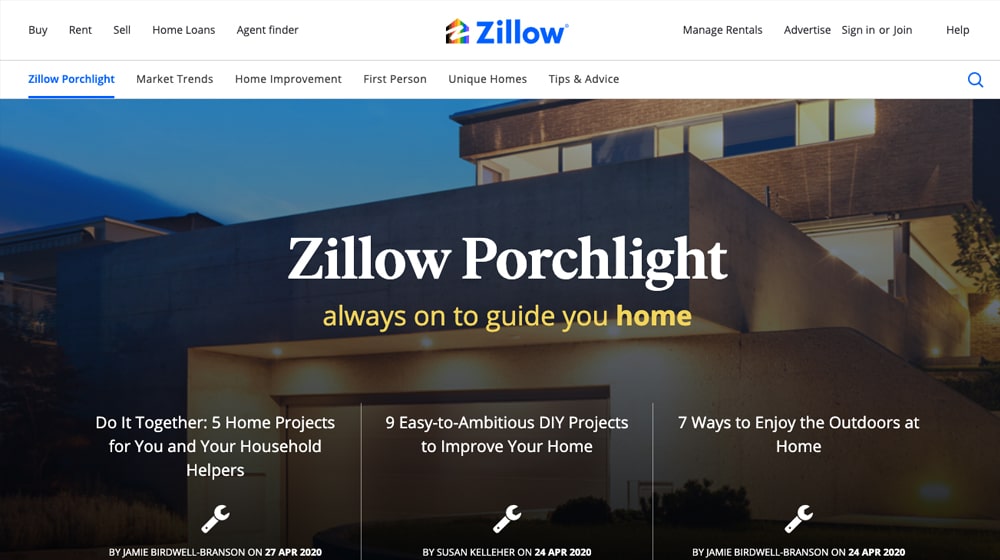
People looking to buy a home can get advice for anything from budgeting to making a home wishlist, and people selling a home get advice on staging, improvements, and selling.
- While the majority of their blog is focused on buying and selling homes, it also turns light-hearted sometimes by featuring unique homes that pop up from time to time, like tiny homes, homes built into caves, and actual castles.
- Something Zillow does that not many blogs do (though Crazy Egg does, even if I didn't mention it above) is that they've branded their blog. It's not just "the Zillow blog", it's The Zillow Porchlight. Giving the blog a brand of its own can help keep readers and writers engaged with it.
Zillow's blog has changed a lot over the years, and the form it takes now might not be what it looks like when you're reading this in another year or two. Be sure to take a look for yourself and see what you can find that you like.
7. WPMUDEV
WPMUDEV is a company that creates some high profile plugins for WordPress, including Smush, Hummingbird, Hustle, Defender, and Beehive.
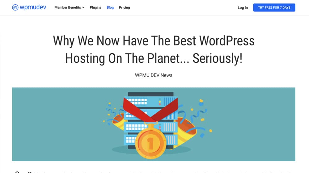
Since WordPress has a wide array of topics you can cover on a themed blog, they write about everything from the internal mechanics to analyzing traffic to plugins you can use, even if they don't make a comparable plugin themselves.
- I have to give serious props to their graphic designer. WPMUDEV has established a firm cartoon-style aesthetic with its graphic design that carries over from their landing pages to their plugins to their blog images. They've made personifications of each of their plugins as superheroes, and they use those characters frequently. Even on posts that don't use the characters, the graphic design is unique and on point.
- They feature the authors of their posts front and center with overlays on top of the blog image, rather than just a small author byline underneath the title. You can click through directly to the author's feed if you want, and you can see posts that have had more than one author work on them, which is a rarity in modern blogging.
- Their content is almost always heavily focused on actionable advice. They give you tutorials, steps to complete specific tasks, and knowledge about issues you might encounter in day to day WordPress usage. It's all very useful information.
Really, though, I can't overstate how excellent their graphic design and aesthetic is. It might not be everyone's cup of tea, but I love it.
8. Mashable
Some might call it cheating to call an online magazine a "business blog" but hey, they're a blog in the business of blogging, so I'll allow it. You can veto it if you want, but you'll have to write up your own entry to replace it in the comments.
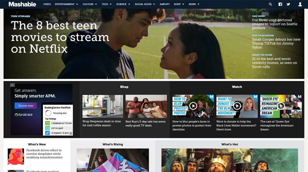
Mashable, of course, is a news magazine that covers everything from tech to current events.
- You have a ton of options from the first second the page loads. They have a few featured stories, but you can see content from a wide range of categories and topics above the fold, with links to categories and more. There's a ton to explore and it's always changing.
- Unlike many of the blogs on this list, Mashable uses an infinite scroll, so there's always content to browse if you just keep going.
- They sort content by size in a way that emphasizes interest. The "what's hot" tab, their popular content, is the largest. "What's rising" is middle-sized, while the "what's new" content is the smallest. As content gets more popular, it moves from left to right into positions of increasing prominence.
If there's one thing I don't really like about Mashable, it's that they use a script to auto-refresh the page every few minutes. It's useful for people who just keep a tab open, to see new content as it appears, but if you're scrolling down the page it sends you back to the top and is quite disruptive.
9. Home Depot
While you might not expect a hardware store to have a good blog, Home Depot's blog is actually pretty good.
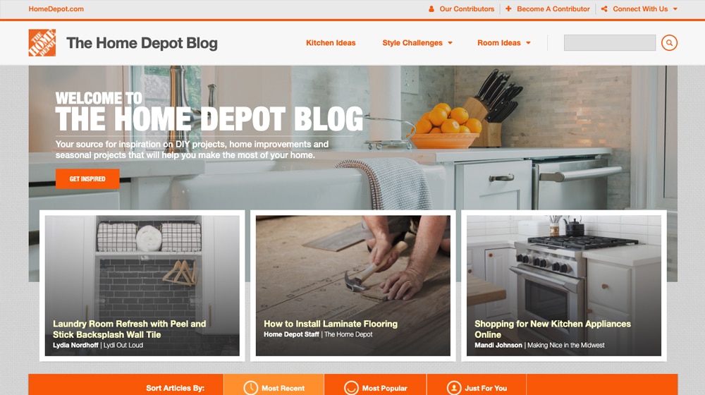
At first, glance, it just looks like a grid of simple DIY content, but there's some detail you might not have noticed.
- Each author gets their own themed sub-blog, in a sense. Jen Woodhouse gets "Wood House", Lydia Nordhoff gets "Lydi Out Loud", Casey Anderson gets "Collectively Casey", and so on. Each author can thus use this blog to build out their own following. Home Depot even allows anyone to sign up to be a contributor.
- The actual blog posts themselves are tied into the store. If someone writes a post about a DIY kitchen renovation, they can tag specific products they use, and you can click through to buy them directly to follow along with the project at home.
My biggest gripe with the site is actually the layout of the posts themselves. Because of that "shop this project" box, the actual content of the post is squeezed into just half of the page, making it feel like a poor use of space. They could adjust the sizes or reposition the shop box and it'd feel better, I think.
10. Kotaku
You can use Kotaku as a stand-in for any of their network of sites, including Deadspin, Jalopnik, LifeHacker, and Jezebel. They all have the same design, more or less, which is part of what I like about them.
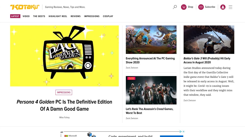
As part of a blog network, each blog has a coherent theme, but they all share a design, so you know when you're on one site in the network.
- Big images! These blogs all share one thing in common, which is large, illustrative images for each post. Kotaku's are usually game-related screenshots, though they can vary somewhat. Jalopnik's are related to cars, The Takeout's blog is related to food, and so forth.
- Cross-promotion is common. One of the posts just barely below the fold on Kotaku as I write this is a post from The Takeout. They can effectively cross-promote because they're all kind of one giant mega-blog.
- Posts have a convenient "save" button next to them, in case you're just browsing but don't have time to read. If you don't have an account, you'll be prompted to register one, but if you do, the post is added to a list of posts for you to go back to later. This can be great for people who don't have a lot of time during the day, or people who like to save posts to reference and share later.
Perhaps my only gripe is that their recent feed of posts has a clock icon that says how long ago the post was published, which isn't all that helpful. In fact, my initial thought upon seeing it is that it's a "time to read", but seeing 45 minutes for what is probably a three-paragraph post doesn't match, so it's an odd choice.
11. Ahrefs
Ahrefs is one of the leading SEO analytics firms out there, specifically focused on links and link building.
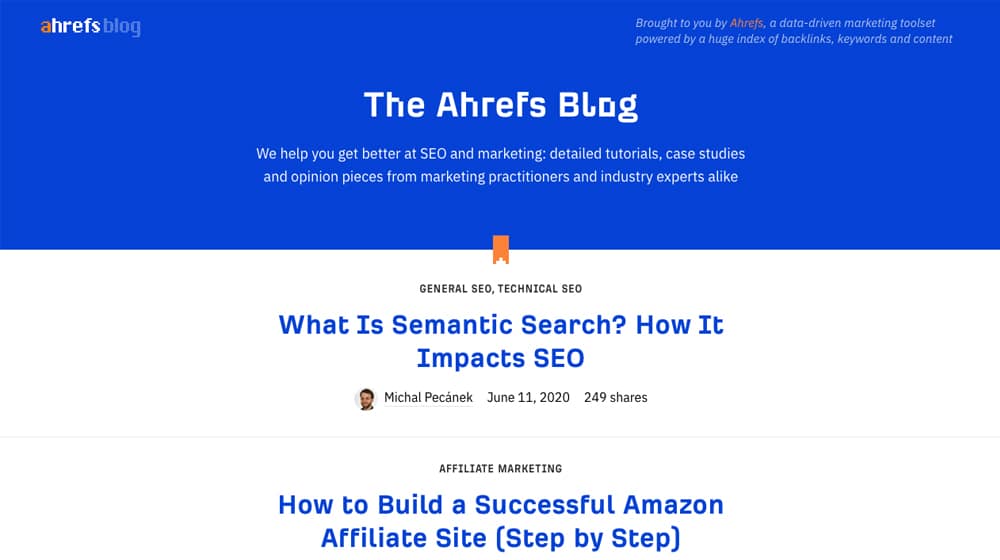
Their tools are top-notch, I highly recommend them myself, so what do I think of their blog?
- Simplicity. Ahrefs is simple to the extreme. Their blog has practically nothing on it; it's a single vertical feed of content, with just the basics. There aren't even blog images! It might seem like it's a wasted opportunity, but they really don't need more. Ahrefs is about their data and advice, not the fluff.
- Depth. The blog posts themselves are huge, full of useful information, data, screenshots, tutorials, and everything else you could want out of a post. When they want to produce a tutorial, they don't half-ass it.
Would Ahrefs be better if they added blog images, mixed up their design, or added more calls to action? Maybe, maybe not. Personally, I like it just the way it is.
Did you find any elements in these blogs that you'd like to implement on your own? Do you have any other large business blogs that you can share for inspiration? Let us know below in the comment section!
Written by James Parsons
Hi, I'm James Parsons! I founded Content Powered, a content marketing agency where I partner with businesses to help them grow through strategic content. With nearly twenty years of SEO and content marketing experience, I've had the joy of helping companies connect with their audiences in meaningful ways. I started my journey by building and growing several successful eCommerce companies solely through content marketing, and I love to share what I've learned along the way. You'll find my thoughts and insights in publications like Search Engine Watch, Search Engine Journal, Forbes, Entrepreneur, and Inc, among others. I've been fortunate to work with wonderful clients ranging from growing businesses to Fortune 500 companies like eBay and Expedia, and helping them shape their content strategies. My focus is on creating optimized content that resonates and converts. I'd love to connect – the best way to contact me is by scheduling a call or by email.


September 02, 2020
Shopify never fails me, I always end up clicking through on their newsletter. They always do a great job with their titles, especially if you use their platform. It seems like they know what you need and the answer just pops up just in the right moment like a proper butler. But I do get most of my inspirations with Canva since it is more in line with my main work apart from having to manage my online shop. I will check out the others, thanks for this list!
September 03, 2020
I'm glad it helped!
November 11, 2020
I like the idea of Home Depot where they engage their customer in their blogs. One of the best strategies I've seen as they don't need to pay for an influencer. For the blog layout, I like Crazy Egg more. It looks so simple and clean.
November 16, 2020
Hey Thanh, thanks for your comment!
I agree, it's beneficial to look at other blogs befor designing your own. For our blog, we were inspired by little bits and pieces from around the web. We might see a font we like, a color scheme, or colors and mix and match them until we have something that we like. It especially helps when starting like a blank slate like we did.
Are you designing your blog from scratch?
May 26, 2021
I like your blog. It's simple and CTA's are placed in the correct area. There are no irritating CTAs that pops every now and then thus I can read the article without any hindrance.
May 26, 2021
Hey David! Thank you, I appreciate that 🙂 always great to hear feedback. I'm not the biggest fan of pop-ups, I don't think your average person likes them either.
June 27, 2022
I love Ahrefs' tools but seeing their blog made me appreciate them so much more. I admire how they execute simplicity and directness. It might not work for everyone but I think it works perfectly well for them.
July 21, 2022
The folks at Ahrefs definitely know their stuff. Plus they have top marketing notch software to boot 🙂