24 Ways to Improve Your Website's User Experience for SEO

SEO and user experience can be viewed as two sides of the same coin. They're both ways of optimizing and improving your website, but they target different audiences. SEO changes how Google and other search engine algorithms view your site, while a good UX improves how your users view and use your site.
The tricky part is how the two interact. Google is on record as saying many forms of user experience are not strictly search ranking factors. However, they also say that their goal is not to serve the results that best cater to their own needs; they deliver search results that cater to users' needs. Thus, a site with a better user experience will rank better than one with a worse user experience, all else being equal.
To reconcile this is to understand that Google wants you to have a high-quality user experience, but they don't want to dictate what that user experience should include. They will not specify your template or design elements, but they will inform you of specific best practices and rules to follow to make your site as user-friendly as possible to everyone.
This practice is more important than ever, by the way. The U.S. Department of Justice recently clarified that access to websites – particularly government and public business sites – is required under the Americans with Disabilities Act. Anticipate some big websites making accessibility changes shortly, and some others that will be the target of accessibility lawsuits.
Suffice it to say that your site needs a good user experience. Improving your UX can help your search engine optimization, both indirectly and, in some cases, directly.
Let's look at some changes you can make to improve both sides of the coin.
1: Ensure Mobile Compatibility
Over 50% of web use is handled on mobile devices today, which means a good user experience begins with a mobile-friendly web design. Responsive design is the go-to option for most websites because it adapts your design to the size of the screen viewing it, and you don't have to cater to just a few most common sizes.
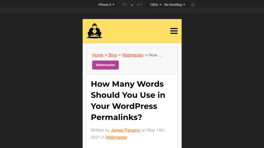
Google also now uses a mobile-first ranking system, where they'll give your mobile design precedence over your desktop design. It's well worth your time to invest in a mobile version.
Consider your site structure. How many clicks does it take to get from your homepage to any particular destination? How logical is it? How well can users find their way from one place to another? Should you display your blog prominently in your navigation or hide it so that your users have difficulty finding it?
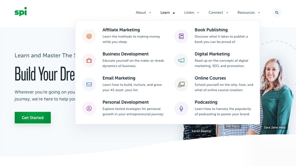
Optimize both your site structure, your hierarchies, and your overall organization. There's no single correct answer here, but flatter and more interconnected structures are usually better.
3: Add Trust Pages
Trust pages are pages that help users trust your brand. They're pages like a Contact Us page, an About Us page, a Privacy Policy page, a Terms of Service page, etc. Most people won't read these – especially things like your privacy policy or terms of service – but having them is more transparent and better than not. You also don't need to dig deep into lawyer-speak and legalese to write them.

Google checks all of these webpages and even requires them for some of their services. Those pages should be there when they come by to crawl your website.
4: Improve Text Readability
Consider that there may be people with poor vision reading your site. Consider, also, that staring at bland, unbroken walls of text is hard on the eyes even if you don't have poor vision.
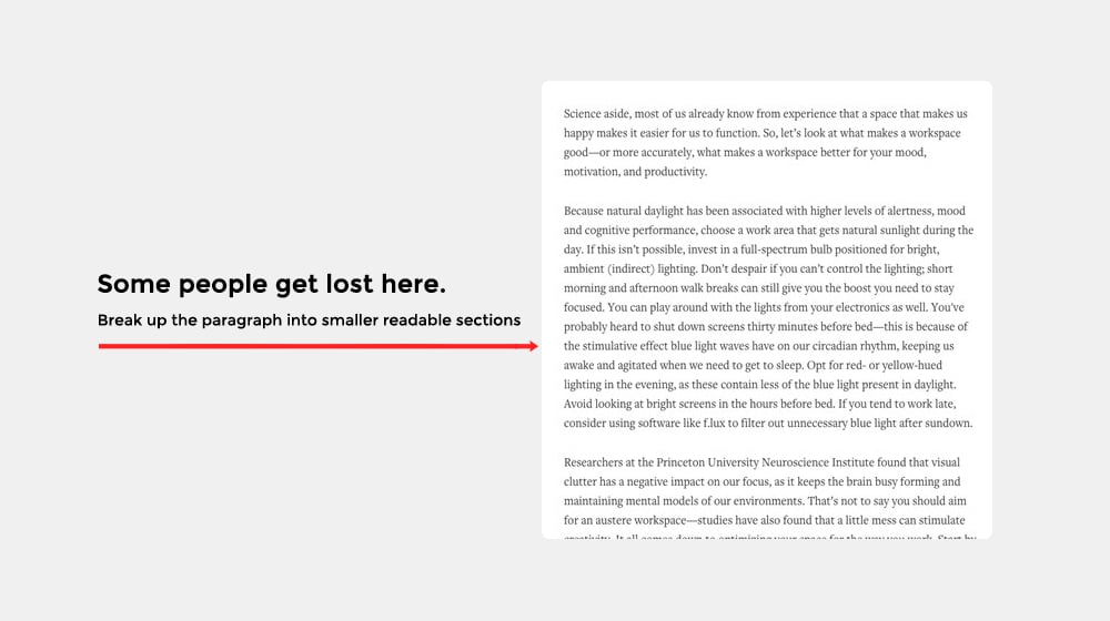
Text readability includes:
- A larger font size. Make sure your headings are bold and prominent.
- Reasonable padding and margins. Take advantage of white space to give your paragraphs, sentences, and containers enough breathing room. Crowded pages are unattractive and harder to read.
- Contrast. Good contrast between background and text colors makes it easier to read.
- Font choice. Some fonts are easier than others to read, and some are specifically designed to be easier to read.
Readability may also be as simple as breaking up large paragraphs. Shorter sentences are easier to digest and are better at retaining your readers' attention.
5: Make Images Smaller Files
Many websites upload full-resolution images, use the wrong file types, or do not adequately compress their images.
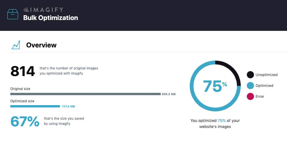
Crunching down your images does two things.
- First, if you make the image's dimensions smaller, you don't need to use software or code to scale it for display, which helps minimize errors and issues that can crop up. Image optimization plugins can resize large images automatically.
- Second, smushing down the file size helps your page load faster, especially if they're in your header or otherwise above the fold.
This is the first of several site speed optimizations I'll mention throughout this post because site speed is just that important.
6: Use Alt Text for Images
One of the critical features of the ADA compliance mentioned above is functional, descriptive alt text for images. Remember, people who use screen readers don't load or see the pictures and need some idea of what the image is.
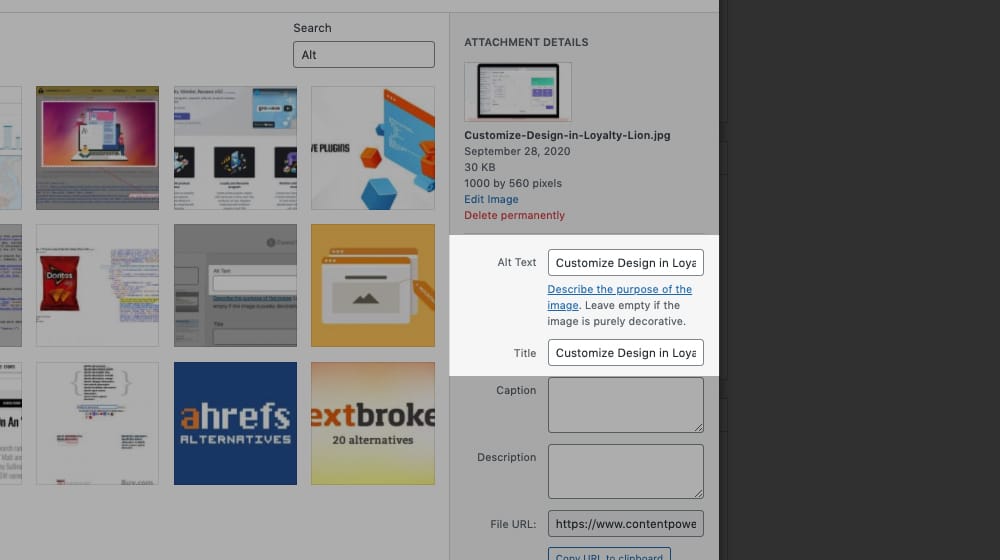
Alt text serves that purpose. It's not there for keywords; it's there to be a description and helpful for the paragraph where it resides. Specify descriptive alt text for every image you use, anywhere you use one. Alt tag plugins can make this process easier and even automate the process entirely.
7: Use an Attractive, Clear Design
Clarity is the name of the game. There are near-infinite options in the plane of a website, but simplicity in design helps keep everything clear to your users. Unfortunately, many clever scrolling CSS effects, parallax animations, and sliders can cause problems and may not be ideal for most businesses moving forward.

You can still exercise your creativity in design; make it clear and attractive when you do.
Hidden divs are an excellent way to put information behind "collapsed" shutters, like an FAQ where the questions are visible, but the answers are hidden until you click. This strategy can be acceptable in moderation, but some people love going overboard with them for SEO, as you can stuff a ton of content into your page without changing the look or feel.

Try to cut back on how much information is hidden, visually, from your users. Use it with purpose, not just as a design element.
9: Minimize Pop-Ups Whenever Possible
If you're like me, you hate all the "before you go" exit-intent popups on websites. Some sites will have 2-3 popups before you even get a chance to see their content! This approach is, obviously, terrible for users. Sure, to an extent, they work for CRO, but they still aren't ideal for accessibility. Pop-ups can also tank your bounce rate and time on site metrics.
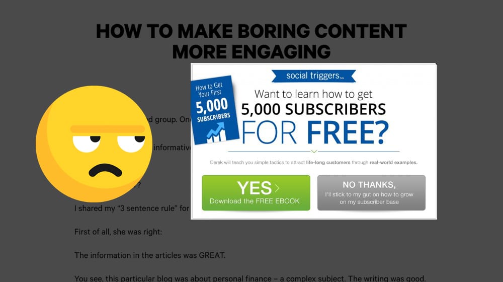
The tide is shifting on them, and I expect they'll be on their way out in the next few years. You can find other good ways to convey your CTA; I believe in you.
10: Keep Your Content Up to Date
Updated content is both a search ranking factor and a user attraction factor. Google's search displays the last updated date of content, and for many pieces of content, users prefer getting the most recently updated information they can. That means you can benefit your site by keeping your content – or at least your top 10-20% of your content – up to date.
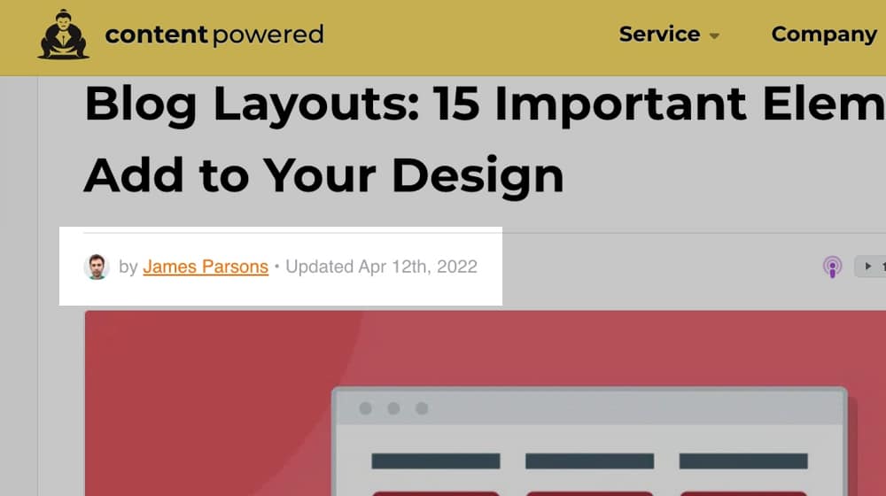
It would also help if you kept your title tags up to date. If your page title doesn't match your content, you could be experiencing lower-than-expected click-through rates or confused readers.
It doesn't need to be major updates, but some edits, changes, and updates to facts can be helpful.
11: Avoid Too Many Ads and CTAs
A significant aspect of SEO is that too many ads on a page can hurt your site's performance. Google used to have pretty harsh penalties for this, but they seem to have dropped off recently, judging by how some websites (MediaWiki is a big offender here) can be just absolutely covered in ads and still rank.
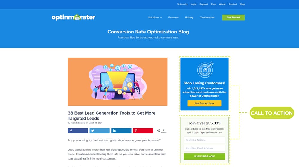
Too many ads are also an accessibility and user experience issue, so minimizing them is always a good idea. This moderation also applies to your CTAs, though some CTAs can still work fine, as long as they're tasteful.
This one may be a little controversial to some of you. I generally prefer a navigation bar that sticks to the top of the screen and scrolls with the user. The sticky functionality helps ensure that access to navigation is always available and reduces the chances of users leaving because they would otherwise have to hunt for and locate something else to click.
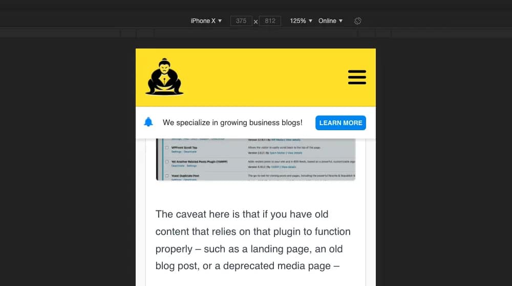
The caveat here is that your navigation shouldn't be disruptive. I've seen sites where the navbar covers a third of the screen real estate on a smaller laptop screen! That's a poor user experience, as some users will have difficulty reading your content (particularly those with smaller phone screens).
We create blog content that converts - not just for ourselves, but for our clients, too.
We pick blog topics like hedge funds pick stocks. Then, we create articles that are 10x better to earn the top spot.
Content marketing has two ingredients - content and marketing. We've earned our black belts in both.
13: Open Links in New Tabs
To an extent, this one can be overridden by a user's browser settings. However, you should make the default behavior for links on your page – both internal and external – be "open in new tab/window." This way, users can click your links to read more, but they don't lose their place on your site when they do it. There are even plugins that can add this functionality to your external links automatically.
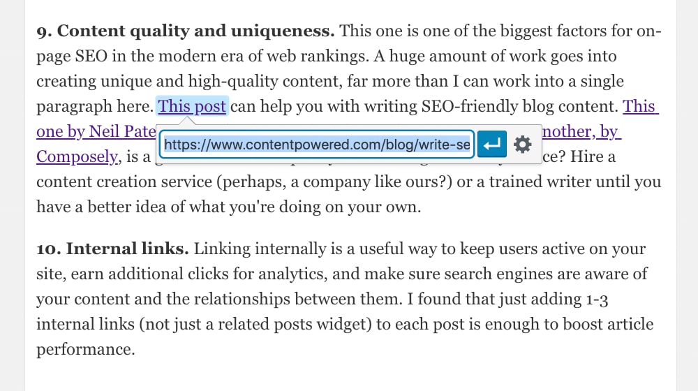
It helps prevent people from clicking away and just never returning to your page, which costs you a reader every time it happens.
14: Focus on Core Web Vitals
Google's Core Web Vitals are a series of metrics that measure mostly the initial load. A few minor annoyances you experience on the web, like having the entire page shift with a lazy-loaded image pops in, are part of them.
It isn't a good look when your content jumps around, so Google codifies good behavior and helps you figure out how to fix it. Do so for the good of everyone using your page on anything less than a fiber connection next door to your server.
15: Avoid Unreadable or Unindexable Elements
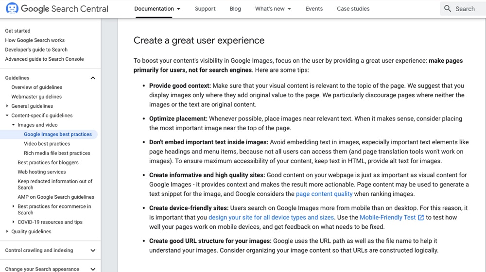
The trend is much less prevalent now than it used to be. Still, people would design site elements so that they couldn't easily be indexed in the past—for example, putting critical text for your site on images (like making your navigation buttons as images instead of text) or generating your content live via script.
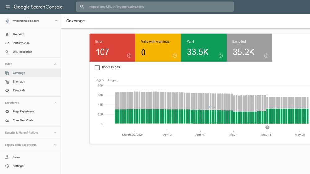
Both are difficult to index in different ways and make it more challenging to use the site if anything goes wrong. Someone who has JavaScript disabled or doesn't correctly load images would find your site impossible to use.
16: Minify Scripts and CSS
The larger your scripts are, the longer they take to render, and generally, the more significant their impact on your site. Sometimes that's fine, but other times it's detrimental to your user experience.
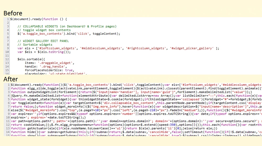
I generally recommend running your scripts and CSS through a minification applet to crunch them down and make them that much smaller. It might only be a few kilobytes of saved file size, but sometimes that can be enough for mobile sites.
17: Make Links Stand Out
Have you ever visited a site where links are formatted to be the same color as text, and the links either don't stand out or only stand out when you hover over them with your cursor? This practice is a usability faux pas and makes it harder for people who legitimately want to use your site to navigate around it.
Make your links stand out, differentiated from the rest of your text. I generally prefer a different color and an underline and don't bother with fancy animations.
Some SEOs theorize that blue links are better for your SEO and your website's user experience. After all, links have been blue since the start of the internet; they may be more recognizable as links to your users.
18: Use Plenty of Formatting to Break Up Information
Text formatting is one of the biggest things you can do to improve your web content. Break up longer paragraphs into smaller chunks. Use bold, underline, and italics to emphasize points and information. Summarize with bullet points and numbered lists. Use pull quotes and little icons to add value.
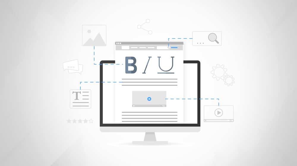
It's a great way to make your quality content dramatically easier to consume. It can also help highlight keywords for Google's indexation, though they don't need the help.
19: Improve Page Speed Across the Board
Site speed is one of the most critical website usability factors today. Attention spans are at an all-time low, and people don't have the patience to wait for a site, especially if they're in an area with flaky internet coverage and their phones are slow to load content. People may have waited 10 seconds for a site to load a decade ago, but with fiber optic internet and high-speed mobile data plans, they'll assume your website is broken and leave.
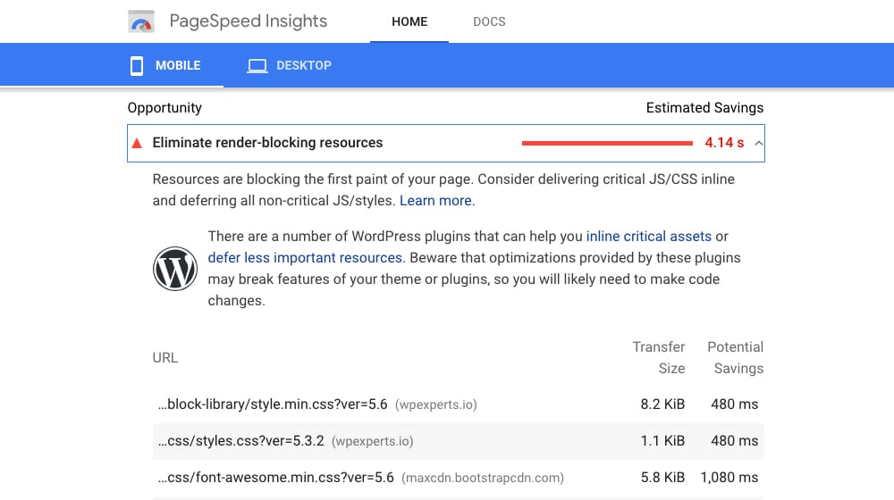
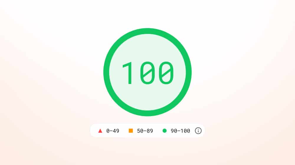
PageSpeed Insights not only measures your page load time, but it also measures the load speed of individual assets and how fast your website appears to load. If you haven't checked your score yet or optimized your site to reach a high 90's score on mobile, I highly recommend that you start that process.
Improving the load time of your site helps provide information and accessibility to as many people as possible, and you may even see an increase your conversion rate.
20: Update Your UX Periodically
Things change. Standards evolve, preferences evolve, and laws and regulations develop. Over time, what used to be good, the industry-standard designs look outdated or no longer comply with modern design sensibilities.
I recommend two things.
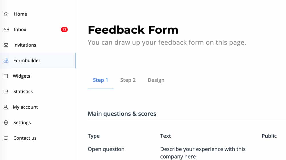
First, set up a process where you can gather feedback from your users, whether it's occasional surveys or just a passive feedback form. Consider feedback from your users as their preferences change. Platforms like WordPress make gathering feedback straightforward (with plugins, comments, etc), and in my experience, implementing these insights can lead to happier users and better search rankings.
Second, perform an audit of your user experience at least once every year. This audit can identify potential issues and work to solve them.
Optimizing your overall UX design might not be a direct SEO factor, but it's closely related, and any benefit to your audience is a benefit to your brand.
There's no time like the present to get started!
When I've integrated social media into website designs, I've noticed a stronger connection with potential customers. It boosts user engagement and provides SEO benefits, thanks to increased social sharing and inbound links.
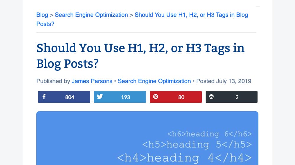
Sharing buttons help content reach broader audiences, leading to more website visits and improved user satisfaction. This not only amplifies a site's digital marketing footprint but also makes it easier for visitors to engage with and share content they value.
22. Optimize for Ecommerce
In the world of online shopping, I believe a seamless ecommerce experience is key. Streamlined checkouts, clear product descriptions, and persuasive calls to action capture user attention, leading to longer site visits and lower bounce rates.

Moreover, when I've included user reviews, I've observed an increase in trust among potential customers. All these factors combined not only drive sales but also enhance the site's SEO by increasing organic user engagement.
23. Structured Data (Schema Markup)
Structured data helps search engines understand the context of your content.
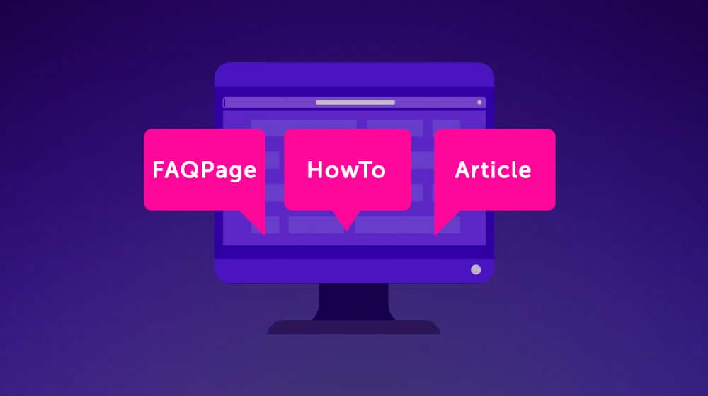
By incorporating schema markup, you not only improve the chances of having enhanced SERP features (like rich snippets), but it can also improve the user experience by presenting information in a clearer manner.
24. Content Clusters and Pillar Posts
Instead of standalone blog posts, consider creating clusters of content around specific topics.

This provides a more comprehensive resource for users and can significantly boost topical authority for SEO.
Wrapping Up
Striking a balance between SEO and user experience is very important. As search engines continuously refine their algorithms to prioritize user-centric websites, websites must adapt to ensure that they are both search-engine friendly and user-oriented.
By implementing some of the strategies I mentioned above, websites can achieve not only higher rankings but also build genuine connections with their audience.
Remember, an optimized site isn't just about visibility; it's about delivering value in every user interaction. Small changes like improving your font readability or improving your mobile menus don't sound like they will help your SEO, but those small changes add up. Make your users happy, and search engines will make you happy! It really is that simple.




September 07, 2022 at 5:22 pm
UX plays such a big role, especially for casual visitors. One look and if they get turned off by pop-ups or wonky spacings, they will leave without a second thought.
October 07, 2022 at 7:57 pm
Agreed!