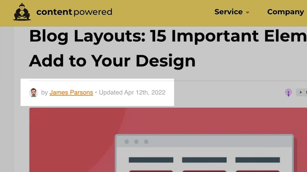
Blog Layouts: 15 Important Elements to Add to Your Design
Written by ![]()

What stands out on the blogs you remember when you look around the web? It might be the content, sure, but I'm guessing it also has something to do with the layout and design of the blog as well.
Some blogs are memorable for buck-wild and unattractive designs, to put it bluntly. A blog with a layout that scrolls horizontally, a blog that is cluttered and full of animations; these kinds of things happen occasionally and eventually die off because they don't keep the attention of their visitors.
Other blogs have solid, high-quality designs, and it's often minimalist and subtle web design decisions you might not even notice.
One thing's for sure; good design goes above and beyond whatever the default in WordPress's 20XX base theme gives you. An effective website design also extends beyond your blog and your homepage - if the rest of your web pages have glaring issues, your blog will be negatively affected.
I've put together a list of 15 design elements that bloggers can add, tweak, or change. Each one of these can give you a boost in SEO, user experience, or accessibility, all of which help your business in the long run.
Key Takeaways
- Displaying the "last updated" date instead of publication date keeps content fresh while implying authority and experience.
- Prominent author bios with credentials and social links support Google's E-A-T algorithm, building expertise, authoritativeness, and trustworthiness.
- Readability essentials include 16px+ font sizes, high-contrast colors, readable typefaces, and sufficient white space throughout your layout.
- A table of contents improves navigation, reduces bounce rate, and helps users quickly jump to relevant sections within posts.
- Blog index pages showing only 2-4 posts risk appearing as thin content; displaying 10+ posts creates a more valuable, indexable page.
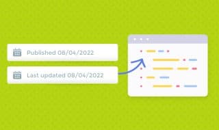
1: Change Publication Date to Updated Date
I wrote a post analyzing the debate about dates in blog posts a while back. Some people argue that a publication date gives authority to a post. Others say removing it makes a post more evergreen. I wrote a detailed analysis here if you want to read it:
Since I wrote that post, I decided to go with a third option: the date last updated. Instead of no dates at all (which fools nobody) or a date of publication (which can make older content look out of date and get less traffic), the date of the most recent update can help keep your content fresh while implying that it's older and thus more authoritative. It's the best of both worlds and easy to implement. If you're also thinking about how often you should update blog posts for SEO, that's worth reading alongside this tip - and if you want search engines to better understand your content, using an article schema generator can help signal freshness too.
To make this change, you may have to dig into your blog template files to add this functionality to your single.php file. Here's the code I use on this blog for anybody interested in a short tutorial:
<br> $u_time = get_the_time(&#039;U&#039;);$u_modified_time = get_the_modified_time(&#039;U&#039;);the_modified_time(&#039;M jS, Y&#039;);<br>
Here's another pro tip. If you use the above code, make sure you also add this to your functions.php file in your WordPress theme:
<br>
/**<br>
* Scheduled posts should update modified date when published<br>
*/</p>
<!-- /wp:paragraph -->
<!-- wp:paragraph -->
<p>function update_modified_date_to_post_date( $post ) {<br>
$updated_data = [<br>
&#039;ID&#039; =&amp;amp;gt; $post-&amp;amp;gt;ID,<br>
&#039;post_modified&#039; =&amp;amp;gt; $post-&amp;amp;gt;post_date,<br>
&#039;post_modified_gmt&#039; =&amp;amp;gt; $post-&amp;amp;gt;post_date_gmt<br>
];<br>
wp_update_post( $updated_data );<br>
}<br>
add_action( &#039;future_to_publish&#039;, &#039;update_modified_date_to_post_date&#039;, 10, 1 );<br>
This code ensures that any scheduled posts will automatically display the scheduled post date as the "Updated" date when it eventually goes live. If you write an article on the 8th and it's published on the 10th, it won't say "Updated on April 8th". That may look weird to the visitors and search engines viewing your blog homepage.
Even if your site only has one author, you should emphasize your author bio on every blog post. Generally, you'll want a bio box at the bottom of the article and a "by YourName" byline at the top with a link to a profile page. The bio box should include 3-4 sentences of salient information, generally with one humorous line, one line of citations and recognition of authority, and a line or two that links to things like your social media profiles. Optimizing your author bio for SEO can make a meaningful difference in how your content is perceived.
This strategy is helpful for Google's E-A-T algorithm, which stands for Expertise, Authoritativeness, and Trustworthiness.
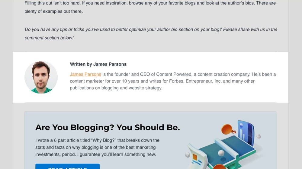
Would you trust this post more if it was published by me (James Parsons) or by my company name (Content Powered), where you have no idea who wrote it and why?
It's challenging to convey those things without telling your readers who wrote the article. If you're working on your site's overall credibility, you may also want to look into tools like our disavow file generator to clean up any low-quality links that could undermine that trust.
Breadcrumb navigation is a great way for users to browse content throughout your site. It should apply to more than just your business blog (it's excellent on product pages and nested About pages, too). Still, it's beneficial on blogs, mainly when using the category system.
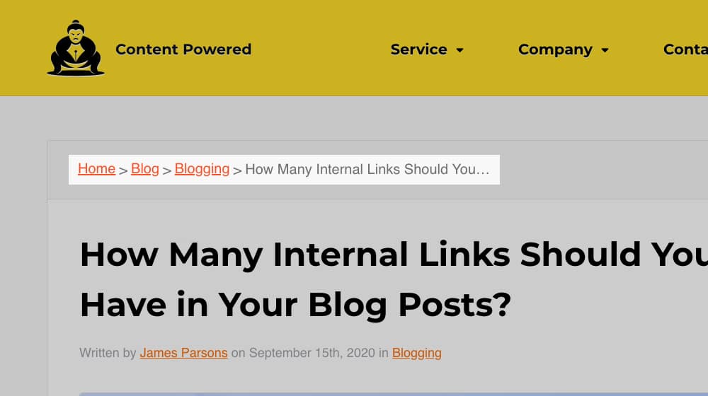
I wrote a whole post about why breadcrumbs are helpful and what SEO value they bring to the table (as well as how to implement them):
Luckily, it's straightforward to enable breadcrumb navigation 99% of the time, so this tweak helps your users and Google navigate your site much more efficiently. Check it out.
On the topic of navigation, ensure that your header and footer menus are optimized too.
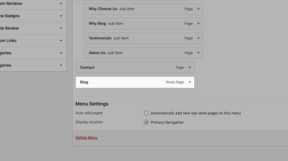
Remove broken or irrelevant links, make sure that your mobile navigation is optimized and easy to use, and beef up your navigation overall. Each page should be labeled appropriately and with user experience in mind. It also helps to give the users as many options as possible - a menu with 1-3 dropdown menus and 10-25 pages is better than a menu with only a few pages. Users love options, and Google loves what users love.
4: Use Proper Pagination
Pagination is splitting content into multiple pages. It's pretty contentious in modern blog design.
On the one hand, pagination is an opportunity for an engaged reader to click a button to keep reading. That creates a second event in Google Analytics and can reduce your bounce rate.
People hate it, especially on mobile. On the other hand, many people won't click through to a second page. It's even worse when you consider how much of the bad old days of the internet relied on blog posts where each "page" was a single paragraph, abusing page views for ad revenue.
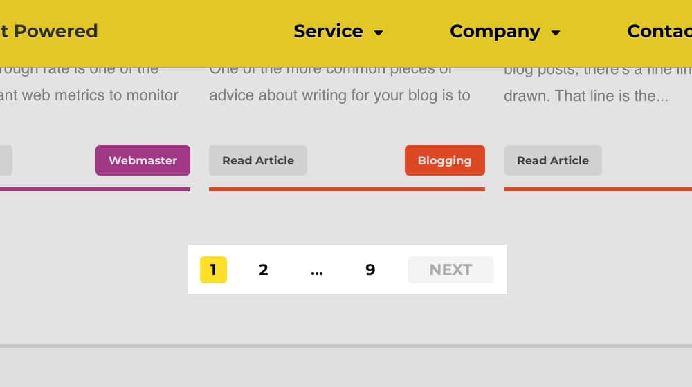
If you're using pagination rather than something like an infinite scroll, there are three things to remember.
- Only use it when there's significant content on one page, like 1,000+ words of a blog post.
- It's more beneficial for search results, product lists, and blog post indexes than posts themselves.
- No matter what, use
rel="canonical"references to canonize the first page so you don't get hit with duplicate content penalties on paginated content.
The decision of if and how to use pagination is yours, but if you're going to use it, make sure to use it right.
In WordPress and several other blogging systems, you can choose to use categories, tags, or both to classify your content. Categories are generally broad types of content, like content about PPC, conversion rate optimization, or content marketing. There may be some overlap - and a post can have multiple categories - but most posts should only have one.
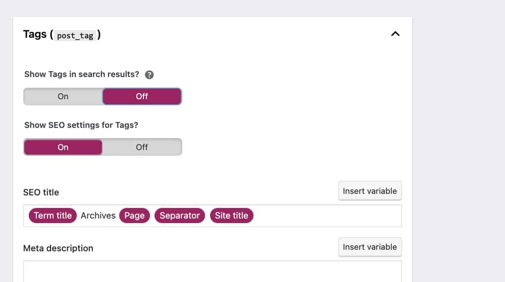
On the other hand, tags are more like keywords you associate with a post. They tend to be more specific, and posts usually have multiple tags.
I'm not a big fan of the tag system. It's much more cluttered and harder to navigate when looking for unique content on a blog. Plus, I've seen instances of tag pages being indexed in a way that hurts SEO. Whichever one you pick (and I think it should be categories, but you do you), make sure you're using it properly. If you're running an online store, this is especially relevant given the common WooCommerce SEO issues that poor taxonomy management can create. For a deeper dive into how WordPress tags can affect your rankings, it's worth understanding the risks before committing to a system.
Every important element of page design ties back to an HTML tag somehow, and those tags should have CSS styling attached to them. Some themes will have this built-in, while others leave it out for some code blocks (usually out of laziness). Nulled WP themes and plugins are especially prone to this problem.
Remember; any code block that lacks proper styling won't be ready to use when you need to use it. I recommend making a test post, using all of your code blocks, and styling them the way you want them. That includes everything from H1 to H6, blockquote, links, numbered and bulleted lists, nested lists, and anything else you can think up. If the designer didn't style those elements, then you'll have to add the styling yourself.
Google cares a great deal about how your code is loaded and in what order to maximize your page speed. Make sure to handle your CSS properly for page speed purposes while modifying your website.
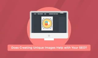
7: Proper Image Handling
Images in blog posts should be consistent in size, shape, position, and file size. You should also make sure to add captions and alt text to them. Google specifies that alt text should be descriptive since it's mainly for image search context and screen reader accessibility, so shoehorning in content or keywords will be detrimental. If you're struggling with this, you can automatically generate alt text for images to get a helpful starting point.

I recommend establishing a preset way of handling images, including compressing them down for smaller file sizes, ensuring proper dimensions, and testing to ensure that they appear correctly on desktop and mobile devices. You'd be surprised at all the ways images can go wonky.
Large images are slow to load, and a slow-loading page takes a significant hit on PageSpeed and Core Web Vitals. Even if you lazyload images, make sure they don't shift content around when they load. It's also worth reviewing how to fix the "Defer Offscreen Images" message on Google PageSpeed to keep your load times in check.
8: Use a Large Post Grid
One thing I've never understood is blogs with a blog index that only shows 2-4 blog posts at a time.
When you make that, you're creating a core indexable page for your site, with a couple of small images and fewer than 100 words of content (if it's just blog titles) or maybe 1,000 words if you include snippets. Do you know what that looks like to me? Thin content.
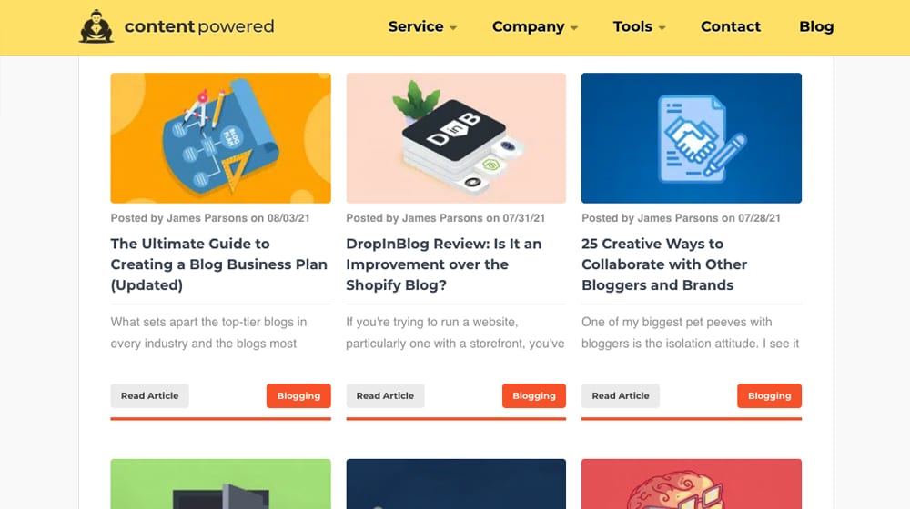
It's trivially easy to make your blog index display 10+ blog posts at a time. In fact, with endless scrolling, you can make it show everything on your site. Why not try it out? It's not like a huge overhead or super slow to load if your site is appropriately optimized. Make your index a helpful page, not a thin page that people would rather ignore. If you're unsure whether your content quality is up to par, it may be worth learning how to recover a blog from a Google core update, since thin index pages can contribute to ranking drops.
9: Use an Integrated Search Bar
I don't know about you, but I rarely use the Google search plugin or "search this page" bar on a website. If I want to search a website, I'm often using Google.com and using a site: operator. But, you know what?
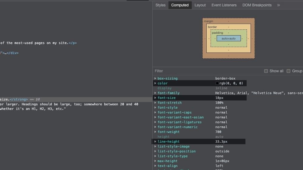
The search bar is one of the most-used pages on my site.
I might not use it, but many people do, and it's a big hit to accessibility if you don't offer it. Plus, it's effortless to integrate a search bar on most CMS platforms, so there's little reason not to. The only thing I recommend is styling it to match, rather than just having a big Google box up in the corner. If you want to better understand what visitors are looking for, our search intent classifier can help you analyze queries and tailor your content accordingly.
10: Add a Table of Contents
At the top of every one of my blog posts, you'll find a table of contents. That table lists all of the headings and subheadings throughout the post and uses links to make it easy to jump to a specific section if all you want to read is one precise tip.
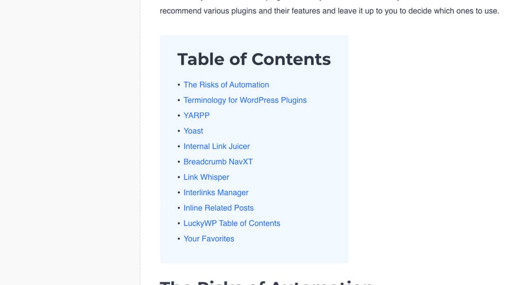
It's incredibly potent. It helps users find exactly the value they want to see, helps with navigation, and even allows people to link to a specific section of the page. On top of that, it's tracked as an interaction and helps reduce bounce rate.
Plus, it's super easy to implement. I use a WordPress plugin to implement it. You can read my full post on tables of contents right here, including instructions on implementing one.
11: Readability
In terms of design, one of the more recent pushes on the internet is accessibility. One of the best things you can do is adjust your font.
You want three things:
- A large font size. I prefer 16 points or larger. Headings should be large, too; somewhere between 20 and 40 pixels, depending on whether it's an H1, H2, H3, etc. - and if you're unsure which unit to use, check out our guide on which font size unit is best for SEO.
- A high contrast color choice. Black typography on light gray or white blog layout, or inverted for a dark mode works well (or both color schemes). You can check contrast levels here.
- An easily-readable font. You might even consider a dyslexia-friendly font like Dyslexie, OpenDyslexic, or Sylexiad.
- White space. You want to give each of your elements enough breathing room. If your text is too close to your containers or stuffed into their sections, it can look messy and hard to read.
Make sure to test how it looks on both desktop and mobile. Sometimes your theme changes colors or sizes in a way you don't want, and you'll need to troubleshoot it to fix it. You can also use our readability analyzer to check how easy your content is to read.
12: Integrate Calls to Action
Getting someone to read your blog is not the last step in the process; it's the first. It would help if you had a call to action integrated throughout your site. It can be sidebar ads, in-text links, explicit text CTAs, or anything else.
There are tons of them, and I've written extensively about them. For example:
- The 30 Best CTA Plugins for WordPress
- Guide to Adding CTAs to Your Text
- 50+ CTAs that Increase Conversions
- 22 Reasons People Aren't Clicking Your CTAs
Please read up on CTAs, implement them for your newsletter, product, and anything else you want to promote, and iteratively test them to get the most out of your blog. You'll be happy with the results. If you're also working on formatting your content, our text case converter can help keep your headings and titles consistent.
One of the best ways to keep people around on your site is a related posts box. I like YARRP, the Yet Another Related Posts Plugin, because it can be configured to automatically put links to posts based on the contents of an article, rather than just by keywords, category, or title.
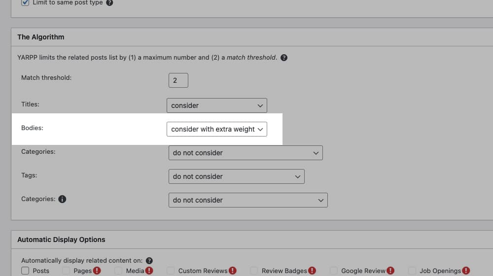
If you're interested, give it a look. It's one of the best and most accurate related post engines that I've found to date, as long as it's styled and configured correctly. You can also use our Article Link Analyzer Tool to audit how your internal links are performing across your posts.
14: Make Custom Snippets
Snippets are little shortcodes and bits of flair that improve the look and feel of your post.
You can use a plugin like Post Snippets to manage these. You essentially build a library of custom snippets you can apply as a style around any bit of text to highlight the added value in a consistent way across your site. You may also want to check out rich snippets you can add to your blog posts to further enhance how your content appears in search results.
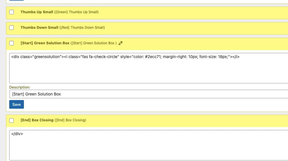
Plus, if you change how the snippet works, it reflects across the site instead of requiring you to go back and edit every old post. Extremely convenient and practical.
15: Promote Blog Comments
There are many ways you can use blog comments on your site. Some people turn them off (which I disagree with), but most people today leave them on. Some people use a plugin like Disqus, CommentLuv, or Facebook Comments, but frankly, I find that base WordPress comments are the best option.
The built-in comments are free, you have more control over them, and it's endlessly customizable. Akismet is excellent at blocking spam, and I prefer to show search engines the comments my visitors leave in my HTML source code (and not loaded over JavaScript).

Make sure you do three things.
- Style your comments to fit in with the rest of your design.
- Monitor your comments and respond to them when they come in.
- Use an anti-spam plugin like Akismet or Antispam Bee to filter comments.
Why not leave a comment right now and test how my system works? You can get a good idea of implementing it on your blog while helping me and everybody else. What's not to love?
Bonus Elements
I'm sure I'll be adding more to this post over time, so I'll use this section for elements that I discover or that users mention to me. Here are a handful of bonus elements that you can consider adding to your blog to improve your layout and user experience:
- Use podcasts or audio transcriptions. If you have a WordPress blog, I wrote a great guide on this subject here.
- Eye-catching featured images. Great graphics make a huge difference in traffic, sharing, links, time on site, bounce rate, and every other conceivable metric. Your blog images (particularly the featured ones) are often the first element your visitors see. It would be best to work hard to ensure that the image is an attractive, custom, and high-quality graphic. Put your best foot forward. If you need extra help, consider hiring a graphic designer or freelancer to help you out. It turns out attractive blog posts are more fun to read than unattractive ones.
- Social sharing buttons. Most users are already logged into social media; if you can make it easy for them to share your post with their followers with a single click, then users will often take you up on that. You'd be amazed at how often users will share your blog content if you give them the ability to. Just make sure that they don't slow down your website; if you're interested, I wrote a great guide on social plugins that don't slow down a WordPress blog. You can also use a social media character counter to optimize your shared posts before publishing.
- A useful sidebar. This element typically sits on the right side of your blog posts and can show your recent posts, popular posts, new blog posts, or other useful widgets. You can also take advantage of this section by adding a call to action and making it a "sticky" element to catch the reader's eye and improve conversions.
Do you have any vital blog layout tips to add to this list? Please share with us in the comments below! If you have any questions for me, I'd also love to hear from you, and I make it a point to reply to every constructive question with a detailed answer.
Written by James Parsons
Hi, I'm James Parsons! I founded Content Powered, a content marketing agency where I partner with businesses to help them grow through strategic content. With nearly twenty years of SEO and content marketing experience, I've had the joy of helping companies connect with their audiences in meaningful ways. I started my journey by building and growing several successful eCommerce companies solely through content marketing, and I love to share what I've learned along the way. You'll find my thoughts and insights in publications like Search Engine Watch, Search Engine Journal, Forbes, Entrepreneur, and Inc, among others. I've been fortunate to work with wonderful clients ranging from growing businesses to Fortune 500 companies like eBay and Expedia, and helping them shape their content strategies. My focus is on creating optimized content that resonates and converts. I'd love to connect – the best way to contact me is by scheduling a call or by email.


April 20, 2022
I really like the layout your blog has so thanks for sharing insights into how you made it!
April 21, 2022
Thanks Ben, I appreciate it!
April 21, 2022
What do you think of retaining the original publication date while displaying the date updated as well? I'm not sure I want to remove the original publication date but I'm afraid it might seem too repetitive to display two dates.
April 21, 2022
Hey Bea!
The only concern is that search engines may decide to grab one of those dates and list it in their search engines.
It's hard to tell them to focus on the "Update" date and not the "Publish" date, or vice versa.
I've seen a handful of sites do this, and it couldn't hurt to try. If you decide to go this route, would test out a handful of your posts after you've given them enough time to update in Google's index and make sure that the results are acceptable to you.
November 20, 2023
The recommendation to use a large post grid for a more informative index page is intriguing. Have you noticed increased engagement since implementing this change?
November 20, 2023
Hey Daisy!
It's hard to measure a lot of SEO changes because there are hundreds of factors - so directly attributing any single change or tweak to traffic increases is impossible.
That said, this does double as an SEO improvement and a user experience improvement. If your blog only has four posts per page and your users are constantly clicking "Next" on those very short pages, that can frustrate your users. Also, showing search engines 500 "pagination" pages when you could just as easily be showing them 20 of them (with more posts on each page) could confuse them and potentially water down the quality of your average page.
To answer your question more directly, I haven't directly measured engagement with things like heatmap tools on both longer and shorter blog post loops. However, since this strategy falls in line with Google's advice of minimizing thin, low-value pages, I would recommend implementing and testing it!
March 27, 2025
Loved this article! These go hand in hand
March 27, 2025
Thanks Billal! I appreciate it 🙂