Shopify Landing Pages: How to Easily Build Effective Pages
Written by 
Shopify is one of the most popular eCommerce platforms in the world, and many people are creating unique online stores using the marketing tools it provides you. At the same time, many more people struggle to find that same level of success.
Maybe you're struggling, or perhaps you're already successful but want to kick that success to the next level. Or, you're just starting and don't want to fumble in the dark.
Whatever your situation, you can benefit from learning the best ways to build high-converting landing pages in Shopify to use in your PPC or digital marketing campaigns.
Let's get started with the tutorial!
Are Landing Pages That Important?
Consider your Shopify store for a moment. What would you consider the essentials? Your product pages, of course. Without them, you can't sell anything. Your blog is essential since content marketing is crucial to any good marketing strategy. Your homepage is critical too, but more out of necessity than for primary usability reasons.
What about your landing pages? Do you even have landing pages?
Surprisingly, plenty of store owners don't.
How effective are they?
- The average conversion rate for landing pages – across industries – is nearly 10%.
- Companies with 31-40 landing pages get seven times more leads than companies with 1-5.
- Companies with 40+ landing pages get twelve times more leads than companies with just 15.
Good landing pages can ramp up your conversion rates to an insane degree. How?
Targeting.
Think about it. If you're searching the internet for a company selling a specific product, which will be more enticing? A webpage that lists every possible item in the product collection, or a page dedicated to that particular product?
Landing pages are more closely aligned with what you're searching for specifically. Now, if you're searching for a solution to a problem and don't know what product you want, that's another story entirely. That's where blog posts and comparison pages come into play. Once you know what you're looking for, though, landing pages are the most enticing kinds of pages.
But wait. Don't product pages fulfill that role? After all, they're specific pages dedicated to the product.
One product can have multiple landing pages, too. Think of something like a graphics card for a computer. There are all kinds of different people who might be interested in a graphics card, so you can have landing pages that:
- Explain the power of the graphics card when used in 4k gaming.
- Explain the power of the graphics card's multi-threading when used for video rendering.
- Explain how you can link up the graphics card with another by using SLI configuration for an even more powerful machine.
- Explain whether or not the card is artificially limited (or not) and how well it works for crypto mining.
Four different kinds of users (gamers, media producers, boundary-pushers, and crypto enthusiasts) all have different interests in a graphics card. A product page may answer their questions in passing, but it's not focused on their concerns.
And, again, it's that targeting that makes a landing page powerful.
You can think of it as the difference between a teacher lecturing to a class and a tutor teaching you one-on-one. The more personalized attention will be more effective.
Methods to Create a Shopify Landing Page
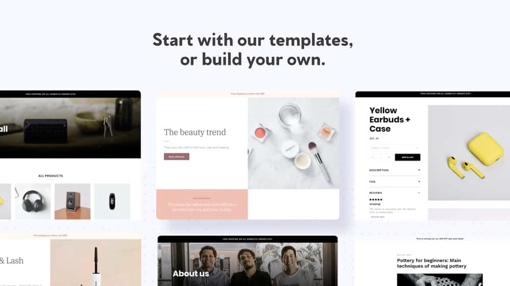
Shopify, of course, allows you to create landing pages directly on their platform. All you have to do is click "add page" and customize it with whatever content you want. Easy, right?
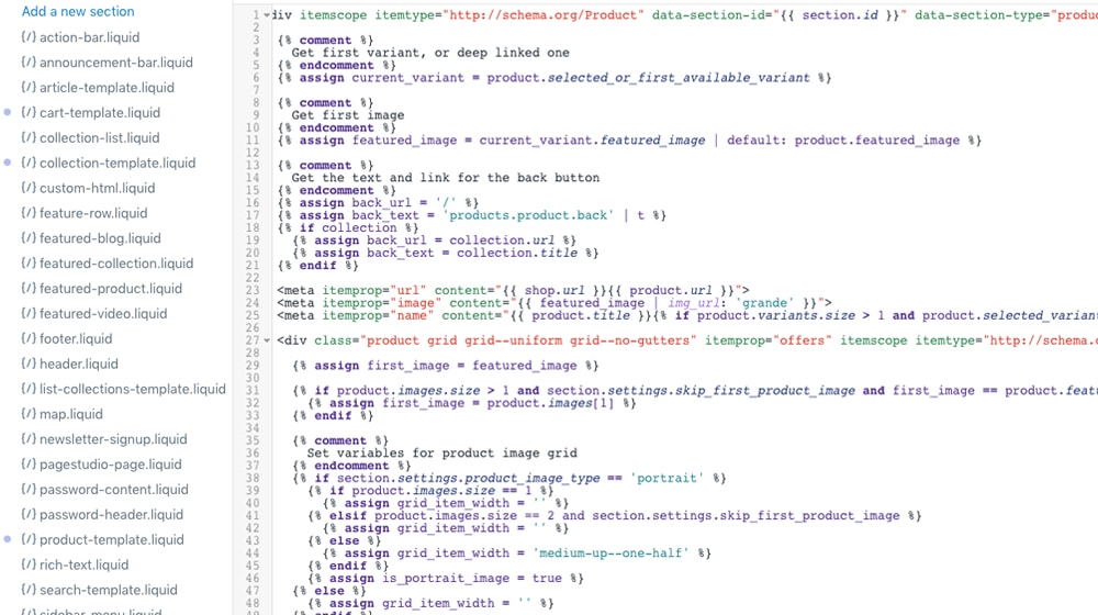
If you're willing to learn Liquid (Shopify's coding/template language) or hire someone who knows it, you can do much more than use the landing page templates and elements Shopify provides. Alternatively, you can use one of many tools to build Shopify pages with more complexity and with a drag-and-drop editor.
There are quite a few different drag-and-drop tools you can use to make landing pages. I have a rundown of 20 of them and a deeper comparison between two of the more popular options (Zeno and Shogun) here:
If you don't have a Shopify landing page builder yet (such as Shogun, Unbounce, GemPages, or Pagefly), or if you're not comfortable coding in liquid, I recommend reading these two posts and shop around for a page builder before you move forward.
I'll wait.
Are you back from the Shopify app store? Okay, now that you have a page builder app installed, let's keep reading!
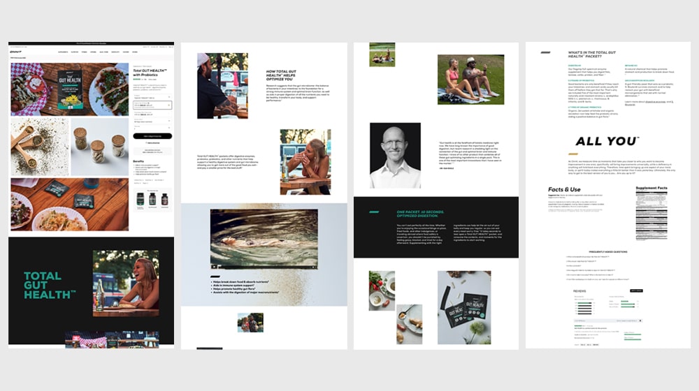
Elements of a Pro-Tier Shopify Landing Page
Using a powerful tool is just enough to get you started. It doesn't matter how powerful or customized your app is if you don't know what goes into a good landing page.
To succeed with landing pages on Shopify, you need to design them properly. That starts at the very top of the page.
1. Optimize your headline.
Your headline is the first thing most people see on your landing page. It's your primary above-the-fold piece of content, and it's often shared with the copy of the ads you're running that lead to it.
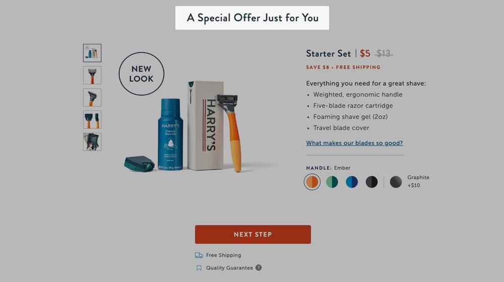
It needs to be highly targeted to the specific user and interests you're targeting.
A water filter might promote filtering 99.99% of contaminants, having faster throughput, maintaining water pressure, or having filters that last a long time before needing replacement. That's several different landing pages worth of focus, right there. Your goal is to pick one for your landing page, aligned with the marketing campaign and with your target audience.
A good headline presents an offer that overcomes a user's primary objection or concern. You consider the buyer's pain point and deliver the solution.
2. Write a solid subheading.
Your subheading is a sentence or two underneath your heading, usually accompanied by an image, that illustrates your value proposition. Our hypothetical water filter's subheading might talk about its capacity, its longevity, the health benefits of filtered water, or even how cheap it works out to be per day of use.
You're two or three sentences into your landing page at this point, and already, you've enticed a reader with a line that directly addresses their immediate need and alleviates their biggest concern.
What are those concerns and needs? That's what your market research needs to tell you. If you know your audience generally has four different primary problems, that's four distinct landing pages you can create, one for each. All four landing pages cover all the bases, of course, but the issue that takes precedence for a specific group of users is the one that gets top billing for the landing page targeting them.
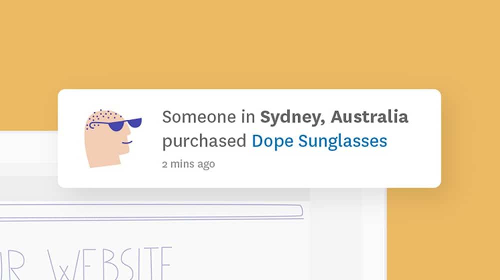
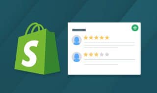
Social proof is societal pressure that encourages a user to trust you and the claims you make.
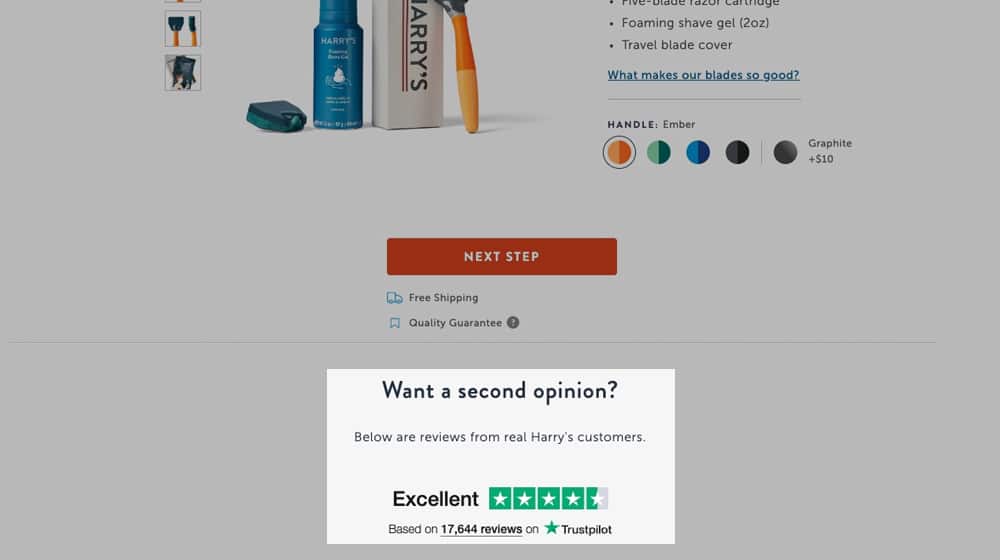
There are a lot of different forms that social proof can take.
- You can display statements about your user base, for example: "50,000 people agree: our water filters are great!"
- You can display media coverage on your site, usually represented by logos of the sites covering you.
- You can mention noteworthy clients or customers with name recognition, typically represented by logos.
- You can highlight user testimonials or reviews explaining your product's features and functionality.
- You can display your social media trust signals, such as the number of followers your page has.
- Passive website trust signals, like SSL, the presence of a contact page, and even a live chat.
There are many ways to add various forms of social proof when you build landing pages, which is why I explained them in greater detail here:
4. Add a great call to action.
A call to action is the next step you want your potential customers to take. Generally, your landing page should only have one primary call to action, though sometimes you can have a direct call to action and a couple of secondary CTAs for people who don't bite right away.
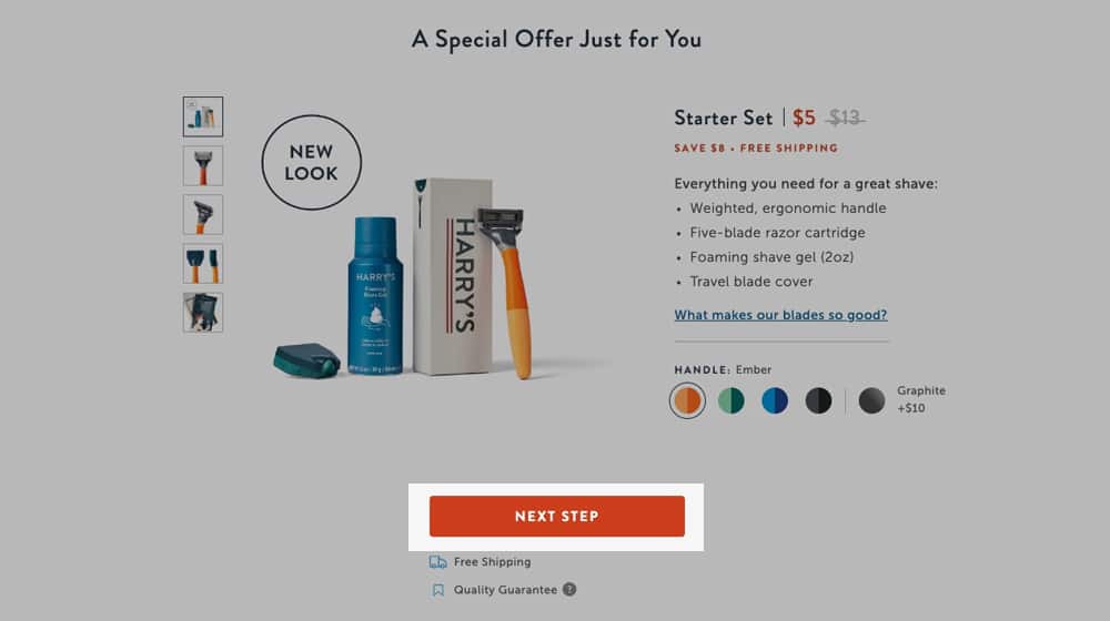
For example, take a quick look at my service page.
First, you have the "Schedule a call" button at the top. As you scroll down, you see a list of benefits of using my service and another "schedule a call" button. Scroll down more, and you get my social proof, case studies, and other convincing information, and another "schedule a call" button. There's always that CTA there for you.
This example is a generic service page, so it's not highly targeted toward specific groups, which is why it doesn't follow every tip on this list. Actual landing pages should be more focused.
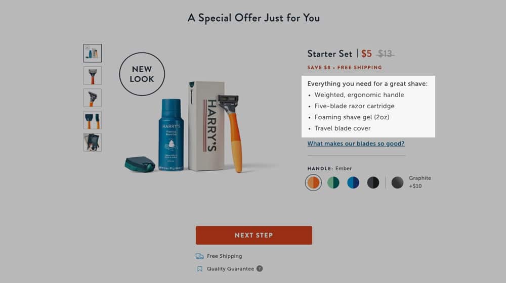
5. Elaborate below the fold.
The "fold" is the line between what a user sees when the page loads and what they must scroll down to see. It comes from newspapers, where anything on the top half of the front page was above the fold (since it was what was on display in a newsstand), and everything else was below the fold.

Your landing page, below the fold, is where you can go into greater detail about your product and offer.
- Write about the primary features of your product, organized and focused on the user's primary concerns.
- Address the most common problems a user may have in clear bullets.
- Offer more niche information and FAQ answers further down.
- Layer in more social proof, FOMO, and whatever else goes well.
There's a lot of room to reorganize, optimize, and adjust everything below the fold of a landing page. Many people won't even scroll down to see it, but that's good because it means the people who see it are more enticed by what they read.
This type of layout is significantly more effective than most of the default Shopify pages you see with a product photo, a brief description, some reviews, and an "add to cart" button. It's also a unique example of product pages that almost resemble landing pages.
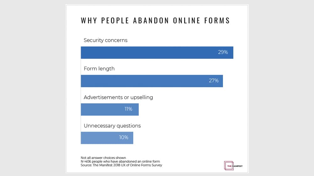
6. Keep your forms short.
Suppose your landing page is all about lead generation, newsletter opt-ins, waiting list sign-ups, or anything that involves the user submitting information. In that case, you want to keep that form as short as possible. Ask as little as you can, and trust that your marketing later can get more out of them.
Every additional field you ask a user to fill in is a field they might not want. Asking for an email for email marketing purposes is fine, but asking for their business name or income level might turn them off. Asking about the size of their company dissuades anyone who doesn't own or represent a company. Asking for income levels feels invasive. Much of that can come up later in a sales call, if necessary.
Of course, if your CTA button involves clicking to schedule an appointment or buying a product, that's a different story.
The goal is to ensure that everything is as frictionless as possible and that it's always apparent to the user what you want them to do next. The more focused your landing page is, the better off you'll be.
7. Test and optimize.
Landing pages need to be aligned with your marketing, but you may find that you have several ideas. That's where split testing comes in. Testing and optimization are a massive part of getting your landing pages to work effectively.
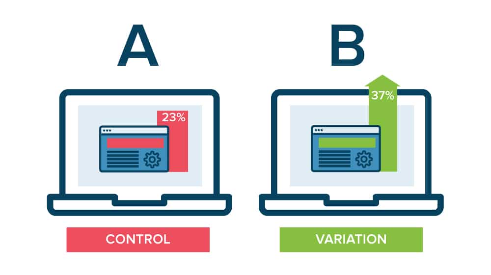
It's also something deserving of a lot more space than I can give it in this post, so I recommend you read a guide like this one to get started:
Popular landing page builders like Shogun have a split testing feature (also known as A/B testing), so you can create several landing page variations, and it will rotate between them to find out which one is performing the best.
8. Use complimentary Shopify apps.
Shopify has a massive app store, and many of these apps can work together. For example, if you use an app for pop-ups, cart abandonment software, or a countdown timer, you can likely integrate those apps on your landing pages as well. You can try out SMS marketing and push notifications, display social proof, and improve the SEO of your pages, so they perform better on search engines.
I wrote a guide on my 30 favorite Shopify apps that are designed to increase your conversions; check them out and think of some ways you can tie these into your landing page builder apps to improve your eCommerce website:
That, my friends, is how you create a high-converting Shopify landing page like a pro. If you have any questions, feel free to leave them in the comments!
Written by James Parsons
Hi, I'm James Parsons! I founded Content Powered, a content marketing agency where I partner with businesses to help them grow through strategic content. With nearly twenty years of SEO and content marketing experience, I've had the joy of helping companies connect with their audiences in meaningful ways. I started my journey by building and growing several successful eCommerce companies solely through content marketing, and I love to share what I've learned along the way. You'll find my thoughts and insights in publications like Search Engine Watch, Search Engine Journal, Forbes, Entrepreneur, and Inc, among others. I've been fortunate to work with wonderful clients ranging from growing businesses to Fortune 500 companies like eBay and Expedia, and helping them shape their content strategies. My focus is on creating optimized content that resonates and converts. I'd love to connect – the best way to contact me is by scheduling a call or by email.

Comments